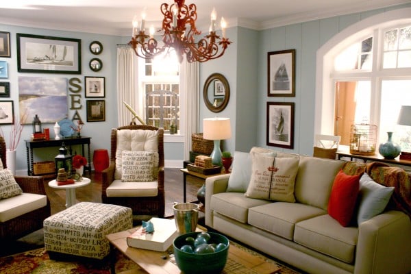
Inspiration photos are the home-design equivalent of bringing a smart friend shopping. They keep you focused, stop you from panic-buying a neon chair at 11:48 p.m., and help you figure out what you actually love instead of what looked good for three seconds on your phone. When used well, inspiration photos can shape everything from your color palette and furniture style to your lighting, layout, finishes, and even how a room feels when you walk into it.
The trick, though, is not to copy one pretty room like you are reenacting a decorating crime scene. The real goal is to study many images, find the repeated details that keep showing up, and translate those ideas into a version that fits your home, your routine, and your budget. That is how inspiration photos go from “nice picture on the internet” to “wow, this room finally feels like us.”
If you are redesigning a whole house, refreshing a single room, or trying to make your place look less like “assorted furniture survivors,” using inspiration photos can help you build a home that feels cohesive, personal, and beautifully put together.
Why Inspiration Photos Work So Well
Most people do not struggle because they have no taste. They struggle because they have too many ideas floating around at once. One day it is modern organic. The next day it is vintage cottage. By Friday, somehow you are considering moody glam and a striped ceiling. Inspiration photos help organize that chaos.
When you collect photos of rooms you love, your preferences start revealing themselves. You may notice that almost every room you saved has warm wood tones, soft lighting, linen textures, black accents, or artwork with lots of movement. Maybe you are drawn to quiet neutral rooms with sculptural furniture. Maybe you keep pinning spaces with bold paint, layered rugs, and enough personality to make beige nervous.
That pattern recognition is the gold. It tells you what matters most to your eye. And once you know that, you can make smarter decisions about what to buy, what to skip, and what will still feel right six months from now.
Start by Collecting the Right Kind of Photos
The first step is simple: gather more than one photo. In fact, gather a lot. Pull inspiration from design magazines, decorating websites, social platforms, builder galleries, paint brand tools, and room makeovers. Save anything that makes you pause. Do not overthink it yet.
But be strategic. Instead of saving only one dreamy living room with cathedral ceilings and windows the size of a movie screen, save a range of rooms that reflect real possibilities. Include photos that match your home’s basic conditions: room size, ceiling height, natural light, flooring, and architecture. If your house is a compact townhouse, it helps more to study stylish townhouses than sprawling estates that belong in a Nancy Meyers universe.
You should also organize your photos by room. Kitchen photos should not be mixed with bedroom ideas and bathroom tile dreams in one giant visual soup. Create separate folders or boards for the living room, kitchen, bedroom, bathroom, entry, and outdoor spaces. That makes it easier to compare apples to apples and chandeliers to chandeliers.
Look for Patterns, Not Perfect Copies
This is where the magic happens. Once you have a healthy stack of inspiration photos, study them like a detective with excellent throw pillows. Ask yourself:
- What colors show up again and again?
- Are the rooms airy and bright, dark and moody, or warm and layered?
- Do the spaces feel formal, relaxed, eclectic, minimal, or collected over time?
- What materials keep appearing: wood, brass, stone, cane, boucle, leather, linen?
- Are the furniture shapes sleek, curved, tailored, vintage, oversized, or mixed?
- How is lighting used: table lamps, sconces, pendants, dim mood, bright task light?
When you notice the same ingredients repeating, write them down. Maybe your pattern list reads like this: warm white walls, medium oak wood, black metal details, vintage-style rugs, layered lamps, and one statement art piece per room. That list is more useful than any single photo because it becomes your design filter.
Now, when you shop, you are not asking, “Is this trendy?” You are asking, “Does this fit the visual language I already know I love?” That question will save you money, time, and at least one regrettable side table.
Translate the Photos Into Your Home’s Reality
1. Match the Mood, Not the Exact Room
A common mistake is trying to duplicate a photo without considering the room it came from. A giant sectional may look amazing in a studio photo with generous dimensions and perfect styling, but in your smaller living room it may swallow the space like a hungry whale. So instead of copying exact pieces, copy the feeling.
If the inspiration room feels calm, airy, and grounded, ask what creates that mood. Is it the muted palette? The natural textures? The open floor space? The limited number of accessories? You can recreate those qualities without buying the exact sofa or the exact lamp that mysteriously costs as much as a used car.
2. Respect Scale and Proportion
Photos can be sneaky. A coffee table may look petite in a large room and enormous in a small one. Wall art that feels balanced over a long sofa can look awkwardly tiny above a compact loveseat. Always compare the size of what you see in the photo to the size of your actual room and furniture.
Measure everything before buying. Then compare your measurements to what would look right in context. Inspiration is fun, but tape measures are what separate beautiful homes from expensive mistakes.
3. Account for Light
Lighting changes everything. A paint color that looks creamy and soft in a sun-drenched photo may read dull, yellow, or flat in a darker room. A moody green that looks dramatic in a north-facing library may feel oppressive in a tiny hallway with no natural light.
Use inspiration photos as a guide, then test colors and materials in your own room. Look at samples in morning light, afternoon light, evening light, and artificial light. If a room only looks good at 2:15 p.m. on a sunny Tuesday, that is not a design plan. That is a trap.
4. Work With Your Home’s Architecture
A home looks best when its decor has a relationship with the structure itself. That does not mean you must decorate a colonial house like a museum or a modern condo like a spaceship. It means your choices should feel intentional. Inspiration photos are most useful when they help you find the balance between your style and your home’s bones.
For example, a traditional room can absolutely handle modern art and cleaner furniture lines. A contemporary home can feel warmer with vintage wood pieces and softer textiles. The best interiors rarely stick to one rigid formula. They mix, edit, and adapt.
Create a Mood Board Before You Buy Anything
Once you have your best inspiration photos, bring them together in one place. That can be a digital board, a saved design folder, a presentation slide, or an old-school pinboard if you like touching real samples and pretending you are in a very chic studio.
Your mood board should include more than pretty rooms. Add the actual items you are considering: paint chips, sofa options, rug ideas, fabric swatches, wood finishes, hardware, light fixtures, and art references. This is where inspiration becomes a plan.
A good mood board helps you answer important questions before spending money:
- Do these colors actually work together?
- Is there enough contrast, or does everything blur together?
- Are the finishes too mixed, or pleasantly layered?
- Does the room have one focal point, or five loud cousins all talking at once?
- Will the style still make sense once the practical pieces are added?
If something looks off on the board, it will probably look off in the room. Much better to discover that digitally than after a delivery truck has already arrived.
Use Inspiration Photos to Build a Cohesive Color Palette
One of the smartest ways to use inspiration photos is to pull color ideas from them. Not just wall colors, either. Look at the full palette: upholstery, wood tones, metals, rugs, drapery, art, and accessories.
A balanced home usually has a few repeating colors or undertones that travel from room to room. That does not mean every room should be identical. It means there should be some visual rhythm. Maybe warm whites repeat on the walls, black appears in lighting and frames, and earthy greens show up in textiles and decor. That creates flow without making the house feel like a furniture catalog.
Try building a simple palette rule for each room: one main background color, one supporting tone, one accent color, and one or two repeat finishes. The result will feel collected rather than random.
Do Not Forget Function
Beautiful inspiration photos can occasionally forget that humans live in houses. A room may look stunning online, but if it offers nowhere to set down a drink, no reading light, no storage, and no comfortable seating, it is not a success. It is a very attractive inconvenience.
So while you are gathering visual inspiration, also think about how you use the room. Do you need washable fabrics because of kids or pets? Do you work from your dining table sometimes? Do you need bedside lighting for reading? Does your entry need real storage, not just a cute bowl that can hold precisely three keys and a paper clip?
The best look for your home is not just stylish. It supports your life. Inspiration photos help most when they lead you toward rooms that are both pretty and practical.
Common Mistakes to Avoid
Saving too few photos. One image can inspire you, but a collection reveals your real preferences.
Copying without adapting. The room in the photo is not your room. Use it as a guide, not a blueprint.
Ignoring scale. Always measure before buying.
Skipping samples. Paint, fabric, wallpaper, and finishes all look different in real life.
Following trends too literally. Trendy details can be fun, but foundation pieces should still feel like you.
Overdecorating. Many gorgeous rooms succeed because they are edited well. Leave breathing room.
How Inspiration Photos Help With Remodeling and Working With Pros
Inspiration photos are not just for casual decorating. They are especially valuable during renovations or when working with contractors, builders, architects, or interior designers. Why? Because they help translate vague opinions into visual direction.
Saying “I want the kitchen to feel warm but modern” can mean twenty different things to twenty different people. Showing five photos with similar cabinet styles, wood tones, hardware, lighting, and backsplash treatment makes your vision much clearer. It reduces confusion and can prevent costly miscommunication.
Photos are also helpful when you are deciding where to splurge and where to save. You may discover that what you love most is not a specific designer sofa, but the layered lighting, rich paint color, and mix of textures. Great news: that is often easier to recreate than an entire luxury shopping cart.
Real-Life Experiences: What Using Inspiration Photos Actually Feels Like
There is a very specific kind of decorating stress that happens when you know you want your home to feel better, but you cannot explain what “better” means. It is not dramatic enough for a reality show, yet somehow it can make a simple shopping trip feel like an identity crisis. You stand in front of a wall of paint chips thinking, “Do I live in warm beige, cool gray, earthy taupe, or emotional confusion?” This is where inspiration photos become surprisingly personal and practical.
One common experience is realizing that your taste is more consistent than you thought. People often assume they like “everything,” but after saving twenty or thirty rooms, patterns show up fast. Maybe every image has soft whites, natural wood, black window frames, and woven textures. Or maybe your saved rooms are full of color, vintage art, patterned drapes, and fearless wallpaper. That moment is helpful because it replaces random browsing with self-awareness. Suddenly, choices get easier.
Another real experience is learning that what looks good online does not always feel good in person. Plenty of homeowners fall in love with dark, dramatic rooms in photos, then discover their own room gets very little daylight and starts looking like a stylish cave by lunchtime. Others save bright, minimalist rooms but later realize they personally prefer warmer, lived-in spaces with books, layered textiles, and signs that an actual human has eaten soup there. Inspiration photos are useful, but only when they are tested against your real life.
There is also the confidence factor. When people create a board before they shop, they usually feel calmer and more decisive. Instead of wandering from store to store getting seduced by every trendy lamp and every suspiciously adorable accent chair, they have a visual plan. That plan acts like a filter. It does not make every decision instant, but it does reduce second-guessing. A home starts coming together faster because purchases relate to each other.
Using inspiration photos can also be emotional in a good way. A lot of people are not just decorating rooms. They are creating a fresh start after moving, renovating after years of waiting, combining households, or updating a home so it better reflects who they are now. In that context, inspiration photos are not shallow at all. They help people picture a home that feels calmer, happier, more welcoming, more adult, more playful, or simply more finished.
And then comes the most satisfying experience of all: seeing the room take shape and realizing the finished result does not look exactly like any one photo you saved. It looks better for one important reason. It looks like your home. The lighting is yours. The proportions are yours. The mix of practical pieces and pretty details is yours. The inspiration photos did their job. They guided you toward clarity, helped you avoid mistakes, and gave you a language for your style. But in the end, the best look was never about copying somebody else’s room. It was about using those images to uncover your own.
Conclusion
Using inspiration photos well is less about imitation and more about interpretation. The smartest decorators collect widely, analyze patterns, edit ruthlessly, and then adapt what they love to the real conditions of their homes. They pay attention to light, scale, function, and the architecture already in place. They test ideas before committing, and they use mood boards to turn vague tastes into concrete plans.
Do that, and inspiration photos become more than a folder of pretty rooms. They become a decision-making tool, a confidence boost, and a shortcut to a home that feels polished without feeling fake. That is the sweet spot: a space that looks designed, feels comfortable, and reflects your taste instead of someone else’s highlight reel.