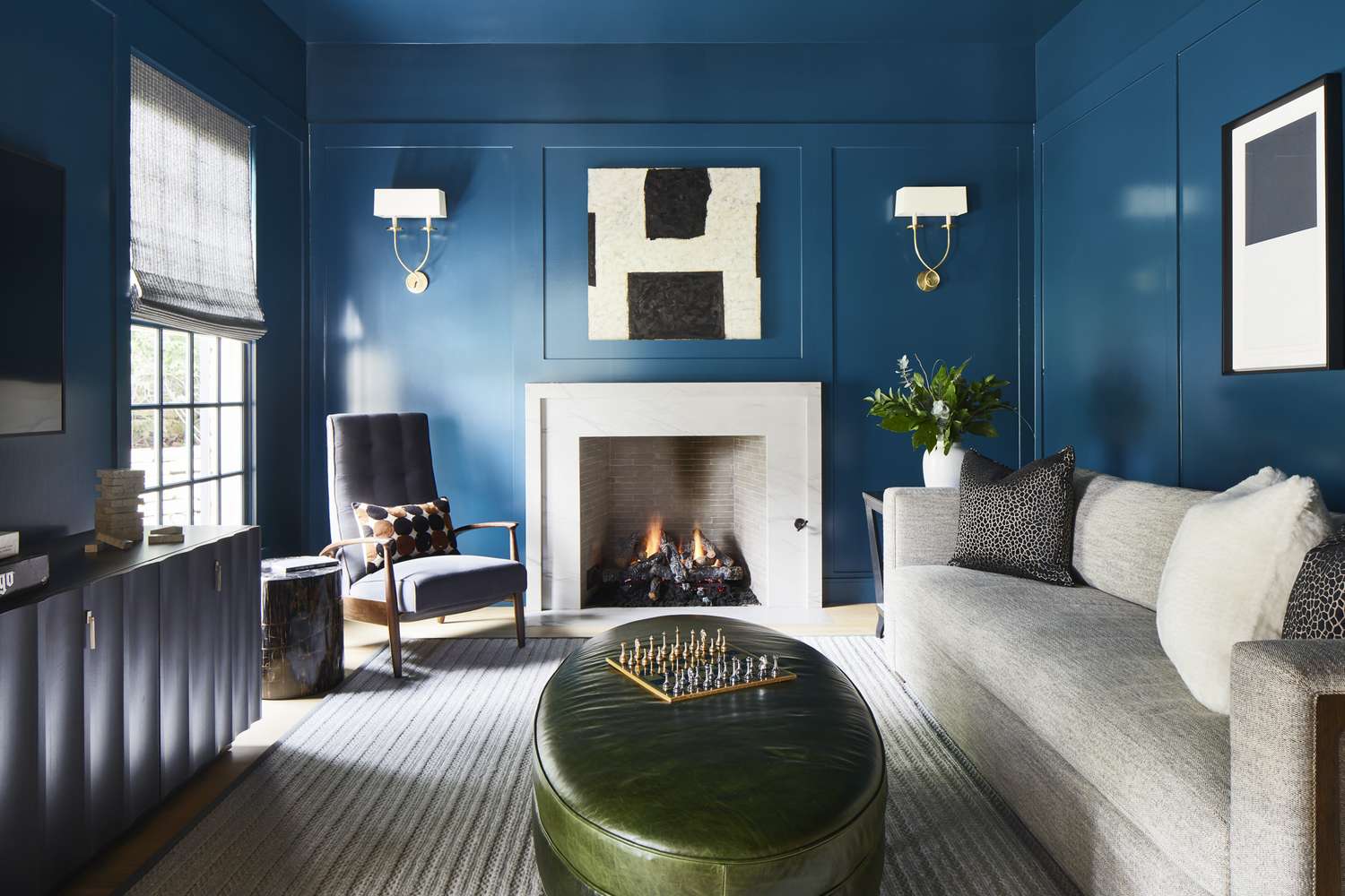
For years, the modern home seemed trapped in a polite little loop of beige, greige, oatmeal, mushroom, and “what color is that exactly?” Somewhere along the way, interiors got so neutral they started to feel like they were apologizing for existing. But 2026 is swinging the pendulum the other way, and not gently. This is the year of color-drenching: walls, ceilings, trim, doors, and sometimes even cabinetry, shelving, and furniture wrapped in one rich, immersive hue.
And honestly? It is about time. After a long reign of safe white walls and cool gray everything, homeowners are craving rooms with pulse. Designers are leaning into cocooning bedrooms, moody dining rooms, expressive kitchens, and little jewel-box spaces that feel intentional instead of generic. The message is clear: if 2019 wanted calm, and 2023 wanted soft minimalism, 2026 wants character. Lots of it. Preferably painted floor to ceiling.
That does not mean neutrals vanish in a puff of dust like a villain in a low-budget movie. It means the old, flat version of neutrality is losing power. In its place, we are seeing richer neutrals, warmer undertones, earthy browns, mossy greens, smoky blue-greens, mauves, oxbloods, and saturated khakis. Even the “quiet” shades coming out of major paint forecasts feel moodier, deeper, and more emotionally tuned in than the blank-canvas tones that dominated the last decade.
Why 2026 Interiors Are Moving Past Bland Neutrals
The shift away from sterile interiors is not random. It reflects how people want their homes to feel now. After years of open-concept sameness, fast trend cycles, and social media rooms styled like short-term rentals, people are asking more from their spaces. They want comfort, identity, softness, and a little theater. They want rooms that feel lived in, not merely staged for a listing photo.
That is one reason color-drenching in interiors is gaining so much traction. It creates atmosphere fast. Instead of treating paint like a background actor, it makes color the lead. And in 2026, atmosphere matters. Across current design coverage, the broader trends point in the same direction: more personalization, more craftsmanship, more vintage character, more dark wood, more pattern, and less fear of visual commitment. Translation: the age of “just paint it agreeable greige and move on” is winding down.
There is also a psychological angle here. Saturated color can make a room feel grounded, enveloping, and surprisingly restful when used well. That sounds backward if you grew up believing bold paint automatically equals chaos. But an all-over wash of one hue often feels calmer than a room chopped up by white trim, contrasting ceilings, and too many competing materials. The eye moves more smoothly. The room reads as a complete thought.
What Color-Drenching Actually Means
If you are new to the term, color-drenching means painting multiple surfaces in a room using the same color or closely related tones. Usually that includes the walls, ceiling, trim, doors, and molding. In more committed versions, it can extend to built-ins, cabinetry, shelves, radiator covers, and sometimes even carefully chosen decor pieces in the same family.
The result is immersive. Instead of each surface announcing itself separately, the room becomes one mood. This is why the trend works especially well in spaces where you want emotional impact: bedrooms, libraries, dining rooms, studies, entryways, and powder rooms. A drenched room feels designed on purpose. Even a simple box of a room suddenly gets presence.
There are also newer cousins of the trend showing up in 2026, including double drenching, where two closely related shades are used across the room, and color capping, where different tones from one family move across walls, architectural details, and ceilings. In other words, the industry is no longer asking whether color drenching matters. It is already expanding the playbook.
Why Designers and Paint Brands Are Betting on This Look
One of the biggest clues about where interiors are going comes from annual paint forecasts. And the 2026 color conversation is not whispering. It is practically singing in velvet opera gloves. Sherwin-Williams selected Universal Khaki, a warm grounding neutral with more depth than the washed-out tans of the past. Benjamin Moore chose Silhouette, a sophisticated charcoal-brown that feels tailored and dramatic. Behr’s Hidden Gem, a smoky jade blue-green, pushes the idea of the “new neutral” into deeper waters. Across forecasts and trend roundups, the recurring mood is warmth, richness, and emotional color.
That matters because paint brands are not operating in a vacuum. These forecasts usually reflect broader movements in fashion, furnishings, real-estate listings, and design culture. The color story for 2026 keeps pointing toward earthy saturation, deeper undertones, and spaces that feel cocooned rather than clinical. Even when a shade is described as neutral, it is not the old kind of neutral. It has body. It has memory. It has opinions.
Real-estate data is also helping push the trend into the mainstream. Listings mentioning color drenching have risen sharply, which suggests the look is no longer a niche designer trick. Buyers are noticing it, editors are spotlighting it, and homeowners are becoming more willing to paint the ceiling instead of pretending it does not exist. The “fifth wall” is finally invited to the party.
The Rooms Where Color-Drenching Works Best
Bedrooms That Feel Like a Retreat
The bedroom may be the most natural place to try a color-drenched room. When the walls, trim, and ceiling all wrap in one muted plum, smoky green, mauve, or cocoa brown, the space feels softer and more private. It is less about visual stimulation and more about enclosure. This is especially effective when paired with layered textiles, dimmable lighting, and natural wood. Suddenly your bedroom stops feeling like a place where laundry goes to judge you.
Dining Rooms With Drama
Dining rooms benefit from bold choices because they are already experience-driven spaces. A deep oxblood, olive, or inky teal can make evening light feel warmer, table settings feel richer, and the whole room feel more intimate. If you want dinner to feel like an occasion instead of a reheated Tuesday, this is a powerful design move.
Home Offices That Improve Focus
One underrated advantage of paint drenching is that it can reduce visual noise. In a home office, that matters. A cocooning green, moody blue, or earthy brown can create a more concentrated environment than a bright white room full of contrast. Add shelves painted the same shade as the walls, and clutter visually recedes instead of shouting for attention.
Powder Rooms and Entryways That Make a Statement
If you are nervous, start small. A powder room is the classic gateway drug to bolder design. Since it is a compact space used in short bursts, you can afford to go dramatic. Jewel tones, dark reds, tobacco browns, and blue-greens all work beautifully here. Entryways are another smart testing ground. A color-drenched foyer immediately signals that the house has a point of view.
Kitchens and Millwork With a Seamless Look
In 2026, color drenching is moving beyond walls and into millwork. Cabinetry, trim, and even matching hardware are being used to create a continuous wash of color. This works especially well in kitchens where you want a refined, tailored feel rather than a patchwork of finishes. Think deep green cabinetry with matching trim, or a smoky brown pantry with the shelving painted to disappear into the background.
The Colors Most Likely to Dominate 2026 Interiors
Earthy Browns and Tailored Charcoals
Brown is not back because it suddenly became trendy again. Brown is back because people missed warmth. Espresso, walnut, cocoa, chestnut, and charcoal-browns feel substantial, grounded, and quietly luxurious. They pair beautifully with plaster, linen, brass, leather, and dark wood. In a color-drenched room, these tones read elegant rather than heavy.
Smoky Greens and Blue-Greens
Green remains one of the strongest bridges between color and comfort. Olive, eucalyptus, moss, sage, and blue-green shades can feel organic, moody, and versatile all at once. These are ideal for homeowners who want to leave white walls behind without going straight into ruby-red drama on day one.
Oxblood, Burgundy, and Warm Red-Browns
If 2026 had a signature flirtation, it might be with rich red-browns. These shades feel sophisticated, a little nostalgic, and unexpectedly livable when used in the right room. They are especially striking in dining rooms, studies, and powder rooms, where lower light levels can make the color feel plush instead of overpowering.
Mauve, Plum, and Dusty Rose Tones
Not every color trend in 2026 is dark and serious. Mauves and softened plums are emerging as nuanced alternatives to beige. They bring warmth and subtle personality without screaming for attention. In bedrooms or sitting rooms, they can feel romantic, grown-up, and a lot more interesting than another “safe” cream wall.
Warm Khaki and Reinvented Neutrals
Here is the twist: some neutrals are surviving, but they are evolving. Warm khaki, truffle, putty, and sun-warmed greige are showing up as richer, more intentional base colors. They are not blank. They are atmospheric. In other words, 2026 is not canceling neutrals. It is firing the boring ones.
How to Try Color-Drenching Without Regretting It
Start With Undertone, Not Just Color Name
“Green” can mean moss, mint, olive, jade, or swamp-adjacent sadness. The undertone decides whether the room feels elegant or accidental. Before painting every surface, test the color in morning light, afternoon light, and lamplight. A good drenched room depends on consistency across changing conditions.
Use Different Finishes for Depth
One of the best tricks in 2026 interior design trends is using the same color in different sheens. Matte or eggshell on walls, satin on trim, and a slight sheen on the ceiling can create subtle variation without breaking the immersive effect. This keeps the room from looking flat while preserving the monochromatic mood.
Layer Texture So the Room Feels Rich, Not Monotone
Color drenching works best when the materials do some of the talking. Linen drapes, boucle chairs, stained wood, stone, velvet pillows, woven shades, plaster finishes, and antique brass all help the room feel dimensional. The more monochromatic the palette, the more texture matters.
Respect the Room’s Light
A north-facing room can make some colors look cooler and moodier. A bright south-facing room can intensify warm tones quickly. This is why the trend looks so sophisticated in editorials and so questionable in rushed weekend paint jobs. Lighting is not a detail. It is the co-author.
Begin Where Commitment Is Easier
If the thought of painting your living room ceiling gives you heart palpitations, do not start there. Try a powder room, reading nook, mudroom, guest bedroom, or office first. Once you experience how polished an all-over color can feel, you will be much less emotionally attached to your off-white era.
What This Trend Really Says About 2026 Living
At its core, color drenching is not just a paint trend. It is a cultural mood shift. It says people are tired of spaces that feel generic, hyper-edited, and emotionally distant. They want homes with memory, softness, mood, and point of view. They want the room to feel like something when they walk in.
It also fits neatly with other design currents shaping 2026: the return of dark woods, the rise of lacquer and gloss, renewed interest in vintage furniture, cozy reading nooks, and spaces designed around personal rituals rather than resale clichés. The house is becoming less of a showroom and more of a self-portrait.
So yes, say goodbye to neutrals. Or at least say goodbye to the timid, flattening version that dominated for too long. The new era is richer, moodier, warmer, and more immersive. And frankly, it is more fun.
What Living With Color-Drenching Actually Feels Like
Design trends are easy to admire online and a little harder to imagine in real life, which is why the experience of color drenching matters. Living in a drenched room does not feel like standing inside a giant paint chip. When it is done well, it feels oddly natural. You walk in and the room stops feeling assembled piece by piece; it feels whole. The walls are not separate from the trim, and the ceiling is no longer a blank lid hovering above the furniture. Everything participates.
In the morning, a color-drenched bedroom can feel surprisingly gentle. Soft daylight hits the walls, the tone shifts slightly, and the room takes on a hushed, cocoon-like quality. A dusty mauve room can feel tender and flattering. An olive room can feel grounded and quiet. A brown room can feel like the design equivalent of a really good cup of coffee: comforting, a little serious, and deeply welcome. The mood changes with the light, which is part of the charm. White rooms reflect daylight; drenched rooms absorb it, filter it, and give it character.
In the evening, the experience changes again. Lamplight deepens everything. A blue-green study starts to feel cinematic. A burgundy dining room makes candlelight look richer. A khaki sitting room suddenly reads tailored instead of plain. This is one reason people fall so hard for the trend after seeing it in person. The room feels active without being busy. There is drama, but not clutter. Personality, but not visual shouting.
There is also a comfort factor that people underestimate. High-contrast rooms can feel stimulating because your eye is constantly jumping from one edge to another. In a drenched room, the eye can relax. The boundaries blur a little. Shelves painted the same color as the wall can make books and objects feel curated rather than messy. Molding painted in the same hue looks architectural instead of fussy. Even awkward rooms can gain confidence when every surface is working together.
Of course, the experience is not identical in every space. A tiny powder room drenched in oxblood feels playful, bold, and slightly mischievous. A family room in a smoky green feels calmer and more lived-in. A home office in cocoa or deep teal can feel more focused, as though the room itself has decided to stop multitasking. That is the quiet power of this trend: it changes not only how a room looks, but how it behaves.
And perhaps the biggest emotional shift is this: color drenching gives a home conviction. It says someone made a choice here. Someone wanted mood instead of default settings. In an era when so many interiors have blurred into the same beige algorithm, that confidence feels refreshing. The best drenched rooms are not trying to please everybody. They are trying to feel right to the people who actually live there. That, more than any single paint shade, is what will define 2026 interiors.
Conclusion
Color-drenching will define 2026 interiors because it delivers what modern homeowners want most: warmth, personality, immersion, and a stronger emotional connection to the rooms they live in every day. From earthy browns and smoky greens to mauves, oxbloods, and reimagined neutrals, the palette of the year is deeper and more expressive than the quiet tones that came before it.
The smartest thing about this trend is that it is flexible. You can go full drama in a dining room, try a cocooning green in the bedroom, or experiment with a small powder room before committing to a larger space. However you approach it, the message of 2026 is clear: homes are no longer trying to disappear behind safe paint choices. They are stepping into character. And honestly, the walls deserve a little main-character energy too.