Note: This publish-ready article is written in standard American English, with SEO structure, natural keyword use, and no external source links or unnecessary citation placeholders.
Why High-Energy Color Is Having a Very Fun Moment
For years, interior design seemed trapped in a quiet little beige cardigan. White walls, gray sofas, pale wood floors, and “just a hint of texture” became the unofficial uniform of modern homes. It was calm, sure. It was tasteful, absolutely. But sometimes a room needs more than calm. Sometimes it needs a tangerine chair, a cobalt blue ceiling, a chartreuse lamp that looks like it has plans after midnight, and a rug bold enough to introduce itself before you do.
That is where high-energy color comes in. High-energy color in interiors is not simply about making a room bright. It is about using bold paint colors, playful decor, expressive patterns, and confident color combinations to create spaces that feel alive. Think coral dining rooms, sunshine yellow breakfast nooks, emerald green bookcases, hot pink powder rooms, tomato red accents, electric blue cabinetry, and rooms that look like they have a personality instead of a warranty packet.
The rise of dopamine decor, colorful maximalism, and personality-driven home design has made one thing clear: people are tired of homes that look like hotel lobbies designed by a very polite spreadsheet. Today’s fun interiors celebrate individuality. They blend comfort with surprise. They use color not as an afterthought, but as the main character.
What Makes a Color “High-Energy”?
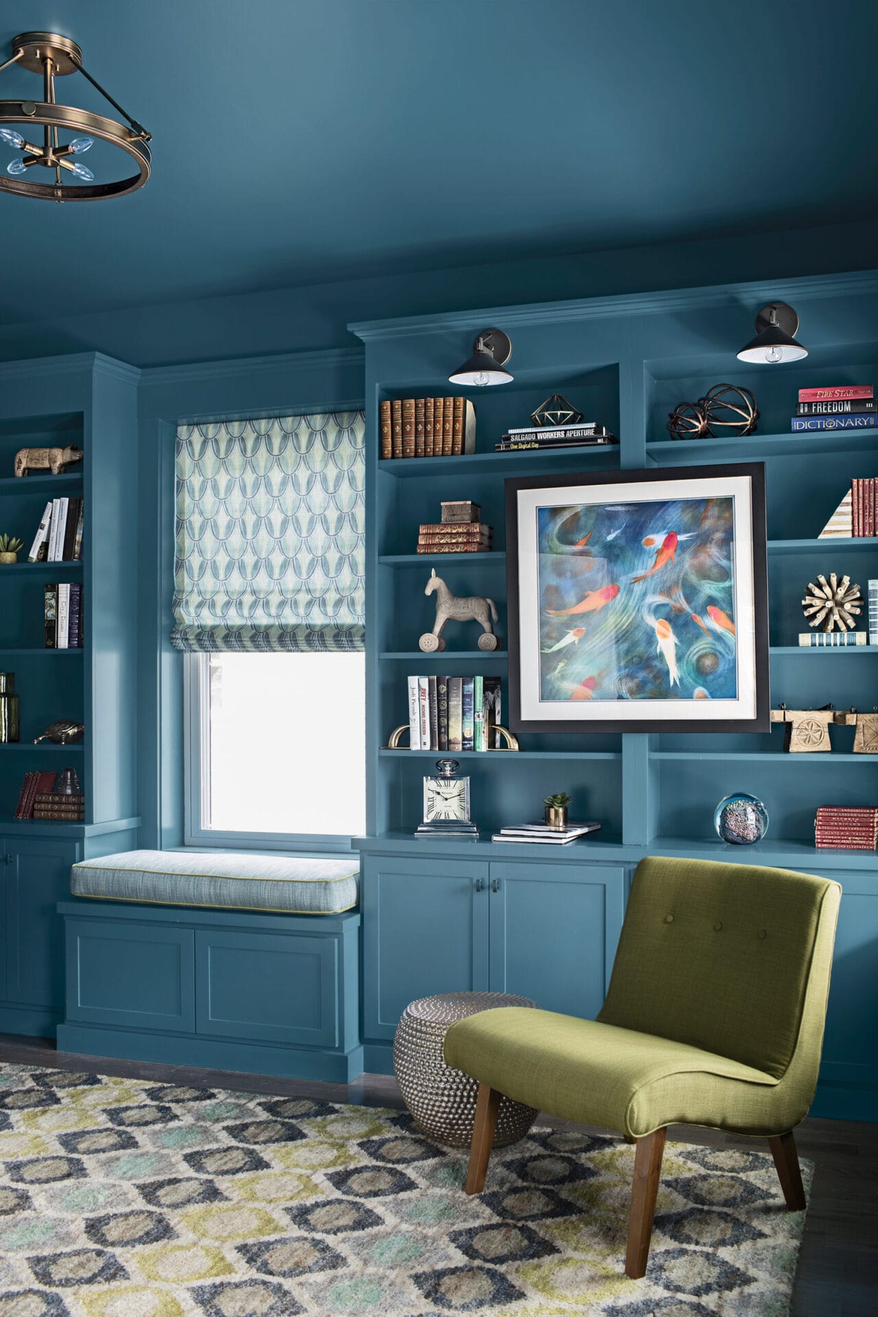
A high-energy color is usually saturated, vivid, warm, bright, or dramatically deep. It catches the eye quickly and changes the emotional temperature of a room. Red, orange, yellow, magenta, turquoise, cobalt, lime green, and jewel tones often fall into this category, but energy does not always mean neon. A rich aubergine wall, a deep teal sofa, or a lacquered cherry-red side table can feel just as dynamic as a bright citrus shade.
Color Energy Comes From Three Things
First, there is saturation. Highly saturated colors feel stronger and more expressive because they contain less gray. A vivid orange has more punch than a muted clay shade. A true cobalt blue feels more energetic than a dusty blue-gray.
Second, there is contrast. A bright yellow chair in a white room will feel energetic because it stands out. A black-and-white checkerboard floor paired with red artwork creates instant movement. Contrast gives the eye something to do, which is why colorful interiors often feel lively even when the furniture layout is simple.
Third, there is context. A bold red bedroom might feel overstimulating for some people, while a red dining room can feel festive and appetizing. A neon green office may not be everyone’s productivity dream, but a green powder room with brass fixtures can feel fresh, cheeky, and unforgettable.
The Secret: Fun Interiors Still Need Balance
Here is the truth: high-energy color is fun, but chaos wearing a lampshade is still chaos. The best colorful interiors are not random. They may look effortless, but they usually rely on smart design rules, thoughtful repetition, and a little restraint. Yes, restraint can exist in a room with a purple sofa. It just wears better shoes.
A common strategy is the 60-30-10 rule. In simple terms, use one dominant color for about 60 percent of the room, a secondary color for about 30 percent, and an accent color for the final 10 percent. For example, a living room might use warm white walls as the base, a saturated blue sofa and curtains as the secondary color, and orange pillows or art as the accent. This keeps the space energetic without making it feel like a box of crayons had a group project.
Use Neutrals as a Stage, Not a Surrender
Neutral colors are not the enemy of high-energy interiors. In fact, they often make bold colors look better. Cream walls can make a raspberry velvet sofa glow. Natural wood floors can ground a turquoise kitchen. Black trim can sharpen a playful palette and make it look intentional rather than accidental.
The key is to use neutrals as breathing room. When every surface is shouting, nothing is heard. When bold color has space around it, the room feels edited, stylish, and much easier to live with.
How to Choose a High-Energy Color Palette That Works
The easiest way to choose a colorful interior palette is to start with something you already love. It could be a vintage rug, a piece of artwork, patterned curtains, a favorite ceramic bowl, or even a photo from a vacation. Pull three or four colors from that item and use them as your guide. This approach works because the palette has already been visually tested by the object that inspired it.
Try Warm, Cool, or Mixed Energy
Warm high-energy palettes use colors like coral, tomato red, marigold, peach, rust, and fuchsia. These shades are social, cheerful, and inviting. They work beautifully in kitchens, dining rooms, entryways, and family spaces where conversation and movement are part of the mood.
Cool high-energy palettes rely on cobalt, emerald, teal, violet, aqua, and peacock blue. These colors can feel bold without becoming too visually hot. They are especially useful in bedrooms, offices, and living rooms where you want drama but still need a sense of calm.
Mixed palettes combine warm and cool colors for maximum personality. Pink and green, blue and orange, yellow and violet, or red and turquoise can look fantastic when balanced with neutral walls, natural materials, or repeated accents.
Room-by-Room Ideas for High-Energy Color
High-energy color can work in every room, but the best application depends on how you use the space. A color that feels delightful in a hallway may feel too intense in a bedroom. A daring shade that seems risky in a living room might be perfect in a powder room where guests only spend a few minutes and secretly judge your hand soap.
Living Room: Start With One Big Color Moment
The living room is often the most visible space in a home, so bold color here should feel intentional. A saturated sofa is one of the easiest ways to create a high-energy focal point. Try emerald green velvet, cobalt blue linen, paprika orange boucle, or a deep plum sectional. Keep the walls soft if you want the furniture to star, or go all-in with colorful walls and quieter upholstery.
Artwork is another smart option. Large-scale art with bright colors can energize a neutral living room instantly. Add coordinating pillows, a throw blanket, or a sculptural lamp to repeat the colors and create cohesion. Repetition is what makes bold design look planned instead of panicked.
Kitchen: Use Color Where It Sparks Joy
Kitchens are perfect for high-energy color because they are active spaces. A yellow breakfast nook can feel sunny even before the coffee starts doing its job. Blue lower cabinets, green tile, coral bar stools, or a red pendant light can make the kitchen feel personal and lively.
If you are nervous about painting all the cabinets, start with the island. A colorful island gives the room a focal point without overwhelming the entire space. Another idea is to use colorful tile as a backsplash. Tile has texture, shine, and pattern, which means even a small area can create a big design impact.
Dining Room: Be Brave, Because Dinner Is Temporary
Dining rooms are excellent places to experiment with bold paint colors. Unlike bedrooms or home offices, dining rooms are usually used for shorter periods of time, which makes them ideal for dramatic choices. A raspberry wall, lacquered navy ceiling, or burnt orange wallpaper can turn an ordinary meal into an occasion.
For a polished look, combine high-energy walls with classic furniture. A traditional wood table looks fresher against teal walls. Cane chairs feel playful with coral paint. A modern dining set becomes more memorable under a glossy plum ceiling. The contrast between familiar furniture and unexpected color creates a stylish tension.
Bedroom: Go Energetic, But Not Exhausting
Bedrooms need a different strategy. High-energy color can work beautifully, but it should support rest rather than fight it like a tiny design gremlin. Instead of neon walls, consider jewel tones, muted brights, or colorful accents. A deep green headboard, terracotta bedding, cobalt lamps, or blush-and-orange artwork can bring energy while keeping the mood sleep-friendly.
If you love bright colors, try using them behind the bed rather than on every wall. Another option is colorful bedding, which can be swapped seasonally. This keeps the room flexible and prevents design regret from moving in and unpacking a suitcase.
Bathroom and Powder Room: The Best Place to Be Wild
Small bathrooms and powder rooms are the secret playground of interior design. Because they are compact, they can handle bold wallpaper, saturated paint, patterned tile, and dramatic lighting. A tiny room painted emerald green or wrapped in banana-leaf wallpaper can feel luxurious rather than overwhelming.
Powder rooms are especially forgiving because they do not need to function as restful retreats. Add a colorful mirror, playful sconces, a painted vanity, or patterned floor tile. If the rest of your house is calm, a bold powder room can feel like a delightful wink.
High-Energy Color Without Painting the Walls
Not everyone can paint. Renters, commitment-phobes, and people still emotionally recovering from choosing the wrong beige all need color options too. Fortunately, paint is only one tool.
Use Textiles for Flexible Color
Rugs, curtains, pillows, bedding, and throws can transform a room quickly. A colorful rug can anchor a living room and introduce a palette without touching the walls. Curtains in a bold print can add height, movement, and personality. Pillows are the easiest low-risk experiment, though they do have a way of multiplying when no one is watching.
Bring in Colorful Furniture
A bright chair, painted dresser, lacquered side table, or colorful bookcase can make a room feel fresh without a full renovation. If you are buying one colorful piece, choose a color you have loved for years rather than one you met online last Tuesday. Trends are fun, but personal taste has better staying power.
Try Art, Books, and Objects
Books, ceramics, framed prints, lampshades, trays, and vases are small but powerful. Grouping colorful accessories in threes or repeating the same shade in several places helps the room feel connected. For example, a red vase, red artwork, and red trim on a pillow can make the color feel intentional.
Common Mistakes to Avoid With Bold Interior Color
High-energy color is forgiving, but a few mistakes can make a room feel less “fun interior” and more “indoor carnival during a power surge.” The first mistake is choosing colors only under store lighting. Paint and fabric can look completely different at home depending on natural light, time of day, and nearby finishes. Always test swatches before committing.
The second mistake is ignoring undertones. A bright white with cool undertones can make warm colors look sharper, while a creamy white can soften them. A gray sofa may have blue, green, or purple undertones that affect how it pairs with bold colors. The more energetic the palette, the more undertones matter.
The third mistake is forgetting texture. A room filled with flat, bright surfaces can feel harsh. Add velvet, linen, rattan, wood, ceramic, wool, glass, and metal. Texture gives color depth and makes a bold room feel layered instead of loud.
How Lighting Changes High-Energy Color
Lighting can make or break colorful interiors. A color that looks cheerful in morning sunlight may look dull under a cool LED bulb at night. South-facing rooms often intensify warm colors. North-facing rooms may make colors appear cooler and softer. East-facing rooms get bright morning light, while west-facing rooms can make warm hues glow in the afternoon.
Before painting a room coral, cobalt, green, or yellow, test large samples on multiple walls. Look at them in the morning, afternoon, and evening. Then look again when you are tired, hungry, and slightly annoyed. That is the real test of whether you can live with a bold color.
Real-Life Experience: Living With High-Energy Color
The first time you bring high-energy color into a home, it can feel a little dramatic. You might start with one orange pillow and suddenly question your entire identity. But after a few days, something interesting happens: the color begins to feel less like a risk and more like a mood-lifter. A bright entryway can make coming home feel happier. A blue reading chair can become the spot everyone wants. A painted cabinet can turn a boring corner into the most photographed part of the house.
One of the best experiences with colorful interiors is discovering how much a small change can alter the atmosphere of a room. For example, imagine a plain white dining area with a wood table and neutral chairs. It is functional, but not especially memorable. Add a tomato red pendant light, a striped rug, and two framed prints with red, pink, and yellow accents, and suddenly the room has rhythm. It feels like a place where people linger, laugh, and maybe order dessert even though they said they were full.
Another real-world lesson is that color often becomes easier once you stop trying to impress imaginary guests. Many people decorate for resale value, visitors, or vague internet approval. But the most successful fun interiors usually come from personal connection. Maybe you love turquoise because it reminds you of summer vacations. Maybe yellow feels like morning energy. Maybe green makes your apartment feel closer to nature. When the color means something to you, the room feels authentic instead of trendy.
There is also a practical side to high-energy color. It can help define zones in open spaces. A colorful rug can separate the living area from the dining area. A painted bookcase can turn a blank wall into a reading corner. A bold ceiling can make a small room feel designed rather than forgotten. Color is not just decoration; it is a tool for shaping how a space works.
Of course, not every experiment will be perfect. A bright yellow bedroom may feel cheerful at noon and wildly enthusiastic at 6 a.m. A deep purple hallway may look elegant online but too dark in a windowless apartment. That is not failure; that is design research with better snacks. The trick is to start with flexible layers when you are unsure. Try colorful lampshades, removable wallpaper, slipcovers, peel-and-stick tile, or painted furniture before committing to an entire room.
The most rewarding part of living with high-energy color is how it changes the emotional relationship with your home. Instead of being a neutral backdrop, the space starts participating in daily life. It wakes up the kitchen, warms up the dining room, gives the living room confidence, and makes even a tiny bathroom feel like it has a secret career as a boutique hotel. Fun interiors are not about perfection. They are about personality, comfort, and the tiny thrill of seeing a color you love every single day.
Conclusion: Let Your Home Have a Little Fun
High-energy color makes for fun interiors because it gives a home emotion, movement, and character. Whether you choose a bold wall color, a jewel-toned sofa, a playful rug, or a tiny powder room wrapped in dramatic wallpaper, color can change the way a room looks and the way it feels to live in it.
The best colorful interiors are not careless. They balance bold choices with thoughtful repetition, comfortable neutrals, proper lighting, and practical room function. Start with colors you genuinely love, test them in your space, and build a palette that supports your daily life. A fun home does not need to look like anyone else’s. In fact, that is the whole point.