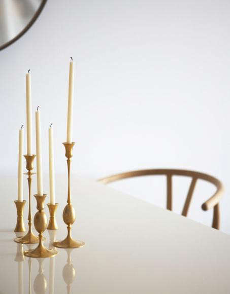
Some accessories whisper. Gold-toned candlesticks do not. They stand on a dining table, a mantel, a bookshelf, or a lonely console and instantly announce that someone in this house has opinions about ambiance. Good opinions, ideally. In a decorating world that swings wildly between ultra-minimal restraint and “I found this at an estate sale and now it owns my personality,” gold-toned candlesticks sit comfortably in the middle. They can look polished, romantic, vintage, moody, glamorous, rustic, or just plain expensive without requiring your credit card to enter cardiac arrest.
That is exactly why the high/low approach works so well here. You do not need a full set of heirloom brass candlesticks rescued from a Paris flea market while wearing a trench coat and emotional depth. You can pair one or two elevated pieces with simpler, budget-friendly styles and still create a layered, collected look. In fact, that slightly mixed, not-too-perfect arrangement often looks better than buying six identical candlesticks that resemble they came bundled with a corporate holiday centerpiece.
Gold-toned candlesticks also solve a practical styling problem: rooms need warmth, shine, and height. A throw pillow adds softness. A vase adds shape. A candlestick adds vertical rhythm, flicker, and just enough metallic light to wake up a flat surface. Whether you lean modern, traditional, transitional, cottage, or “my algorithm keeps showing me moody European interiors,” this accessory plays nicely with almost every decorating style.
Why Gold-Toned Candlesticks Still Work So Well
The appeal is simple. Gold-toned finishes reflect light in a softer, warmer way than chrome or stark black metal. They bring a room to life without screaming for attention. Even when unlit, they act like jewelry for a table or shelf. When candles are lit, they create that impossible-to-fake glow that makes dinner look better, bookshelves look smarter, and takeout feel almost intentional.
Another reason they endure is flexibility. Gold-toned candlesticks are available in polished finishes, brushed finishes, aged brass looks, hammered textures, slim modern silhouettes, chunky sculptural forms, and traditional turned shapes. That range makes them unusually democratic. A pared-back apartment can use a minimal set with clean lines. A traditional home can layer antique-inspired holders with linen runners and darker wood. A maximalist can group mismatched pieces and call it curation, which is honestly one of decorating’s greatest loopholes.
And then there is the emotional factor. Candlesticks make ordinary rooms feel ceremonial. A weeknight pasta dinner becomes a tablescape. A basic fireplace suddenly has atmosphere. A bare entry console looks less like an afterthought and more like the opening chapter of a stylish home. Gold-toned candlesticks are tiny mood managers, and they do their job without demanding a full room makeover.
The High/Low Decorating Formula
The smartest way to style gold-toned candlesticks is not to think in terms of “cheap” and “expensive.” Think in terms of anchor pieces and supporting pieces. Your higher-end candlesticks serve as the anchors. These are the sculptural, weighty, beautifully finished pieces that catch the eye first. Your lower-cost options fill out the arrangement, add height variety, and help the display feel abundant rather than sparse.
Low: The Accessible Layer
Budget-friendly gold-toned candlesticks are perfect for the practical part of decorating. They help you build a collection fast, especially if you want a fuller dining table arrangement or a symmetrical mantel. The best affordable options usually come in sets, feature simple silhouettes, and offer enough shine to read as intentional from across the room. Look for classic round bases, slim stems, matte or softly brushed finishes, and a stable structure. If you are styling for everyday use, this is where your workhorse candlesticks live.
Affordable does not have to mean flimsy or forgettable. In fact, simple lower-priced candlesticks often look more elegant than overly ornate bargain versions trying too hard to impersonate Versailles. A clean shape in a restrained gold tone is easier to pair with tableware, books, trays, and florals. It also gives your room a chance to breathe. Think of these pieces as the reliable supporting cast members who never miss a cue and somehow make the star look even better.
High: The Statement Layer
Higher-end gold-toned candlesticks usually earn their keep through material, finish, craftsmanship, or design. They may feature solid brass, unlacquered surfaces that mellow over time, hand-hammered texture, sculptural curves, or antique-inspired detailing that feels less mass-market and more collected. These are the pieces that make guests ask, “Where did you get those?” in the tone people reserve for handbags, kitchen ranges, and suspiciously good marble.
A splurge candlestick also changes how the entire vignette reads. Pair one refined, weighty holder with two or three simpler pieces and suddenly the whole arrangement looks elevated. It is the same principle as adding one tailored blazer to an outfit full of basics. No one needs to know the full budget breakdown. Your candlesticks, like a good publicist, should protect the illusion.
How to Mix High and Low Without Making It Look Random
The secret is consistency in one or two elements. Keep the finish family related, even if the exact tone varies. Aged brass, champagne gold, antique gold, and warm brushed gold can work together if they all feel muted and intentional. What tends to go wrong is mixing a soft vintage-style brass with something extremely yellow, mirror-shiny, or glittery. That is where the arrangement starts to look less collected and more confused.
Height is your next tool. A good grouping usually includes at least three levels: short, medium, and tall. This creates movement for the eye and keeps the arrangement from looking flat. Odd numbers work especially well. Three candlesticks on a coffee table. Five across a dining table. A pair flanking a mirror, plus one smaller accent piece nearby. The point is not perfection. It is rhythm.
You should also vary the silhouette. Pair a slender, modern taper holder with a more traditional turned candlestick. Mix a hammered finish with a smooth one. Add a lantern-style holder nearby if the space needs volume. Contrast is what keeps gold-toned accessories from looking too matchy-matchy. Matching can be elegant, but overmatching can make a room feel staged in a way that suggests someone removed the price tags ten minutes ago.
Best Places to Use Gold-Toned Candlesticks
Dining Tables
This is their natural habitat. A row of gold-toned candlesticks running down the center of a dining table creates instant formality, even if the meal is rotisserie chicken and a salad you bought because it made you feel responsible. Use taper holders in mixed heights for a classic look, or combine taper and pillar styles if the table needs more visual weight. Keep florals low if the candles are tall. Your guests should see one another, not engage in diplomatic negotiations through a metallic forest.
Mantels
Gold-toned candlesticks look especially strong on mantels because they add height without the heaviness of bulky decor. They also pair beautifully with darker fireplace surrounds, artwork, and mirrors. A pair of taller holders can frame the center of the mantel, while shorter ones layer in near stacked books or ceramic objects. If the room already has black accents, the contrast with brass or gold tones is especially handsome.
Coffee Tables and Consoles
Here, restraint matters. One or two candlesticks can be enough, especially if you are already working with books, trays, bowls, or flowers. Choose shapes with presence rather than sheer height. A sculptural gold-toned holder on a stack of large books can do more for a console than six tiny accessories competing for attention. As a general rule, if the table starts to resemble a home decor clearance shelf, edit ruthlessly.
Bedrooms and Bathrooms
Yes, really. A small gold-toned candlestick on a dresser, bedside table, or bathroom shelf can soften the room and add a more personal feel. The trick is scale. Go smaller, simpler, and a little quieter. In these spaces, candlesticks should feel intimate, not theatrical. You are aiming for calm sophistication, not “gothic opera in a powder room.”
Choosing the Right Finish
Not all gold-toned candlesticks are created equal. Some look mellow and expensive. Some look like they were inspired by a trophy shop. The difference often comes down to finish. Antique brass is warm, classic, and forgiving. It works well in traditional and transitional homes. Brushed gold feels cleaner and a bit more contemporary. Hammered gold adds texture and catches light beautifully, making it a smart choice for larger surfaces that need extra dimension. Unlacquered brass develops character over time, which is wonderful if you appreciate a finish that softens and changes rather than staying factory-perfect forever.
If you prefer a room that feels layered and lived-in, lean toward aged finishes. If your space is modern and streamlined, a simpler polished or brushed gold can look sharper. Either way, avoid anything so aggressively shiny that it steals attention from everything else around it. Gold-toned candlesticks should glow, not blind.
How to Style Them Through the Seasons
One reason gold-toned candlesticks earn their shelf space is that they transition effortlessly through the year. In spring, pair them with fresh white or blush tapers and loose greenery. In summer, go minimal with ivory candles, woven textures, and glass. In fall, deeper candle colors like rust, olive, taupe, or oxblood make the metal feel richer. In winter, gold-toned candlesticks are basically in their natural glory, especially next to evergreen branches, darker woods, and soft fabrics.
You can also shift the mood with candle color alone. Cream feels timeless. Black feels dramatic. Dusty mauve or moss green can read old-world and interesting. Rich brown or cinnamon feels tailored and cozy. Bright red can be festive, but use it intentionally unless you want the entire arrangement to start humming holiday music in October.
Mistakes to Avoid
The first mistake is buying only one style in one size. A row of identical candlesticks can work in very formal settings, but in most homes it reads flat. The second mistake is choosing a finish that clashes with the room’s other metals. Gold-toned candlesticks can absolutely mix with black, silver, copper, or chrome, but there should be some logic behind the combination. Repeat the warmer tone elsewhere in the room through frames, hardware, a tray, or lighting so the candlesticks do not feel lonely.
The third mistake is ignoring proportion. A delicate set on a huge farmhouse table will disappear. Massive candlesticks on a tiny side table will feel absurd. Match the visual weight of the candlestick to the furniture. And finally, remember candle safety. Use the right candle size, keep flames away from fabric and greenery, and never leave lit candles unattended. A beautiful centerpiece should not end with your smoke detector delivering an unsolicited review.
Why This Accessory Has Staying Power
Trends come and go, but the reason gold-toned candlesticks stick around is that they perform like timeless accessories. They add shine without the commitment of metallic furniture. They add tradition without forcing the room to feel formal. They can be thrifted, inherited, splurged on, or picked up during a surprisingly successful budget-store run. Most importantly, they make a space feel considered. Not overdone. Considered.
That is the real genius of the high/low approach. You do not need every piece to be extraordinary. You need the arrangement to feel balanced, warm, and personal. One sculptural candlestick, two simpler companions, the right candle color, and a surface with a little breathing room can do more for a room than a dozen trendier objects ever will.
Experiences With High/Low Gold-Toned Candlesticks
Living with gold-toned candlesticks teaches you something almost immediately: they are less about candles and more about atmosphere. A bare dining table can feel cold all week, but add a small cluster of gold-toned holders and suddenly the room looks finished even when nothing is lit. That is the first surprise. They work as sculpture by day and mood lighting by night. The second surprise is how forgiving they are. A slightly tarnished finish often looks better, not worse. A little wax drip can read charming instead of messy. Unlike accessories that demand constant fluffing, polishing, or emotional labor, these pieces tend to improve with use.
There is also a quiet thrill in building a collection over time. Maybe you start with a simple affordable trio for a holiday table. Later, you add one heavier brass piece with better lines and more presence. Then perhaps a hammered holder finds its way onto the mantel, followed by a thrifted vintage candlestick that is a little crooked but full of personality. Before long, you have a group that looks layered and personal, not store-bought in one afternoon. That is the beauty of the high/low method in real life. It leaves room for taste to evolve.
In everyday use, gold-toned candlesticks also prove surprisingly versatile. They can make a quiet breakfast nook feel intentional, soften a modern bookshelf, and add height to a coffee table without the visual heaviness of a lamp or a tall vase. They are especially helpful in rooms that feel a little flat. If a space has too many soft textures and not enough contrast, metallic candleholders add just enough crispness. If a room is all hard edges and dark furniture, the warm finish and candle glow make it feel more human. It is a small intervention with a big emotional payoff.
Perhaps the most enjoyable experience, though, is how these pieces change the ritual of being at home. Lighting a pair of candles in gold-toned holders before dinner makes an ordinary night feel slower and more deliberate. Setting them on a mantel in winter makes the room feel layered even before the fire is on. Using them during holidays is lovely, but keeping them out after the season ends is even better. That is when they stop being “decor” and start becoming part of the house’s rhythm. And honestly, any accessory that can survive both trend cycles and Tuesday night leftovers deserves respect.
Conclusion
Gold-toned candlesticks are one of the easiest ways to make a room feel warmer, richer, and more complete without blowing your decorating budget. The trick is not chasing one perfect set. It is mixing practical everyday pieces with one or two elevated styles, then letting finish, height, and placement do the heavy lifting. When done well, the result feels effortless, collected, and quietly luxurious. Which is exactly what most of us want from home accessories: beauty, usefulness, and just enough drama to keep things interesting.