Pure Brilliant White sounds simple, almost suspiciously simple. It is white, right? How complicated can it be? Then you bring home five paint samples, hold them against the wall, and suddenly one looks blue, one looks yellow, one looks like fresh printer paper, and one looks like it has been quietly judging your sofa since 2009. Welcome to the surprisingly dramatic world of white paint.
In interior design, Pure Brilliant White represents more than a clean color choice. It is a design tool, a light reflector, a modern backdrop, a trim enhancer, and sometimes the reason your living room looks like either a boutique hotel or an operating room. Used well, it can make a space feel crisp, calm, spacious, and polished. Used carelessly, it can become cold, glaring, or flat. The difference is not magic. It is lighting, undertones, finish, surface prep, and the other colors living in the room.
This guide explores how Pure Brilliant White works in real homes, where it shines, where it struggles, and how to use it without turning your house into a blank loading screen. Whether you are painting walls, trim, cabinets, doors, ceilings, or a full minimalist interior, this article will help you make a confident, stylish decision.
What Is Pure Brilliant White?
Pure Brilliant White is a bright, clean white associated with freshness, clarity, and high reflectance. In practical design language, it usually refers to a white paint or finish that appears crisp and highly luminous, with little visible warmth or softness. It is the kind of white people imagine when they say, “I just want it clean and bright.”
However, no white exists in isolation. A bright white wall will react to sunlight, shadows, flooring, furniture, window direction, and artificial bulbs. Place it beside warm oak floors and it may look slightly cooler. Pair it with gray tile and blue daylight, and it may suddenly feel icy. Put it in a room with poor natural light, and instead of looking brilliant, it can look dull and chalky. White is not lazy. White is busy absorbing the personality of everything around it.
Why Pure Brilliant White Is So Popular
Pure Brilliant White remains popular because it offers what many homeowners want: flexibility. It works with modern interiors, Scandinavian spaces, gallery walls, farmhouse kitchens, coastal rooms, rental refreshes, and simple trim updates. It gives the eye a place to rest and allows furniture, art, plants, and textures to stand out.
Another reason is resale appeal. Neutral colors, especially white and off-white shades, tend to feel safer to buyers because they are easy to imagine living with. A bright white wall does not demand a particular lifestyle. It does not say, “I am a purple dining room and you must respect my choices.” Instead, it says, “Bring your sofa, your art, your questionable lamp, and we will figure it out.”
The Design Psychology of Bright White
White is often associated with cleanliness, simplicity, openness, and order. That is why it appears in kitchens, bathrooms, healthcare spaces, showrooms, and minimalist interiors. In a home, Pure Brilliant White can create a feeling of calm when balanced with soft textures, natural materials, and warm lighting.
But the same clean quality can become sterile if the room lacks contrast. A completely white space with shiny floors, cool bulbs, and no texture can feel less like a home and more like a place where a robot learns etiquette. To avoid that, use white as a foundation, then layer warmth through wood, linen, wool, rattan, brass, ceramics, plants, or artwork.
Understanding Undertones: The Secret Life of White Paint
White paint can have subtle undertones of yellow, blue, gray, green, pink, or beige. These undertones are not always obvious on a small paint chip, but they become more noticeable once the color covers an entire wall. Pure Brilliant White usually leans cleaner and cooler than creamy whites, but it can still shift depending on the environment.
Warm Whites vs. Cool Whites
Warm whites have hints of cream, ivory, yellow, beige, or pink. They feel softer and more inviting, especially in traditional homes, bedrooms, and spaces with warm woods. Cool whites have hints of blue, gray, or green. They feel crisp, modern, and sharp, especially in contemporary kitchens, bathrooms, and minimalist spaces.
Pure Brilliant White sits closer to the crisp side of the white family. That makes it excellent for trim, doors, cabinets, and spaces where you want a clean architectural line. On every wall in a low-light room, though, it may need help from warm decor and layered lighting.
How Lighting Changes Pure Brilliant White
Lighting is the main reason white paint behaves like it has a secret second career. A white that looks perfect in the store may look completely different at home. Natural light changes throughout the day, and artificial bulbs add their own color temperature.
North-Facing Rooms
North-facing rooms often receive cooler, softer light. Pure Brilliant White can look crisp but may also feel slightly cold or gray. If the room already has gray floors, silver hardware, or cool-toned furniture, add warmth with wood, woven textures, or warmer bulbs.
South-Facing Rooms
South-facing rooms usually receive stronger, warmer light. Pure Brilliant White can look fresh and bright here, but intense sunlight may make it feel glaring during peak hours. Curtains, rugs, matte finishes, and warm accents can soften the effect.
East- and West-Facing Rooms
East-facing rooms are brighter in the morning and cooler later in the day. West-facing rooms can glow warmly in the afternoon. Test Pure Brilliant White at several times before committing. Paint is patient; your regret is not.
Best Places to Use Pure Brilliant White
Trim, Baseboards, and Interior Doors
Pure Brilliant White is excellent for trim because it creates crisp contrast. It can make door frames, crown molding, window casings, and baseboards look sharp and intentional. If your walls are soft greige, taupe, beige, blue, green, or muted clay, bright white trim can give the room structure.
Kitchens
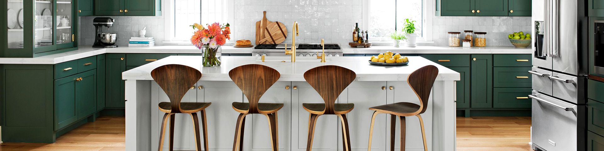
White kitchens remain popular because they feel clean and bright. Pure Brilliant White can work beautifully on cabinets, backsplashes, ceilings, or walls. The key is balance. Pair it with wood cutting boards, stone counters, brushed metal, textured tile, or warm lighting so the kitchen feels welcoming rather than chilly.
Bathrooms
Bathrooms benefit from bright whites because they emphasize cleanliness. Pure Brilliant White can make small bathrooms feel more open, especially when combined with mirrors and good lighting. For durability, consider a finish that handles moisture and cleaning better than a flat wall paint.
Ceilings
A bright white ceiling can make a room feel taller and lighter. It is especially useful when walls are painted in deeper or warmer shades. If the walls are already Pure Brilliant White, painting the ceiling the same color can create a seamless, gallery-like effect.
Modern Living Rooms
In living rooms, Pure Brilliant White works best when it has company. Think textured curtains, layered rugs, framed art, sculptural lighting, books, plants, and furniture with natural materials. The goal is not “empty museum.” The goal is “calm home that knows where the coasters are.”
When Pure Brilliant White May Not Be the Best Choice
Pure Brilliant White is powerful, but it is not a universal solution. In dark rooms with very little natural light, it may not create the bright, airy look people expect. Instead, it can appear flat because there is not enough light for it to reflect. In those spaces, a soft off-white, warm neutral, mushroom, cream, or pale greige may feel more alive.
It can also highlight wall imperfections. Bright white reflects light strongly, so dents, uneven drywall, patch marks, and roller texture can become more visible. If your walls have characterand by character, we mean mysterious bumps from three previous ownersprep work matters.
Choosing the Right Paint Finish
Color gets most of the attention, but finish determines how the paint performs. A Pure Brilliant White in matte will feel softer and less reflective. The same color in semi-gloss will appear brighter, sharper, and easier to wipe clean.
Flat or Matte
Flat and matte finishes hide minor imperfections better because they absorb light. They work well for ceilings, adult bedrooms, and low-traffic walls. The downside is that they are usually less washable than shinier finishes.
Eggshell or Satin
Eggshell and satin finishes are popular for living rooms, hallways, kitchens, and family spaces because they offer a balance of softness and cleanability. Satin is slightly shinier and often more durable.
Semi-Gloss or Gloss
Semi-gloss and gloss finishes are commonly used for trim, doors, cabinets, and areas that need frequent cleaning. In Pure Brilliant White, they create a crisp, polished effect. They also reveal imperfections, so careful prep is essential.
How to Test Pure Brilliant White Before Painting
Do not choose white paint from a tiny chip under store lighting unless you enjoy surprises with receipts. Buy a sample or use large peel-and-stick swatches. Place them on different walls in the same room. Look at them in morning light, afternoon light, evening light, and under your regular lamps.
Compare the sample against flooring, countertops, tile, upholstery, and existing trim. If your sofa is warm beige and your white looks blue beside it, the room may feel mismatched. If your counters are cool marble and your white looks creamy yellow, the cabinets may seem dingy. White paint is basically a relationship test for your finishes.
Pairing Pure Brilliant White With Other Colors
Pure Brilliant White pairs well with many palettes because it is clean and adaptable. For a modern look, combine it with black, charcoal, glass, chrome, and pale oak. For a coastal style, pair it with sandy beige, soft blue, weathered wood, and woven textures. For a warm organic look, use terracotta, olive, walnut, linen, and creamy neutrals.
For bedrooms, soften it with muted colors such as dusty rose, sage, oatmeal, mushroom, or warm gray. For children’s rooms, Pure Brilliant White can become a flexible backdrop for colorful bedding, bookshelves, and art without needing a full repaint every time a new cartoon obsession arrives.
Pure Brilliant White for Small Spaces
Many people paint small rooms white because they expect white to make them feel larger. Sometimes it does. But brightness alone is not enough. A small room also needs contrast, proportion, and good lighting. Pure Brilliant White can help bounce light around, but if the space has no natural light, the result may be bland rather than spacious.
Use mirrors, layered lighting, pale flooring, vertical storage, and simple window treatments to support the white. Add one or two richer accents, such as a dark mirror frame, a wood shelf, or colorful art, so the room has depth. Otherwise, the eye has nowhere to land, and the space can feel unfinished.
Preparation Tips for a Flawless White Finish
Pure Brilliant White is honest. Sometimes brutally honest. It shows dust, uneven patches, stains, and sloppy edges. Before painting, clean the walls, fill holes, sand rough spots, remove peeling paint, and use painter’s tape where needed. If you are covering a darker color, use a quality primer so the final white looks even.
For cabinets and trim, preparation is even more important. Degrease surfaces, sand lightly, prime properly, and use the right brush or roller. A brilliant white cabinet with visible brush marks is not the dream. It is a warning label with hinges.
Health and Indoor Air Considerations
When painting indoors, consider ventilation and product labels. Many modern paints are marketed as low-VOC or zero-VOC, but it is still smart to increase airflow during and after painting. Open windows when possible, use fans safely, follow manufacturer instructions, and avoid storing open paint containers inside living spaces.
Water-based latex paints are commonly used for interior walls because they are easier to clean up and generally lower in odor than many solvent-based products. For bedrooms, nurseries, and frequently used rooms, choosing a durable low-odor interior paint can make the project more comfortable.
Common Mistakes to Avoid
Using One White Everywhere Without Testing
A single white may not work equally well on walls, trim, cabinets, and ceilings. Different surfaces receive light differently. Test first, especially in open-concept spaces.
Ignoring Existing Finishes
Flooring, countertops, tile, stone, and upholstery all influence how white appears. Your paint color should cooperate with what is staying in the room.
Choosing the Wrong Sheen
A glossy Pure Brilliant White wall can feel harsh in a sunny room. A flat Pure Brilliant White door may be difficult to clean. Match the sheen to the surface and daily use.
Skipping Wall Prep
Bright white exposes flaws. Clean, patch, sand, and prime. Future you will be grateful, and future guests will not stare at that one weird roller mark during dinner.
Real-Life Experiences With Pure Brilliant White
The first time many homeowners use Pure Brilliant White, the reaction is usually one of two things: “Wow, this looks amazing,” or “Why does my room suddenly feel like a dentist’s office?” The difference often comes down to context. In one small apartment kitchen, for example, Pure Brilliant White on upper cabinets made the space feel cleaner and taller. The old cabinets had been a tired cream color that looked yellow beside the stainless-steel appliances. After sanding, priming, and painting the uppers bright white, the kitchen looked sharper. But the room only became inviting after the owner added wood shelves, a woven runner, and warm under-cabinet lighting.
In another case, a homeowner painted a north-facing bedroom Pure Brilliant White, hoping for a fresh hotel look. Instead, the room felt cold in the morning and a little gray by late afternoon. The fix was not repainting immediately. First came warmer bedding, a natural wood nightstand, linen curtains, and soft white bulbs. Those changes helped, but the walls still felt too stark for a sleep space. Eventually, the room was repainted in a warmer off-white, while Pure Brilliant White stayed on the trim. That combination worked beautifully: soft walls, crisp edges, and no accidental hospital energy.
A living room with good southern light told a different story. Pure Brilliant White walls created the perfect backdrop for large colorful paintings, a tan leather sofa, black metal lamps, and a vintage rug. The brightness made the art pop and kept the room feeling open. Because the space had texture and contrast, the white did not feel empty. It felt intentional, like the room had showered, made coffee, and organized its calendar.
Bathrooms are another place where Pure Brilliant White can perform well. One powder room with no window used bright white walls, a round brass mirror, patterned floor tile, and a small black vanity. The white kept the compact room from feeling cramped, while the bold tile and dark vanity added personality. Without those accents, the bathroom would have looked unfinished. With them, it felt crisp and stylish.
Trim projects are often the easiest win. A home with beige walls and old off-white baseboards can look instantly cleaner when the trim is repainted in Pure Brilliant White. The walls may not even need changing. Fresh trim sharpens the lines of the room, makes doors look newer, and gives the entire space a subtle lift. It is like tailoring for your house: same outfit, better fit.
The biggest lesson from real-life use is that Pure Brilliant White is not a complete design plan. It is a strong foundation. It needs lighting, texture, contrast, and thoughtful finishes to become beautiful. When treated as part of a full room strategy, it can feel fresh, timeless, and surprisingly flexible. When treated as a shortcut, it may look flat. White paint is simple, yes, but simple does not mean effortless. Even the cleanest canvas needs a good frame.
Conclusion
Pure Brilliant White is one of the most versatile and misunderstood choices in home design. It can brighten a kitchen, sharpen trim, refresh cabinets, expand the feeling of a bathroom, and give a modern living room a crisp gallery-like backdrop. But it is not a magic wand in a paint can. It reacts to light, undertones, sheen, furniture, flooring, and the quality of surface preparation.
For the best results, test it in your actual space, compare it with existing materials, choose the right finish, and add warmth through texture and decor. Use it where crispness matters, soften it where comfort matters, and never underestimate the power of a good primer. Pure Brilliant White can absolutely be brilliant. It just prefers to be part of a thoughtful design conversation, not a last-minute panic purchase at 7:42 p.m. on a Tuesday.