If black paint had a charming, well-dressed cousin who knew how to behave at dinner parties, it would probably be Wrought Iron 2124-10 paint by Benjamin Moore. This deep, moody shade is not a flat black, not quite navy, and not merely charcoal gray. It lives in that sophisticated in-between space where drama meets restraintand that is exactly why designers, homeowners, and paint lovers keep inviting it into kitchens, entryways, bedrooms, exteriors, and cabinet makeovers.
Benjamin Moore describes Wrought Iron 2124-10 as a soft, malleable shade of black, and that description is surprisingly accurate. With a Light Reflectance Value, or LRV, of about 8.17, it is undeniably dark. Yet it still has enough softness to avoid the harsh, ink-black look that can make a room feel like a theater lobby after closing time. Its subtle blue-gray undertones give it depth, making it a favorite for people who want bold contrast without shouting across the room.
This guide explores what Wrought Iron 2124-10 paint really looks like, where it works best, what colors pair beautifully with it, and how to use it without accidentally turning your home into a stylish cave. Spoiler: sampling is your best friend, and lighting is the roommate you must negotiate with.
What Is Wrought Iron 2124-10 Paint?
Wrought Iron 2124-10 is a Benjamin Moore color from the Color Preview collection. It is commonly described as a soft black, dark charcoal, or blue-black paint color. The magic is that all three descriptions can be true depending on the room, the light, and the materials around it.
In a bright space, Wrought Iron may reveal a smoky blue undertone. In a shaded room, it often reads closer to deep charcoal or soft black. On cabinets, it can look polished and architectural. On a front door, it feels classic but not predictable. On an accent wall, it says, “Yes, I own a tape measure and possibly a design board.”
Key Color Details
Here are the main facts homeowners usually want to know before buying a sample:
- Brand: Benjamin Moore
- Color name: Wrought Iron
- Color number: 2124-10
- LRV: Approximately 8.17
- Color family: Dark neutral, soft black, charcoal
- Undertones: Blue-gray, sometimes blue-black
- Best uses: Cabinets, doors, trim, shutters, accent walls, built-ins, furniture, and dramatic interiors
Understanding the LRV of Wrought Iron 2124-10
LRV stands for Light Reflectance Value. It measures how much light a paint color reflects on a scale from 0 to 100. Zero is absolute black, while 100 is pure white. Since Wrought Iron has an LRV of about 8.17, it absorbs most light and reflects very little.
In practical terms, this means Wrought Iron is a dark paint color. You should not expect it to brighten a dim room. Instead, it creates depth, contrast, and mood. If your space lacks natural light, Wrought Iron can still look stunning, but it will appear closer to black. If your room gets plenty of sunshine, the color may open up slightly and show more of its charcoal-blue personality.
This is why designers always recommend testing dark colors in real lighting. A tiny paint chip in a store is about as reliable as asking a toddler to guard a cupcake. Use a large sample, move it around the room, and check it in the morning, afternoon, and evening before committing.
What Undertones Does Wrought Iron Have?
The undertones of Benjamin Moore Wrought Iron 2124-10 are what make it special. It has cool blue-gray undertones, though they are usually subtle. Indoors, the blue often hides behind the charcoal base. Outdoors or in strong natural light, the blue can become more noticeable.
Compared with a true black paint, Wrought Iron feels softer and more dimensional. Compared with a navy paint, it is darker and less colorful. Compared with a warm charcoal, it feels cleaner, cooler, and more modern.
Does Wrought Iron Look Blue?
Sometimes, yesbut usually not in an obvious way. Wrought Iron is not a bright navy or a strong blue-black. It is more like charcoal wearing a navy blazer. In north-facing rooms, the cool undertone may become more visible. In warm southern light, it may feel a little softer and more balanced. Against warm wood floors, brass hardware, or creamy white walls, the coolness can look beautifully intentional.
Where to Use Wrought Iron 2124-10 Paint
One reason Wrought Iron paint is so popular is its versatility. It works in traditional, modern, farmhouse, transitional, coastal, and industrial-style homes. Basically, it is the black jeans of paint colors: dress it up, dress it down, and somehow it still looks good.
Kitchen Cabinets
Wrought Iron is a stunning choice for kitchen cabinets, especially when paired with white walls, marble-look quartz, butcher block, warm wood flooring, or unlacquered brass hardware. It adds contrast without feeling as severe as pure black. In a kitchen with good light, the color feels rich and tailored. In a smaller kitchen, it can still work well on lower cabinets or a kitchen island.
For cabinets, consider a durable paint product designed for trim and cabinetry. A satin or semi-gloss finish is usually more practical than matte because cabinets deal with fingerprints, splashes, and the mysterious sticky spots no one in the house will admit creating.
Interior Doors
Painting interior doors in Wrought Iron is one of the easiest ways to make a home feel custom. White walls and dark doors create instant contrast. The look is especially beautiful in hallways, mudrooms, offices, and bedrooms. It can also hide scuffs better than white doors, which is a small miracle if you have pets, kids, or adults who kick doors open while holding laundry.
Accent Walls
A Wrought Iron accent wall can add drama to a bedroom, dining room, office, or living room. Because the color is so deep, it works best when the wall has a purpose. Think behind a bed, behind built-ins, around a fireplace, or in a cozy reading nook. Random dark walls can feel disconnected, but intentional dark walls feel expensive.
Built-Ins and Bookcases
Wrought Iron is beautiful on built-in shelving, library walls, media cabinets, and fireplace surrounds. It gives ordinary storage a designer look and makes books, ceramics, woven baskets, framed art, and metallic accents stand out. If your built-ins are currently builder-grade white and you want them to look custom, this color can do some heavy lifting.
Front Doors and Shutters
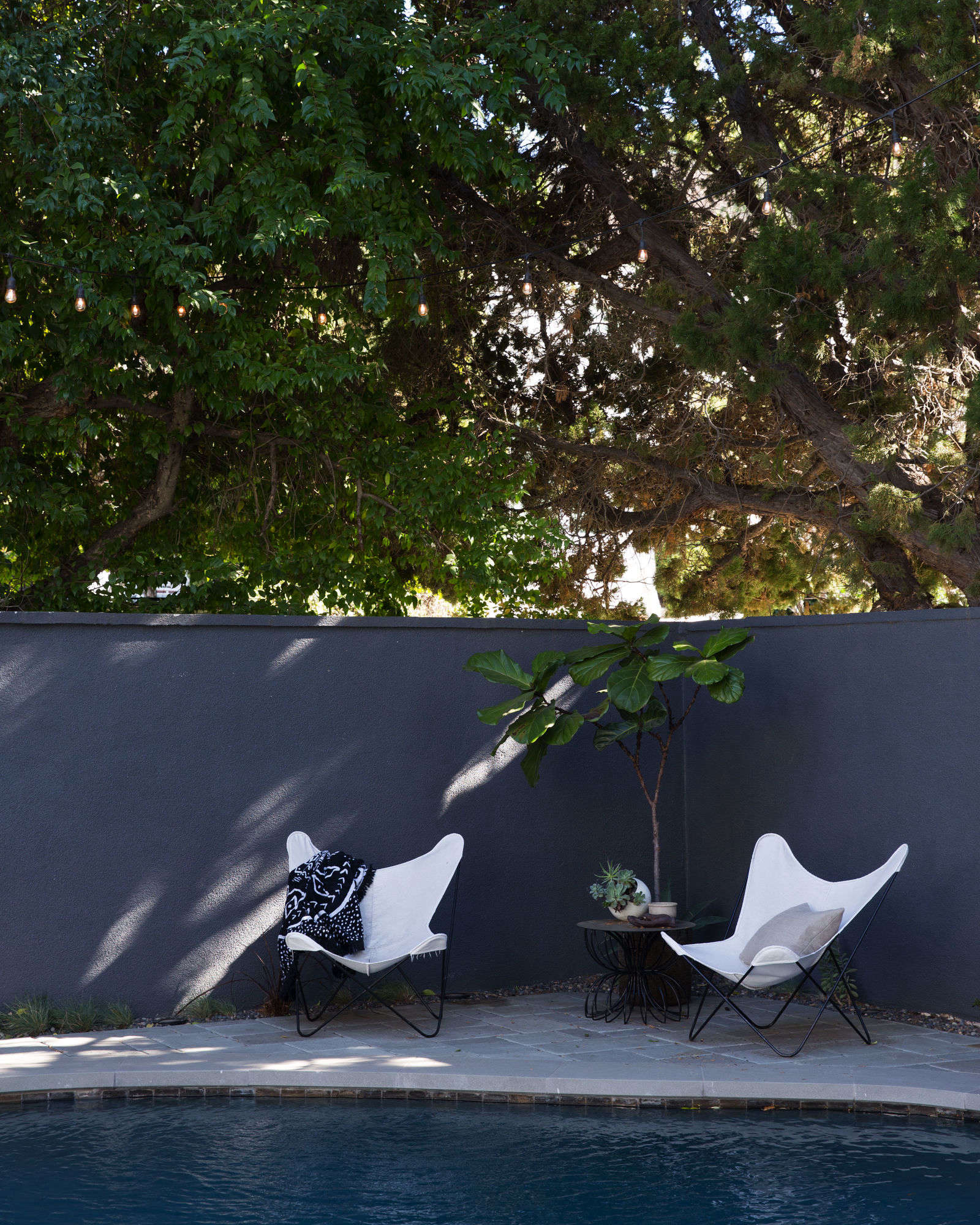
Wrought Iron is also a popular choice for front doors and shutters. On exteriors, it may look slightly lighter and more charcoal than it does indoors, especially in direct sunlight. Its blue undertone can pair well with white siding, red brick, gray stone, taupe exteriors, and warm wood accents.
For exterior use, always choose the right exterior paint product and test the color outside. Sun exposure, shade, roof color, landscaping, and neighboring materials can all change how dark paint reads. A color that looks refined on a sample board may look unexpectedly blue beside certain brick or stone.
Best Colors to Pair With Wrought Iron 2124-10
Because Wrought Iron is dark and cool-leaning, it pairs beautifully with whites, warm neutrals, muted blues, earthy greens, natural wood, and metal finishes. The goal is to create balance. Too many cool elements can make a room feel chilly, while warm accents can bring out the richness of the paint.
White Paint Colors
Wrought Iron looks crisp with clean whites and softer with creamy whites. Try pairing it with shades like White Dove, Chantilly Lace, Simply White, or White Ice, depending on the mood you want. A clean white creates strong contrast, while a warmer white creates a more relaxed and welcoming look.
Soft Grays and Blue-Grays
Since Wrought Iron has blue-gray undertones, it can coordinate beautifully with pale gray, misty blue-gray, and silvery neutrals. These pairings work especially well in bedrooms, bathrooms, and offices where you want a calm but elevated feeling.
Warm Woods and Brass
Warm wood tones are one of the best partners for Wrought Iron. Oak, walnut, maple, and reclaimed wood add warmth and texture. Brass, bronze, and aged gold hardware also look fantastic against this deep shade. The combination feels classic, rich, and just a little bit fancyin the best way.
Wrought Iron vs. Other Popular Dark Paint Colors
Choosing a dark paint color can feel like comparing identical black T-shirts under bad dressing-room lighting. But the differences matter. Wrought Iron has its own personality, especially when compared with other popular moody shades.
Wrought Iron vs. Iron Ore
Sherwin-Williams Iron Ore is another beloved soft black. Iron Ore often feels slightly warmer and earthier, while Wrought Iron leans cooler with a blue-gray undertone. If your home has warm stone, creamy siding, or brown roofing, Iron Ore may blend more easily. If you want a cooler, cleaner charcoal, Wrought Iron may be the better fit.
Wrought Iron vs. Cheating Heart
Benjamin Moore Cheating Heart is also dark and moody, but it tends to show more blue than Wrought Iron. If you want a dramatic navy-charcoal, Cheating Heart may be appealing. If you want something closer to soft black with just a whisper of blue, Wrought Iron is usually safer.
Wrought Iron vs. Kendall Charcoal
Kendall Charcoal is warmer and more brown-gray than Wrought Iron. It feels traditional, grounded, and cozy. Wrought Iron feels cooler, darker, and more graphic. Both are beautiful, but they create different moods.
Wrought Iron vs. Black
A true black paint can be bold, crisp, and dramatic, but it can also look harsh in some homes. Wrought Iron gives you the drama of black with a softer edge. It is ideal when you want contrast without the color feeling like a permanent marker exploded on your wall.
Best Paint Finishes for Wrought Iron
The finish you choose can change how Wrought Iron looks and performs. Dark colors show sheen more noticeably than light colors, so choose carefully.
Matte or Eggshell for Walls
For interior walls, matte or eggshell finishes usually work best. Matte gives a soft, velvety look and helps hide surface imperfections. Eggshell offers a little more durability and is easier to wipe clean. In high-traffic areas, eggshell may be the more practical choice.
Satin for Cabinets and Doors
Satin is a popular option for cabinets, interior doors, trim, and built-ins. It has enough sheen to be washable but does not look overly glossy. On Wrought Iron, satin can create a refined furniture-like finish.
Semi-Gloss for Trim and High-Use Areas
Semi-gloss can work well for trim, doors, and areas that need extra durability. Keep in mind that the higher the sheen, the more surface flaws may show. If your trim has dents, brush marks, or uneven patches, prep work becomes especially important.
How to Sample Wrought Iron the Right Way
Never choose Wrought Iron from a phone screen alone. Screens lie. Store lighting lies. Tiny paint chips are charming little liars too. The best method is to test a large sample in the actual space.
Place the sample near flooring, countertops, tile, brick, stone, and trim. Look at it in daylight and at night with your lamps on. If you are painting cabinets, test the color vertically because horizontal samples can reflect light differently. If you are using it outside, check it on every side of the house you plan to paint.
Common Mistakes to Avoid
Wrought Iron is forgiving for a dark paint color, but it still deserves respect. Here are common mistakes that can make it less successful:
- Skipping primer: Dark colors need good prep for even coverage.
- Using the wrong sheen: Too much gloss can highlight imperfections.
- Ignoring lighting: The color changes significantly from bright sun to dim shade.
- Pairing it with clashing undertones: Some warm stones or tiles may fight the cool blue-gray base.
- Painting too much too fast: Start with one area if you are unsure.
Is Wrought Iron 2124-10 Good for Small Rooms?
Yes, Wrought Iron can work in small rooms, but it depends on the effect you want. Many people assume dark paint always makes small spaces feel smaller. Sometimes it does. But sometimes it makes them feel cozy, intentional, and jewel-box-like.
A powder room painted in Wrought Iron can feel dramatic and upscale. A small office with Wrought Iron built-ins can feel focused and stylish. A tiny bedroom with one dark accent wall can feel grounded. The trick is to balance the color with lighting, mirrors, lighter textiles, and thoughtful contrast.
Experience-Based Tips for Using Wrought Iron 2124-10 Paint
After seeing how dark paint colors behave in real homes, one thing becomes clear: Wrought Iron is best treated like a design feature, not just a wall color. It has presence. It wants to be noticed. That does not mean it is difficult, but it does mean you should give it a plan.
One of the best ways to use Wrought Iron is on a kitchen island. Imagine a white kitchen with warm wood floors, creamy quartz counters, and a deep Wrought Iron island in the center. The island instantly becomes the anchor of the room. It adds weight, contrast, and a sense of custom design without requiring the entire kitchen to go dark. This is especially helpful for homeowners who want something bold but are not emotionally prepared to paint every cabinet a near-black shade. Totally fair. Paint commitment is real.
Another practical experience: Wrought Iron looks different after the second coat. The first coat can appear streaky, thin, or oddly blue. Do not panic. Dark colors often need proper coverage before they reveal their true personality. A quality primer and two finish coats usually create a richer, more even result. If you are painting over white, red, glossy wood, or previously stained surfaces, prep matters even more. Sand, clean, prime, and give the paint enough dry time. Your future self will thank you, possibly with snacks.
On interior doors, Wrought Iron can make a hallway look dramatically more finished. White doors are safe, but dark doors feel designed. The key is consistency. If you paint one random door dark, it may look like it lost a bet. If you paint all the doors on a floor, the choice feels intentional and polished. Pair dark doors with white trim for a crisp look, or use Wrought Iron on both doors and trim for a moodier, more seamless effect.
For exteriors, Wrought Iron is excellent on shutters, front doors, and trim, but it should always be tested outdoors. Direct sun can pull out more blue. Shade can make it look almost black. Red brick can either warm it beautifully or make the cool undertone more obvious. If your brick has purple, gray, or blue undertones, Wrought Iron may look especially harmonious. If your brick is very orange, compare it with warmer dark colors before deciding.
Lighting is another major lesson. In rooms with cool LED bulbs, Wrought Iron may feel sharper and bluer. With warm bulbs, it often appears softer and more charcoal. If the color looks too cool at night, try adjusting the bulb temperature before blaming the paint. Sometimes the villain is not the paint canit is the light bulb wearing a tiny disguise.
Hardware also changes the mood. Black hardware on Wrought Iron creates a subtle, modern look. Brass hardware adds warmth and contrast. Chrome or polished nickel feels cleaner and more contemporary. Leather pulls, wood knobs, or aged bronze can make the color feel earthy and relaxed. The same paint can shift from modern farmhouse to urban loft depending on the finishes around it.
Finally, Wrought Iron rewards restraint. You do not have to use it everywhere. In fact, it often looks best when used strategically: one island, one fireplace wall, one set of built-ins, one front door, or one room where drama makes sense. Let it be the bold note in the design, not the entire orchestra tuning at once.
Final Thoughts on Wrought Iron 2124-10 Paint
Wrought Iron 2124-10 paint is one of Benjamin Moore’s most versatile dark neutrals because it delivers drama without feeling flat, harsh, or overly trendy. Its low LRV makes it rich and moody, while its blue-gray undertone gives it sophistication and depth. It can look like soft black, deep charcoal, or blue-black depending on light and surroundings.
Use it for cabinets, doors, shutters, accent walls, built-ins, furniture, and exterior details when you want a confident color that still plays well with classic materials. Pair it with warm woods, crisp whites, muted grays, brass hardware, stone, brick, and thoughtful lighting. Most importantly, sample it before painting. Wrought Iron is gorgeous, but like all great dark colors, it likes to be courted properly.
Note: This article is written in original American English and synthesized from real paint color information, professional design guidance, and reputable U.S. home-improvement knowledge. No source-code references or contentReference tags are included.