Some paint colors politely sit in the background. Witching Hour 2120-30 does not. This Benjamin Moore shade walks into a room wearing a tailored black coat, raises one eyebrow, and somehow makes the furniture stand up straighter. Officially described as a cool charcoal black, Witching Hour is dramatic, elegant, and surprisingly flexible when used with intention.
For homeowners, designers, and brave DIY painters who are tired of “safe beige” but not quite ready to paint the entire house midnight black, Witching Hour 2120-30 offers a refined middle path. It is dark, yes. Moody, absolutely. But it is not flat, lifeless, or harsh. Its cool charcoal personality gives it depth, making it useful for accent walls, cabinetry, doors, built-ins, powder rooms, dining rooms, offices, and even exterior details when the correct exterior-rated paint product is selected.
This guide breaks down what Witching Hour paint looks like, where it works best, which colors pair beautifully with it, how lighting changes its appearance, and what real-life painting experience teaches you after the roller is already in your hand and your cat is judging your technique.
What Color Is Witching Hour 2120-30?
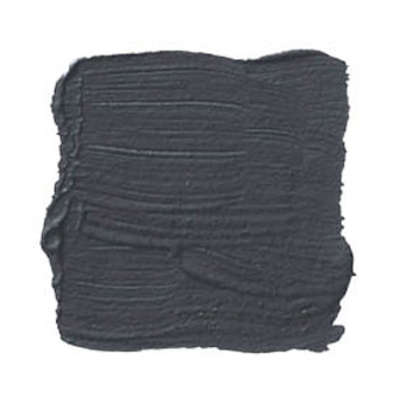
Witching Hour 2120-30 is a Benjamin Moore paint color from the Color Preview collection. It is best understood as a cool charcoal black with subtle blue-gray depth. While some dark colors lean brown, green, or purple, Witching Hour sits closer to a smoky, sophisticated blackened charcoal. It has enough softness to avoid looking like a basic black marker on the wall, but enough strength to create serious visual impact.
The color has an official Light Reflectance Value, or LRV, of 8.71. LRV measures how much visible light a color reflects, from 0 for absolute black to 100 for pure white. At 8.71, Witching Hour is very dark. That means it absorbs a lot of light and creates a cozy, cocoon-like effect. In a bright room, it can look like a deep charcoal. In a dim room, it may read nearly black.
That low LRV is also why testing matters. A tiny color chip can whisper. A full wall in Witching Hour sings opera. The same shade can feel sleek and modern in a sunny dining room, mysterious in a hallway, and dramatic in a powder room with warm brass lighting.
Why Witching Hour Paint Is So Popular
Dark paint colors have become a favorite in modern interiors because they add instant character. White walls are useful, but sometimes a room needs more than “clean and bright.” It needs mood, contrast, and a little confidence. Witching Hour 2120-30 delivers all three.
One reason it works so well is its balance. It is bold without being cartoonishly black. It is cool without feeling icy. It can make traditional trim look sharper, modern furniture look more expensive, and artwork pop like it just got better lighting and a publicist.
Witching Hour also photographs beautifully when paired with layered lighting, natural textures, and contrasting trim. It makes wood tones warmer, white trim crisper, and metallic finishes more noticeable. This is why it often appears in design conversations around moody rooms, black cabinets, dramatic accent walls, and high-contrast interiors.
Best Rooms for Witching Hour 2120-30
Dining Rooms
A dining room painted in Witching Hour feels intimate and polished. It is especially effective with warm wood tables, linen upholstery, brass fixtures, and creamy white trim. Because dining rooms are often used in the evening, this color can create a restaurant-like mood at home. Add dimmable lighting and suddenly Tuesday leftovers feel like a reservation.
Powder Rooms
Small powder rooms are excellent places to use bold paint. Since guests only spend a short time there, the space can handle more personality. Witching Hour on the walls with a marble vanity, gold mirror, and warm sconces can turn a basic half bath into a jewel box.
Home Offices
For a home office, Witching Hour creates focus. Its darker tone can reduce visual noise and make shelves, artwork, and desk accessories feel more intentional. Pair it with a natural wood desk and a lighter rug to prevent the room from feeling too heavy.
Bedrooms
In bedrooms, Witching Hour can be deeply calming when used thoughtfully. It works well behind a bed as an accent wall or on all four walls if the room has good lighting and soft textiles. Add white bedding, textured throws, and warm lamps to keep the space cozy instead of cave-like.
Kitchens and Cabinets
Witching Hour cabinets can look incredibly high-end. The color feels more nuanced than standard black and pairs beautifully with white quartz, soapstone, butcher block, unlacquered brass, matte black hardware, or polished nickel. For cabinets, use a durable cabinet-grade paint product and the right sheen, usually satin, pearl, semi-gloss, or a specialty enamel depending on the surface and product line.
Witching Hour Undertones: What to Expect
The most important thing to know about Witching Hour undertones is that they are cool. The shade can show a blue-gray cast, especially in north-facing rooms or spaces with cool LED bulbs. In warmer light, it may appear softer and more charcoal than blue.
If your room has warm oak floors, beige stone, cream furniture, or brass hardware, Witching Hour can create a beautiful contrast. If your room already has a lot of cool gray tile or blue light, the paint may lean more steely. That is not bad, but it is something to plan around.
Before committing, paint a sample board or use a peel-and-stick sample. Move it around the room in morning light, afternoon light, and evening artificial light. Do not judge it only at noon while standing under one ceiling bulb. Paint colors are moody little actors; they perform differently depending on the stage.
Colors That Pair Well With Witching Hour
Warm Whites
Warm whites soften the drama of Witching Hour and make the contrast feel inviting. Creamy trim, warm white ceilings, and off-white upholstery can keep the room from feeling too stark. This pairing is ideal for traditional, transitional, and cozy modern spaces.
Crisp Whites
For a sharper look, pair Witching Hour with a clean white. This creates a classic black-and-white effect that works well for doors, trim, built-ins, and modern interiors. Just remember that very bright whites can make dark walls look even darker by comparison.
Soft Grays
Soft gray coordinates can create a layered, monochromatic scheme. Use lighter grays for upholstery, rugs, or nearby walls to create depth without introducing too much color. This is a strong option for contemporary living rooms and offices.
Wood Tones
Natural wood is one of the best partners for Witching Hour 2120-30. White oak, walnut, maple, and reclaimed wood all help warm up the dark paint. The contrast between smoky charcoal walls and organic wood grain feels grounded and expensive.
Metallic Accents
Brass, bronze, copper, and gold finishes glow against Witching Hour. Nickel and chrome look cooler and more modern. Matte black hardware can work too, but it creates a quieter, more tonal look rather than strong contrast.
Jewel Tones
Emerald green, deep burgundy, navy, ochre, and rust can all look rich beside Witching Hour. The key is balance. Use jewel tones in pillows, artwork, rugs, or one statement chair instead of turning the room into a color thunderstorm.
Best Sheens for Witching Hour Paint
Sheen matters with dark paint. A flat or matte finish hides wall imperfections better and gives Witching Hour a velvety appearance. Eggshell adds a slight glow and is often practical for living rooms, bedrooms, and dining spaces. Satin or pearl can work well in higher-traffic areas, while semi-gloss is often used for trim, doors, and cabinetry.
Dark colors tend to reveal wall texture, roller marks, dust, and uneven touch-ups more than lighter colors. Higher sheens can make those imperfections more visible because they reflect more light. If your walls are not perfectly smooth, matte or eggshell may be more forgiving.
For cabinets, doors, and trim, durability becomes more important. A cabinet-grade or trim enamel product is usually a better choice than standard wall paint. The goal is a finish that can handle fingerprints, cleaning, and daily use without looking tired after one month of real life.
How Lighting Changes Witching Hour 2120-30
Lighting is the secret boss level of dark paint colors. Witching Hour can shift depending on exposure, bulb temperature, and the amount of natural light in the room.
In north-facing rooms, it may look cooler, smokier, and more blue-gray. In south-facing rooms, it can appear slightly warmer and more balanced because the light is stronger and brighter. East-facing rooms may show a cleaner charcoal tone in the morning, while west-facing rooms can make the color feel richer in late afternoon.
Artificial lighting also matters. Warm bulbs around 2700K can make Witching Hour feel cozier. Cooler bulbs around 4000K may emphasize its blue-gray side. If a room feels too cold after painting, try changing the bulbs before blaming the paint. Sometimes the wall is innocent and the light bulb is the drama.
Witching Hour on Exteriors
Witching Hour can look striking on exterior doors, shutters, trim, and architectural accents when used with an appropriate exterior paint product. On a full exterior, it can create a bold modern look, especially with white trim, natural stone, cedar, or black-framed windows.
However, dark exterior colors absorb more heat and may show dust, fading, and surface flaws more readily than lighter colors. Always confirm that the selected Benjamin Moore product is rated for your exterior surface and climate. A paint color may be beautiful, but the product line and surface preparation determine whether the finish lasts.
How to Use Witching Hour Without Making a Room Feel Too Dark
The trick with Witching Hour is not fear; it is balance. Use contrast, texture, and lighting to support the color.
First, bring in lighter elements. White trim, pale rugs, cream curtains, light bedding, or a marble countertop can keep the room visually open. Second, use reflective accents. Mirrors, glass lamps, metallic fixtures, and framed artwork can bounce light around. Third, layer lighting. A single ceiling fixture is rarely enough for a dark room. Use table lamps, sconces, floor lamps, and under-cabinet lighting where appropriate.
Finally, avoid clutter. Dark paint makes objects stand out more. That can be wonderful for art and decor, but less wonderful for a pile of mail, seven water bottles, and a mystery charging cable from 2014.
Painting Tips for Witching Hour 2120-30
Use a Quality Primer When Needed
If you are painting over a very light or very glossy surface, primer can help with adhesion and coverage. Dark colors often benefit from a tinted primer, especially when the color change is dramatic. Ask your paint retailer what primer works best with the specific Benjamin Moore product you choose.
Apply Two Coats
Most dark colors look better with two coats. The first coat may look uneven, especially while drying. Do not panic. The second coat usually brings the depth, richness, and consistency you expected.
Watch Your Roller Technique
Dark paint can show lap marks if applied unevenly. Keep a wet edge, use consistent pressure, and avoid stretching the paint too thin. Quality rollers and brushes are worth the money here. This is not the moment to use the sad roller cover hiding in the garage since 2018.
Let It Cure
Paint may feel dry quickly, but full curing takes longer. Avoid aggressive cleaning or heavy use until the finish has had proper time to harden according to the product directions.
Common Mistakes to Avoid
One common mistake is choosing Witching Hour from a screen image alone. Digital colors are helpful for inspiration, but screens do not show paint accurately. Always test in your actual space.
Another mistake is using the wrong sheen. A glossy dark wall can look glamorous in the right room, but it can also highlight every bump and drywall seam. For walls, matte or eggshell is often safer. For cabinets and trim, choose durability.
A third mistake is forgetting the ceiling. If the ceiling is bright white, the contrast may feel sharp and modern. If you want a softer look, use a warmer white or consider painting the ceiling a related lighter shade. In small powder rooms, painting the ceiling Witching Hour too can create a dramatic wrapped effect.
Real-Life Experience With Witching Hour 2120-30 Paint
Using Witching Hour 2120-30 in a real home is a little different from admiring it on a paint card. On the card, it looks calm, dark, and stylish. On the wall, it becomes a full design decision. That is the beauty of it. This is not a color you accidentally ignore. It changes the room’s posture.
In one practical example, imagine a small home office with basic white walls, a medium wood desk, black metal shelving, and one window facing north. Before painting, the room feels functional but forgettable. After painting the wall behind the desk in Witching Hour, the desk suddenly looks more intentional, the shelving blends into the background, and framed prints stand out with more contrast. The room feels less like a spare bedroom with Wi-Fi and more like a place where actual decisions happen.
The first lesson from working with this color is that preparation matters. Dark paint is not cruel, but it is honest. If the wall has patches, roller texture, or little dents, Witching Hour may point at them like a tiny interior design detective. Sanding rough spots, wiping down dust, filling holes, and using the right primer can make a major difference.
The second lesson is that lighting can make or break the final result. In daylight, Witching Hour may look like a deep charcoal with a blue-gray soul. At night under warm lamps, it can become softer and more intimate. Under cool, bright bulbs, it may look sharper and slightly more industrial. If the room feels too cold, changing the bulbs to a warmer temperature can help immediately.
The third lesson is that furniture and decor need contrast. A dark sofa against Witching Hour walls can disappear unless you add lighter pillows, a textured throw, or artwork above it. A black cabinet painted in Witching Hour can look stunning, but hardware choice becomes important. Brass feels warm and classic. Nickel feels crisp. Matte black feels modern but very subtle.
For cabinets, the experience is more demanding than walls. Doors and drawers need cleaning, sanding, priming, and patience. A dark color like Witching Hour can make cabinets look custom, but only if the finish is smooth. Rushing cabinet paint is like baking bread and removing it halfway through because it “smells ready.” Tempting, but not wise.
Another useful experience is testing the color beside fixed finishes. Place a sample next to flooring, countertops, tile, fireplace stone, and large furniture. Witching Hour usually plays nicely with warm wood, white marble, soapstone, and neutral upholstery. It may look cooler beside gray tile or blue-toned flooring, which can be beautiful if that is the mood you want.
One of the best uses is on interior doors. Painting doors Witching Hour while keeping walls lighter can add sophistication without darkening the entire room. It is also easier to live with if you are new to dark paint. The same applies to built-ins, bookcases, fireplace walls, and mudroom cabinetry.
In daily life, Witching Hour feels surprisingly livable when balanced with light and texture. It does not have to be gloomy. With cream textiles, wood furniture, layered lamps, plants, and artwork, the color becomes a backdrop rather than a black hole. It gives the room confidence. It says, “Yes, I have opinions about design,” but it does not shout them through a megaphone.
The biggest takeaway from using Witching Hour 2120-30 is simple: sample first, prep well, choose the right sheen, and support the color with good lighting. Do that, and this cool charcoal black can make a room feel tailored, cozy, modern, and memorable. Skip those steps, and the room may feel darker than expected or show more imperfections than planned. Witching Hour rewards thoughtful design, and when it works, it works beautifully.
Conclusion
Witching Hour 2120-30 paint is a bold, elegant Benjamin Moore color for anyone who wants depth without using a flat, basic black. Its cool charcoal character, low LRV, and subtle blue-gray undertone make it ideal for dramatic interiors, refined cabinetry, statement doors, cozy offices, stylish dining rooms, and memorable powder rooms.
The secret to success is planning. Test the color in your room, study it under different lighting, choose the right sheen, and balance it with lighter surfaces, natural textures, and layered illumination. Used well, Witching Hour is not just a paint color. It is a design move with excellent posture.