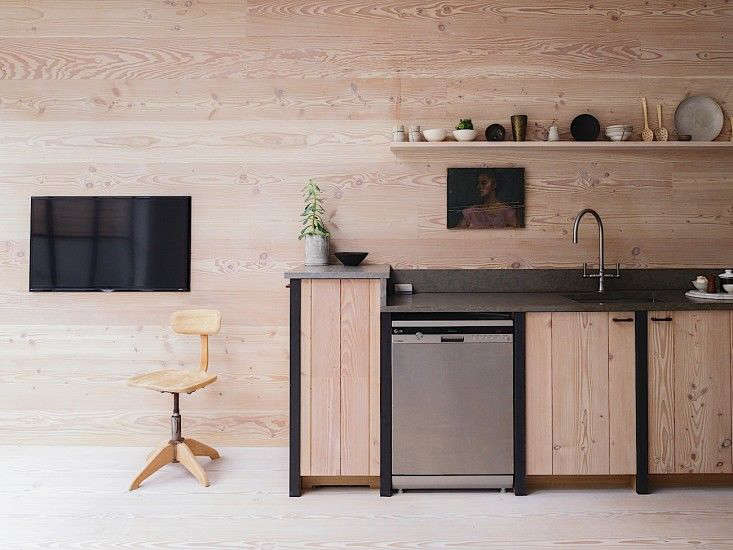
There are website redesigns that arrive like a marching band, all brass, confetti, and questionable font choices. Then there are redesigns that behave more like a well-planned kitchen renovation: quieter, smarter, and immediately useful once you realize the spatula drawer is finally where it should have been all along. The Remodelista and Gardenista redesign belongs firmly in the second category.
For readers who live somewhere between “I’m casually pinning backsplash ideas” and “I have measured my pantry shelves with military seriousness,” Remodelista and Gardenista have long functioned as trusted design companions. Remodelista focuses on the considered home: interiors, remodeling guides, product sourcing, storage, materials, and design inspiration that does not scream for attention. Gardenista extends that same editorial eye outdoors, treating patios, balconies, front stoops, raised beds, and full-scale gardens as real living spaces rather than decorative afterthoughts.
The redesign matters because these sites are not just pretty mood boards. They are working libraries. Readers arrive with practical questions: What countertop material can survive actual life? How do I plan a bathroom remodel without developing a permanent twitch? Which shrubs look effortless but do not secretly require a staff of three? A successful redesign has to do more than look fresh. It must make deep editorial content easier to find, compare, save, and use.
Why the Remodelista & Gardenista Redesign Feels So Right
The central idea behind the Remodelista and Gardenista redesign is simple: beauty should not get in the way of usefulness. That sounds obvious until you have visited a design website where every page loads like a velvet curtain rising over a mystery novel written in pale gray text. Here, the updated experience aims for clarity. The layout gives photography room to breathe, but it also respects the reader’s mission. Inspiration is wonderful; finding the exact guide you need before your contractor asks another terrifying question is better.
Remodelista’s identity has always been built around restraint, sourcing, and editorial confidence. The redesign supports that identity by making the site feel more like a carefully organized design studio than a chaotic digital attic. Gardenista, meanwhile, benefits from a structure that recognizes how people actually garden: sometimes by plant type, sometimes by problem, sometimes by season, and sometimes because they saw one perfect zinc planter and decided their entire personality needed a refresh.
A Cleaner Design for a More Considered Home
In home design, visual clutter is not just an aesthetic problem. It is a decision-making problem. Too many competing elements make it harder to understand what matters. The redesigned Remodelista experience leans into the brand’s familiar values: minimalist but not cold, useful but not dull, elevated but not snobbish. In other words, it is the digital equivalent of a peg rail that looks effortless while quietly holding five coats, a market tote, and your household dignity.
The updated look helps readers scan quickly. Headlines are more legible. Sections feel more intentional. Images remain central because design is visual, but they are supported by clearer pathways into articles, product roundups, house tours, and remodeling guides. This is especially important for a site with a large archive. When a publication has years of kitchens, bathrooms, storage solutions, lighting ideas, and expert advice, the challenge is not producing more content. The challenge is helping readers find the right content at the right moment.
Navigation That Understands Real Projects
One of the smartest parts of the Remodelista redesign is the emphasis on project-based navigation. The addition and prominence of sections such as Remodeling 101 turn the site into a practical starting point for readers who are moving from daydreaming to doing. A kitchen remodel, for example, is not one decision. It is a parade of decisions wearing work boots: cabinets, counters, faucets, lighting, storage, flooring, appliances, and the eternal question of whether open shelving is brave or simply a dust subscription.
By organizing content around common remodeling needs, Remodelista reduces friction. Readers can enter through a broad category, then move into detailed guides. Kitchen and bath content becomes easier to locate. Product posts sit closer to advice. Expert insight feels connected to real-world decisions. That structure serves both casual browsers and serious renovators.
Gardenista Gets Its Own Smarter Pathways
Gardenista’s redesigned experience is equally useful because outdoor design is naturally layered. A reader may want hardscaping advice one day and pollinator-friendly planting ideas the next. Someone with a city balcony needs different guidance from someone planning a meadow-inspired landscape in a large backyard. The redesign supports that range by making Garden Design 101, plant guides, hardscape advice, landscape visits, and product roundups easier to reach.
This matters because gardens can be intimidating. Interior design has paint chips and sofas; gardening has Latin names, soil conditions, sun exposure, drainage issues, and plants that look charming at the nursery but later behave like tiny botanical divas. Gardenista’s value is in demystifying that process. A clear redesign makes the site feel more welcoming to beginners while still useful for experienced gardeners who know the difference between “full sun” and “full sun, unless July has opinions.”
The Power of the “101” Approach
The phrase “101” works because it promises a door, not a dissertation. Remodeling 101 and Garden Design 101 signal that readers can begin somewhere sensible. These sections are not just labels; they are editorial bridges. They turn large, intimidating subjects into smaller steps.
For Remodelista, that might mean understanding kitchen countertops, choosing cabinet hardware, comparing bathroom fixtures, or planning better storage. For Gardenista, it may mean learning about hardscape materials, selecting ground covers, researching shrubs, or understanding how a landscape architect thinks about flow. The redesign makes these educational pathways more prominent, which improves the overall user experience and strengthens the sites’ search value.
Why Search and Discovery Matter for Design Readers
A great design site is part magazine, part reference desk, and part friend who has already researched every faucet so you do not have to. Search and navigation are therefore not minor technical details. They are the foundation of usefulness. When readers look for “small bathroom storage,” “French kitchen ideas,” “low-maintenance perennials,” or “outdoor lighting,” they need fast access to relevant, trustworthy content.
The Remodelista and Gardenista redesign recognizes that inspiration is rarely linear. People do not browse design content like they read a novel. They jump. They compare. They open twelve tabs and pretend this is a system. Good navigation helps turn that behavior into progress rather than chaos. Better category pages, clearer menus, and improved content grouping all make the browsing experience feel more natural.
Directories That Connect Inspiration With Action
Another meaningful part of the redesign is the improved directory experience. Remodelista and Gardenista have long attracted readers who admire professional spaces and then wonder, “Who made that magic happen, and can they also fix my hallway?” A curated architect, designer, and landscape professional directory helps bridge the gap between editorial inspiration and real-life execution.
This is especially valuable because home and garden projects often require expert help. A reader may begin with a house tour, discover a design style, explore materials, and eventually need a professional. By making directories easier to use, the redesign supports the full journey from idea to implementation. That is good UX, but it is also good editorial strategy: the site becomes more useful without losing its point of view.
Editorial Style: Minimalist, But Never Lifeless
The Remodelista voice is one of its strongest assets. It is informed without being fussy, stylish without being breathless, and practical without sounding like an appliance manual. The redesign gives that voice a cleaner room to speak in. Articles feel less buried. Product recommendations are easier to browse. House tours remain aspirational, but the surrounding structure keeps them grounded.
Gardenista has a similar gift. It treats outdoor space with seriousness, but not solemnity. A balcony can matter. A front stoop can be designed. A garden can be sustainable, personal, and beautiful even if it starts with one brave pot of herbs on a windowsill. The redesigned structure reinforces that inclusive approach by making ideas accessible to readers with different spaces, budgets, climates, and levels of confidence.
SEO Value Without Keyword Gymnastics
From an SEO perspective, the Remodelista and Gardenista redesign is a useful case study in how strong content architecture can support organic search. Search engines reward pages that are understandable, organized, and helpful to real users. Clear headings, meaningful categories, descriptive article titles, and logical internal links all help both readers and crawlers understand what a site offers.
The best part is that none of this requires awkward keyword stuffing. A site about remodeling ideas, home design resources, garden design inspiration, and outdoor living can use those phrases naturally because they describe the content honestly. The redesign works because it aligns search visibility with reader intent. People searching for practical guidance can find practical guidance. People looking for inspiration can wander beautifully. People doing both can, of course, open many tabs and call it research.
What Other Publishers Can Learn From This Redesign
The biggest lesson is that redesigning a content-rich website is not about decoration. It is about respect: respect for the archive, for the reader’s time, and for the editorial mission. Remodelista and Gardenista did not need to become louder. They needed to become easier to use. That distinction is everything.
Publishers with deep archives should pay attention to how the redesign highlights evergreen content. A great guide should not disappear after a week. A strong product roundup should remain discoverable. A practical how-to should be connected to related advice. Internal navigation is not just a technical map; it is an editorial recommendation system. It tells readers, “You came for this. You may also need this next.”
Specific Examples of a Better Reader Journey
Imagine a homeowner planning a kitchen update. Before the redesign, that person might have landed on a beautiful kitchen story, admired the lighting, and then needed to hunt for practical information. In the improved experience, the reader can move more easily toward Remodeling 101, kitchen guides, product sourcing, and related expert advice. The path from “I like this” to “I can act on this” becomes shorter.
Now imagine a renter with a small balcony. On Gardenista, that reader may begin with outdoor inspiration, then move into container gardening, plant guides, outdoor furniture, or small-space ideas. The redesign helps avoid the common problem of garden content feeling aimed only at people with sweeping lawns and heroic compost systems. It makes room for the humble balcony, the narrow side yard, and the porch that wants to be more than a place where packages go to experience weather.
The Redesign as a Philosophy
At its best, the Remodelista and Gardenista redesign reflects the same philosophy the sites celebrate in homes and gardens: choose well, organize thoughtfully, and let useful things be beautiful. The web design does not need fireworks because the content already has depth. The job of the redesign is to frame that content, reduce confusion, and make each visit feel productive.
That is why the redesign feels aligned rather than imposed. It does not chase every digital trend. It does not bury the editorial soul beneath shiny effects. Instead, it modernizes the experience while preserving what readers came for in the first place: trusted taste, practical sourcing, expert ideas, and the pleasure of discovering one small detail that changes how a room or garden feels.
Experience Notes: Using the Remodelista & Gardenista Redesign Like a Real Project Planner
The best way to appreciate the Remodelista and Gardenista redesign is to use it the way an actual reader would: slightly overwhelmed, mildly hopeful, and holding a cup of coffee that has gone cold during an unexpected search for unlacquered brass hardware. From that perspective, the redesign feels less like a cosmetic update and more like a practical tool.
Start with a common scenario: you want to refresh your kitchen, but you are not ready for a full remodel. On Remodelista, the improved structure makes it easier to move between inspiration and action. You might begin with a kitchen tour, notice a detail such as open shelving or a compact pendant light, and then follow the thread into product guides or Remodeling 101 advice. This creates a satisfying rhythm. You are not trapped in passive browsing. You are collecting ideas that can become real decisions.
The same experience works outdoors. Suppose your backyard is technically a “garden” in the same way a folding chair is technically “outdoor furniture.” Gardenista’s clearer categories help you begin without shame. You can explore hardscape ideas, plant primers, and garden visits, then narrow your focus to what fits your space. A beginner can learn the basics without feeling scolded by people who casually say things like “amend the soil” before breakfast.
What stands out most is the feeling of editorial continuity between the two sites. Remodelista and Gardenista share a belief that good design is not just about buying something new. It is about looking carefully, choosing thoughtfully, and understanding how materials, objects, plants, and spaces work together. The redesign supports that belief by making the digital experience feel calmer and more connected.
There is also a useful emotional benefit. Renovation and gardening can both make people feel behind before they even begin. A cluttered website amplifies that stress. A clear one lowers it. When navigation is logical and categories are easy to understand, the reader feels more capable. That feeling matters. Confidence is often the difference between saving an idea and actually trying it.
In everyday use, the redesign feels like a well-edited room: not empty, not overdecorated, and not trying too hard. It gives readers a place to browse, learn, save, compare, and plan. Most importantly, it respects the fact that a beautiful home or garden is built through many small decisions. The redesign simply makes those decisions easier to find.
Conclusion: A Redesign That Knows Its Readers
Welcome to the Remodelista & Gardenista redesign, where the point is not merely a new look but a better way to use a beloved design resource. By emphasizing cleaner navigation, stronger educational sections, improved directories, and a calmer visual experience, the redesign helps readers move from inspiration to action with less friction.
For Remodelista, that means making the considered home easier to research, source, and shape. For Gardenista, it means making outdoor living feel more approachable, whether the project is a complete landscape plan or one determined basil plant on a sunny sill. Together, the sites prove that digital design and home design share the same rule: when everything has a thoughtful place, life gets easier.
Note: This article is an original, fully rewritten synthesis based on publicly available information about Remodelista, Gardenista, their redesign, and widely accepted SEO, accessibility, and user-experience best practices.