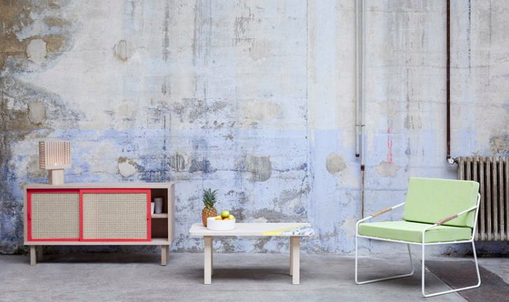
Spring color has a funny way of sneaking into a room. One minute your home is wearing winter neutrals like a sensible wool coat, and the next minute you are staring lovingly at coral, butter yellow, pale blue, and soft gray like they are tiny pastries in a Paris shop window. That is the charm behind Color Stories: Pretty Spring Pastels from Colonel of Paris, a design idea that feels cheerful, relaxed, and quietly sophisticated without shouting, “I bought everything during a seasonal sale and now my living room looks like an Easter basket.”
Colonel, the Paris-based design studio associated with Isabelle Gilles and Yann Poncelet, has long been admired for furniture and lighting that blend light wood, woven textures, bright-but-livable color, and a vacation-state-of-mind sensibility. Their Straw collection, especially, captures the mood beautifully: beech wood, cane and rattan details, lacquered metal, sliding doors, pendant lamps, sideboards, closets, and seating that look as if they wandered in from a sunny apartment near Canal Saint-Martin after stopping for a very stylish espresso.
This article explores why Colonel’s spring pastels work so well, how these colors fit into modern interior design, and how you can borrow the look for your own home. No passport required, though a croissant would not hurt.
Why Colonel of Paris Makes Pastels Feel Grown-Up
Pastels sometimes suffer from a reputation problem. People hear “pastel” and immediately imagine nursery walls, candy hearts, or a cupcake that has made questionable life choices. But the best pastel interiors are not childish. They are controlled, layered, and balanced with texture. Colonel’s work demonstrates this perfectly.
The magic comes from restraint. Instead of flooding a room with sweet colors, Colonel uses pastel shades as accents against natural materials. A coral pendant lamp becomes more sophisticated when its lacquered frame is paired with woven cane. A pale yellow closet feels sunny rather than sugary when it sits on a warm beech body. A gray sideboard with rattan doors feels modern because the color is grounded and the material adds depth. This is pastel design with a backbone.
The key lesson is simple: pastels need texture. Without texture, soft colors can look flat. With cane, rattan, leather, wood grain, fabric, and metal, they become dimensional. Colonel understands this relationship so well that the furniture seems to have its own weather system: light, warm, breezy, and just a little playful.
The Colonel Color Palette: Coral, Yellow, Gray, Indigo, and Fresh Air
The spring pastel palette from Colonel of Paris is not a random scoop of pretty colors. It works because each hue has a job. Coral brings warmth and friendliness. Yellow adds optimism. Light gray calms the room. Indigo and dark gray add contrast. Natural beech and woven cane prevent everything from floating away into the land of marshmallow decor.
Coral: The Friendly Scene-Stealer
Coral is the color equivalent of a friend who arrives at brunch wearing sunglasses indoors but somehow makes it charming. In Colonel’s world, coral works especially well on pendant lighting or cabinet details because it gives a room a warm focal point. It is energetic, but not as aggressive as red. It is sweeter than orange, but not as predictable as pink.
Use coral in small or medium doses: a lamp, a side table, a painted stool, a cushion, or a piece of art. Pair it with pale wood, white walls, soft blue, dark gray, or woven textures. The result feels fresh and modern rather than overly themed.
Yellow: Sunshine Without the Megaphone
Spring yellow can go wrong quickly. Too bright, and your room starts looking like a highlighter pen. Too pale, and it disappears. Colonel’s use of yellow lands in the sweet spot: cheerful, warm, and usable. On a closet door, lamp frame, or accent piece, yellow creates a gentle lift.
Yellow works beautifully with cane because both share a natural warmth. Beech wood, straw tones, rattan, and muted yellow speak the same language. Together, they create a room that feels sunny even on a cloudy afternoon, which is basically interior design sorcery.
Gray: The Adult in the Room
Soft gray is what keeps spring pastels from turning chaotic. Colonel’s gray pieces show how useful a neutral can be when it has personality. A gray cabinet or sideboard balances brighter shades and allows woven rattan doors to stand out. It is also an excellent bridge color if your existing home is full of white, black, beige, or natural wood.
Gray is especially helpful for renters or cautious decorators. If you want the pastel look but are not ready to commit to coral furniture, use gray as the foundation and bring in spring color through lighting, textiles, flowers, or ceramics.
Indigo and Vermilion: The Necessary Plot Twist
The smartest pastel rooms include at least one deeper or more saturated tone. Indigo, vermilion, dark gray, or black keeps the palette from becoming too polite. Think of these darker tones as punctuation marks. Without them, the room is a soft sentence that never ends. With them, it has rhythm.
Colonel’s sideboards and seating show how darker colors can sharpen a pastel scheme. Indigo near cane feels elegant. Vermilion near pale wood feels confident. Black lacquer on a lamp frame gives the whole composition a graphic edge. In other words, pretty does not have to mean delicate.
Rattan, Cane, and Beech: The Texture Behind the Color Story
The real reason Colonel’s spring pastels feel so good is not color alone. It is the material mix. Cane and rattan are natural, woven, breathable, and visually light. Beech wood brings a smooth, pale warmth. Lacquered metal adds a crisp modern line. Together, these materials make the furniture feel casual but designed, relaxed but not sloppy.
Rattan and cane also bring a subtle vacation mood into interiors. They remind us of garden rooms, summer houses, coastal cottages, and old café chairs pulled into the sun. But Colonel avoids the trap of making rattan look too tropical or too nostalgic. The clean forms, contemporary colors, and refined proportions make the pieces feel current.
This is a useful strategy for any home. If your space feels too cold, add woven texture. If it feels too rustic, add clean-lined color. If it feels too colorful, add natural wood. The balance matters more than any single piece.
How to Bring the Colonel of Paris Pastel Look Into Your Home
You do not need to own a Paris showroom, a French apartment, or a mysterious ability to tie scarves elegantly to use this palette. The Colonel-inspired look can be adapted to many American homes, from city apartments to suburban living rooms to small rental spaces.
1. Start With One Pastel Accent
The easiest way to begin is with one clear accent. Try a coral pendant light over a breakfast nook, a pale yellow table lamp on a sideboard, or mint-green cabinet knobs in a kitchen. One strong pastel moment is better than ten weak ones scattered around the room like confetti after a design parade.
2. Pair Soft Color With Natural Materials
Pastels look more elevated when they sit near natural finishes. Put a pale pink vase on a wooden table. Add a butter-yellow cushion to a rattan chair. Use a light blue throw near a cane cabinet. This pairing gives the color texture and prevents it from feeling overly decorative.
3. Add a Dark Anchor
Every pretty room needs a little tension. A black-framed mirror, indigo rug, charcoal side table, or dark blue artwork can ground the sweetness of spring colors. Colonel’s palette works because it lets pale hues breathe while giving them contrast.
4. Use Pastels in Practical Places
Pastels are not only for walls. They can appear on lighting, storage, seating, ceramics, bedding, outdoor furniture, or small accessories. If you are nervous about color, choose flexible pieces first. Lamps, pillows, trays, and art are much easier to change than a full wall of coral paint.
5. Let White Space Do Its Job
One reason Parisian interiors often look effortless is that they allow breathing room. Do not crowd every surface. A cane sideboard with one lamp, one vase, and one stack of books will usually look better than the same sideboard buried under seventeen “curated objects” that are quietly fighting for attention.
Room-by-Room Ideas Inspired by Colonel’s Spring Pastels
Living Room
In the living room, start with a neutral sofa and add spring pastels through accessories. A coral lamp, pale blue cushion, and rattan lounge chair can make the room feel bright without requiring a full redesign. If you have a wood coffee table, even better. The natural grain will connect the colors and textures.
Dining Room
A dining room is a perfect place for the Colonel look because cane chairs, pendant lighting, and sideboards already belong there. Try a woven pendant with a pale yellow or coral detail above the table. Add a gray cabinet with natural doors or a simple vase of tulips in soft pink and cream. Your dinner guests may not know why the room feels chic, but they will absolutely linger over dessert.
Bedroom
Bedrooms benefit from quieter pastels: pale blue, soft green, warm blush, and light gray. Keep the palette calm and tactile. Use linen bedding, a cane headboard, a small wooden bench, and one pastel accent lamp. The goal is not “spring exploded in here.” The goal is “I sleep like a stylish person who has never once doom-scrolled at midnight.”
Kitchen
For kitchens, pastels work best in small architectural moments. Think pale yellow stools, mint cabinet hardware, coral artwork, or a light blue pantry door. If the kitchen is mostly white, wood and rattan accents will make the color feel intentional instead of random.
Entryway
An entryway is the perfect testing ground. Add a pastel mirror, a woven basket, a slim wood console, and a cheerful lamp. This creates a welcoming moment without demanding that the entire house join a pastel support group.
Why Spring Pastels Still Feel Relevant in Modern Design
Spring pastels endure because they answer a real emotional need. After years of heavy minimalism, white boxes, and beige-on-beige rooms, people want homes with warmth, optimism, and personality. But many homeowners still want calm. Pastels offer that middle ground. They bring color without overwhelming the eye.
Modern pastel design is also more flexible than older versions. Today, pastels are paired with burgundy, navy, plum, dark teal, olive, warm brown, black, and terracotta. They are used with cane, oak, stone, plaster, linen, velvet, and metal. This makes them feel layered and grown-up.
Colonel of Paris understood this before it became a wider trend. Their pieces show that spring color does not need to be temporary. When pastel shades are built into thoughtful furniture and paired with quality materials, they can feel timeless, not seasonal.
Design Analysis: What Makes the Colonel Look So Appealing?
The Colonel aesthetic is successful because it balances three opposing ideas: nostalgia, modernity, and play. The cane and rattan details suggest vintage furniture, garden rooms, and handcraft. The clean silhouettes and lacquered frames bring a modern edge. The colors add playfulness. Remove any one of these elements and the design becomes less interesting.
This balance is especially important for SEO readers searching for spring pastel home decor, rattan furniture ideas, French interior design inspiration, or pastel color palettes. They are not just looking for pretty pictures. They want a way to make color livable. Colonel’s work gives them a practical formula: choose one joyful pastel, pair it with woven texture, add pale wood, and ground the palette with a darker note.
That formula can work in a small apartment, a family home, a vacation cottage, or even a home office. It is not about copying the exact furniture piece. It is about understanding the logic behind it.
Experience Notes: Living With Pretty Spring Pastels
The best way to understand the charm of Color Stories: Pretty Spring Pastels from Colonel of Paris is to imagine living with the palette for more than one perfect photo shoot. Pastels can look wonderful on a screen, but the real test happens on a regular Tuesday morning when there are coffee cups in the sink, shoes near the door, and one mysterious receipt on the table that nobody wants to claim.
In real life, spring pastels are surprisingly forgiving when they are used with natural texture. A coral lamp on a wood console can brighten an entryway even when the rest of the house is not perfectly styled. A rattan chair with a pale blue cushion still looks good with a book tossed on it. A yellow cabinet door brings warmth to a room even when the weather outside is gray and uncooperative. These colors do not demand perfection; they reward small moments of care.
One practical experience is that pastels change dramatically with light. Morning sun makes coral and yellow feel lively. Afternoon light softens blue and gray. Warm evening bulbs can turn pale pink into something cozy and flattering. This is why sampling matters. Before painting a wall or buying a large pastel piece, place a sample or swatch in the room and observe it throughout the day. Pastel colors may be gentle, but they are not lazy. They have moods.
Another lesson is that woven furniture earns its keep. Cane doors hide clutter while still keeping a piece visually light. Rattan lamps cast beautiful shadows. A woven basket near the sofa can hold blankets, magazines, or the remote control that everyone insists they did not lose. The Colonel-inspired look is not only decorative; it can be practical. That is a major reason it works for modern homes.
Pastels also help soften hard architecture. If a room has plain white walls, sharp corners, or basic rental finishes, a pastel-and-rattan combination can add instant character. A mint vase, pale yellow lamp, coral artwork, and wood-framed chair can make an ordinary space feel considered. You are not pretending the apartment is a Paris loft. You are giving it a better personality, like upgrading its playlist.
The biggest mistake is using too many sweet colors without contrast. A room filled only with pale pink, pale yellow, pale blue, and white can feel flat. Add black, walnut, navy, dark green, or charcoal. Add books, plants, ceramics, linen, and one slightly odd object that makes guests ask, “Where did you find that?” A good room needs a little friction.
After living with a Colonel-inspired palette, the most noticeable benefit is emotional. These colors make a room feel awake. Not loud. Not trendy for the sake of trend. Just awake. They remind you that furniture can be useful and joyful, that a lamp can do more than illuminate, and that spring does not have to stay outside. Sometimes it can move into the living room, sit politely on a cane sideboard, and look fabulous.
Conclusion
Color Stories: Pretty Spring Pastels from Colonel of Paris is more than a sweet seasonal phrase. It is a smart design approach built on balance: soft color with natural texture, playful details with clean forms, and French charm with everyday function. Colonel’s use of coral, yellow, gray, indigo, beech, cane, and rattan proves that pastels can be mature, stylish, and deeply livable.
The takeaway is not to turn your entire home into a pastel showroom. The better idea is to use spring color with intention. Choose one accent. Add texture. Ground it with a darker tone. Let natural wood warm the palette. Keep the room breathable. When done well, spring pastels feel less like decoration and more like atmosphere: light, charming, and quietly optimistic.
And honestly, if your sideboard looks like it might belong in a Paris apartment where someone casually serves lemonade in handmade glasses, you are probably doing something right.