If your kitchen is short on square footage but big on ambition, cabinet paint can do more heavy lifting than most people realize. No, a gallon of paint will not magically knock down a wall, expand your floor plan, or bribe your refrigerator into becoming less bulky. But the right cabinet color can absolutely change how spacious the room feels.
That is the magic of visual perception. In a small kitchen, every hard contrast, dark corner, and chunky visual break can make the room feel tighter. Cabinet color affects how light moves, where the eye stops, and whether the room feels airy or boxed in. In other words, your cabinets are not just storage. They are optical real estate.
If you want the illusion of more space without a full renovation, start with the cabinets. Below are five cabinet paint colors that consistently make kitchens feel brighter, calmer, and more expansive, plus practical tips for choosing the one that works best in your home.
Why Cabinet Color Has Such a Big Impact on Small Spaces
Cabinets take up a huge amount of visual space in a kitchen. In many layouts, they cover most of the walls from counter height to the ceiling line. That means their color does not just “decorate” the room. It defines the room.
When cabinet paint reflects light well, softens hard edges, and blends gracefully with the walls, the kitchen tends to feel more open. When cabinet paint is too dark, too cold, or too contrasting for the room, the cabinetry can read like a series of big blocks. That is when a kitchen starts to feel crowded, even before you add the toaster, coffee maker, fruit bowl, and that mysterious drawer full of takeout menus from 2019.
The goal is not always to choose the palest possible paint. The goal is to choose a color that helps surfaces recede, keeps the eye moving, and creates a smooth, low-clutter visual flow. Sometimes that means white. Sometimes it means a whispery greige, a dusty sage, or a soft blue-gray that feels like a deep breath.
1. Warm Off-White
If there were a hall of fame for small-space cabinet colors, warm off-white would already have a plaque, a spotlight, and a waiting list of admirers. It works because it reflects plenty of light without feeling sterile. That matters. In real homes, especially kitchens with limited natural light, stark white can look flat, cold, or almost blue. Warm off-white keeps the brightness but adds a little softness and comfort.
This color is especially effective when you want a kitchen to feel open but not clinical. It pairs beautifully with wood floors, brass hardware, white quartz, veined stone, creamy backsplashes, and just about every style from modern farmhouse to transitional to quietly expensive-looking minimalism.
Why it creates the illusion of more space
Warm off-white bounces light around the room and reduces the visual weight of upper and lower cabinets. Because it is close to the brightness of many walls, ceilings, and trim colors, it also minimizes abrupt stops for the eye. Fewer visual interruptions usually equals a bigger-feeling room.
Best for
Kitchens with low or moderate natural light, older homes, galley kitchens, and homeowners who want a timeless look that still feels cozy.
Design tip
Use warm off-white on the cabinets and keep the walls in the same family, just slightly lighter or darker. That near-match can make the room feel more seamless, which is exactly what a small kitchen wants.
2. Soft Greige
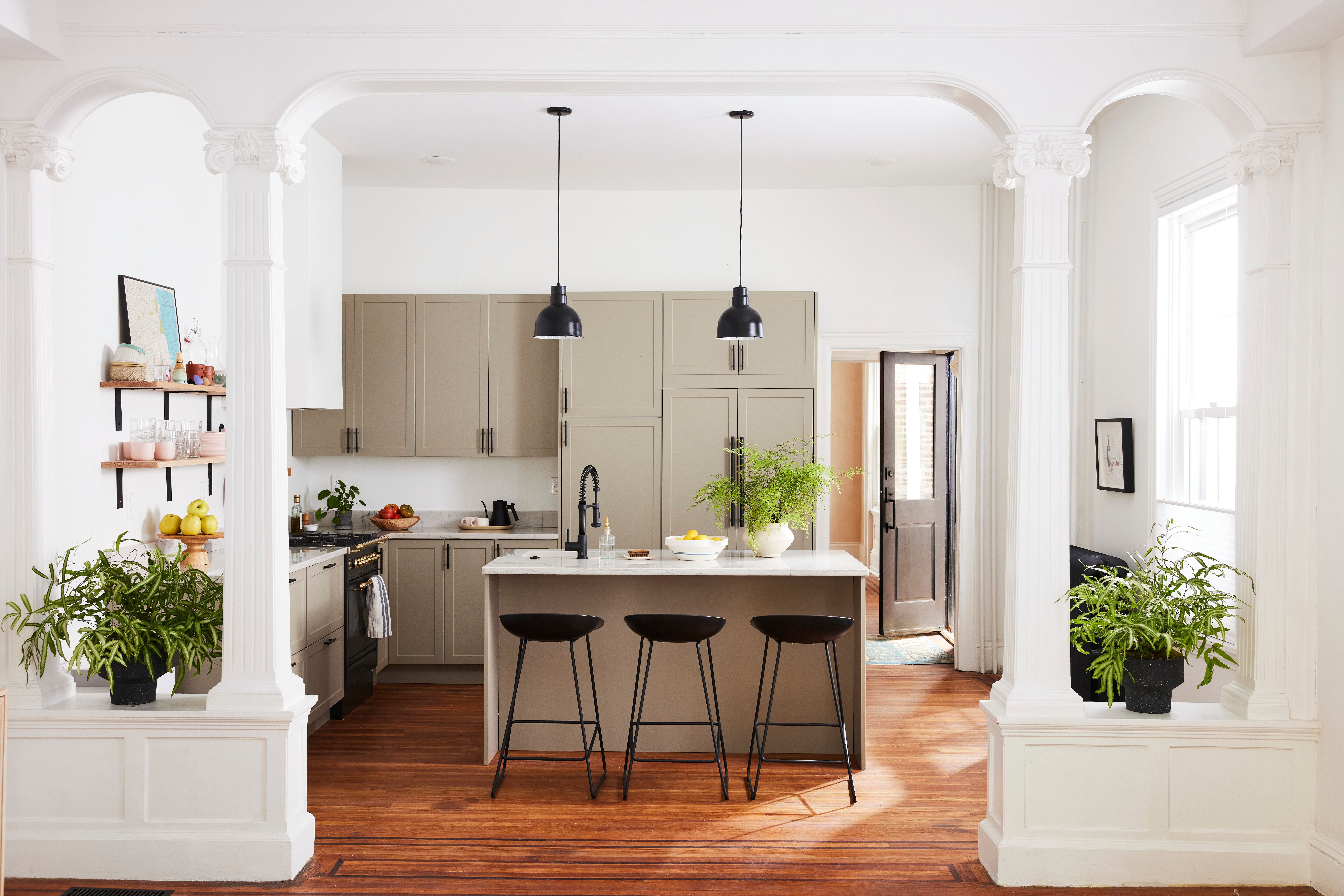
Greige is what happens when gray and beige stop arguing and decide to become useful. A soft greige cabinet color gives you the airy quality of a neutral, but with more depth than plain white. It is a particularly smart choice if your kitchen has mixed materials such as stainless steel appliances, stone counters, warm wood floors, and brushed metal hardware.
In a small space, soft greige works because it smooths out contrast. It is gentle enough to avoid feeling heavy, but rich enough to keep the room from looking washed out. If your kitchen gets uneven light throughout the day, greige can also be more forgiving than white, which tends to expose every shift in undertone from sunrise to dinner prep.
Why it creates the illusion of more space
Soft greige blurs the boundaries between cabinetry and surrounding finishes. Instead of shouting for attention, it creates continuity. That continuity makes the room feel calmer and visually larger.
Best for
Kitchens with warm countertops, beige or taupe tile, natural wood accents, or homeowners who want a neutral that feels elevated rather than plain.
Design tip
Choose a greige with a soft, warm base instead of a muddy or overly purple undertone. In a small kitchen, the wrong undertone can make cabinets look dingy fast.
3. Pale Blue-Gray
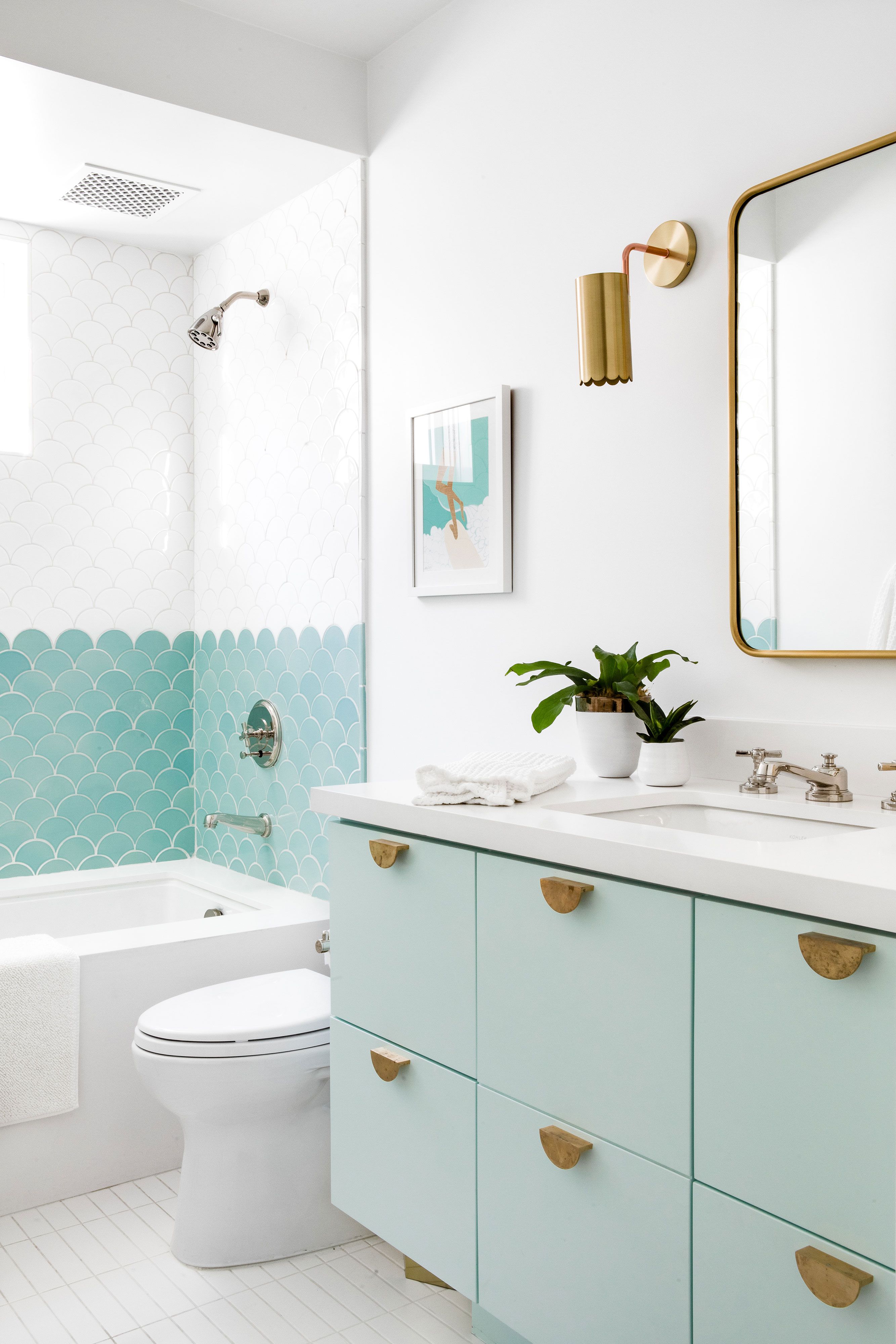
If warm off-white is the reliable classic, pale blue-gray is the cool, collected friend who somehow makes every room feel more relaxed. Blue-based colors are known for visually receding, which means they can make surfaces seem a little farther away than they really are. That is helpful when your cabinets are already taking up a lot of room.
A pale blue-gray feels airy, fresh, and subtly architectural. It brings in color without overwhelming the space, and it plays especially well with polished nickel, chrome, white tile, marble-look counters, and simple shaker cabinetry. In the right light, it can feel almost like a neutral with better manners.
Why it creates the illusion of more space
Cool colors tend to pull back visually. A pale blue-gray gives depth without density, which can make cabinet runs feel less imposing. It also pairs well with white walls and ceilings, reinforcing a bright, open look.
Best for
South-facing or bright kitchens, coastal-inspired spaces, modern kitchens, and homeowners who want more personality than beige but less commitment than navy.
Design tip
Keep the tone soft. Deep blue can be beautiful, but in a small kitchen, pale blue-gray is usually the safer bet if your top priority is making the room feel larger.
4. Dusty Sage or Muted Green
Green has been having a very public design moment, but muted sage earns its popularity honestly. It feels grounded, calm, and natural, and in softer versions it can make cabinetry feel less like furniture blocks and more like part of the room. That is a subtle but important difference.
A dusty sage works well because it carries color while staying quiet. It does not scream for attention. It gently changes the mood of the space, especially when paired with warm woods, creamy counters, unlacquered brass, or handmade-looking tile. In a small kitchen, that low-key charm can go a long way.
Why it creates the illusion of more space
Muted green has enough gray in it to soften edges and enough depth to add dimension. The result is a cabinet color that feels settled rather than bulky. It can also connect beautifully with outdoor views, which visually expands the room by making it feel tied to something beyond its walls.
Best for
Kitchens with wood accents, earthy finishes, cottage or classic styles, and anyone who wants color without chaos.
Design tip
Look for sage shades that are dusty, not neon and not too olive. The more muted the tone, the more spacious and sophisticated the final result tends to feel.
5. Light Taupe or Weathered Sand
For people who want warmth, depth, and versatility without drifting into dark territory, light taupe or weathered sand is a winning move. These shades sit in that sweet spot between beige, mushroom, and sandy neutral. They feel welcoming and layered, but they do not chop up the room the way darker browns can.
This kind of cabinet color is especially useful in kitchens that need a little softness. If bright white feels too sharp and gray feels too cool, a sand-toned neutral can create a more spacious look while still feeling livable. It is the design equivalent of flattering lighting.
Why it creates the illusion of more space
Light taupe adds gentle contrast without creating hard boundaries. It gives the eye enough variation to stay interested, but not so much that cabinetry starts to dominate the room. In many kitchens, that balance makes the space feel wider and less visually busy.
Best for
Homes with warm flooring, mixed-metal finishes, cream backsplashes, or open-plan layouts where the kitchen should flow naturally into nearby living areas.
Design tip
Pair it with simple cabinet fronts and minimal hardware. In a compact kitchen, heavy detailing can make even a beautiful color feel weighty.
How to Choose the Right Cabinet Color for Your Kitchen
Look at the light first
Before you fall in love with a paint chip under perfect store lighting, study your actual kitchen. North-facing kitchens often need warmer shades to counter cool light. Bright kitchens can usually handle cooler tones like pale blue-gray. Artificial lighting matters too. A color that looks soft and creamy at noon can look suspiciously yellow at night.
Match the undertones to your fixed finishes
Countertops, flooring, backsplash tile, and even appliance finishes all affect how cabinet paint reads. If your counters have warm veining, a cold gray cabinet can feel disconnected. If your flooring leans orange, a muddy beige can make the whole room feel tired. The best cabinet paint colors for small kitchens do not fight the finishes you already have.
Keep contrast under control
High contrast can be dramatic, but drama is not always what a tiny kitchen needs. If your goal is to create the illusion of more space, cabinets that are closer in value to the walls and trim often work better than a bold dark-light split.
Test large samples
Paint a generous sample on poster board or sample boards and move it around the kitchen. Look at it in morning light, afternoon light, and with the overhead fixtures on. Cabinets cover a lot of surface area, so tiny swatches are not enough. Tiny swatches are optimists. Full-size tests tell the truth.
Do not ignore sheen
Cabinets need durability, so many homeowners choose satin, semi-gloss, or another washable finish. A slightly more reflective finish can help bounce light, but too much shine can emphasize flaws. In most kitchens, a smooth, durable, low-to-moderate sheen is the sweet spot.
Mistakes That Make Cabinets Feel Heavier
One of the biggest mistakes is choosing a color because it looks trendy online without considering the room itself. Deep charcoal, inky blue, and dramatic forest green can be stunning, but in a small kitchen with limited light, they often absorb brightness and make cabinet runs feel more imposing.
Another common problem is using a too-bright white with cool undertones in a room that needs warmth. Instead of looking crisp, it can feel harsh. Overly busy hardware, ornate door profiles, and strong contrast between cabinets, trim, and walls can also make a kitchen feel more crowded than it is.
If spaciousness is the goal, simplicity wins. Soft color transitions, restrained detailing, and finishes that work together will almost always outperform a dramatic look that fights the size of the room.
What Real Homeowners Often Experience After Repainting Small-Kitchen Cabinets
One of the most common experiences people describe after repainting their cabinets in a lighter, softer tone is that the kitchen suddenly feels cleaner, even before they change anything else. The layout is the same. The appliance placement is the same. The suspiciously large air fryer is still occupying an unreasonable amount of counter space. But because the cabinets no longer dominate the room, the whole kitchen feels less cramped.
Another frequent reaction is surprise at how much the paint changes the light. Homeowners often expect color to change style, but not mood. Then they repaint dark or yellowed cabinets in a warm off-white or soft greige and notice that the room feels brighter from morning through evening. Artificial lighting seems less harsh. Shadows look softer. Even nearby rooms can seem more connected because the kitchen stops reading like a visual dead end.
People also tend to notice that clutter becomes less aggressive. That does not mean clutter disappears. It would be lovely if paint could also organize snack containers and reduce junk mail, but that remains outside its skill set. What does happen is that a calmer cabinet color gives the eye fewer things to process. The room feels quieter. A coffee maker and cutting board still exist, but they no longer compete against a heavy cabinet color for attention.
In homes with older finishes, soft cabinet colors often help bridge awkward combinations that homeowners thought they had to replace immediately. A weathered sand or muted greige can make laminate counters, older tile, and mixed metals feel more intentional. That alone can buy homeowners time and budget. Instead of launching into a full renovation, they realize a thoughtful paint choice can dramatically improve the space now and leave room for future upgrades later.
There is also a practical, emotional side to this project that people do not always expect. Repainting cabinets is one of those updates that can make someone enjoy being in the kitchen again. The room feels easier to enter, easier to style, and easier to keep looking decent on an ordinary Tuesday. That matters more than glossy before-and-after photos suggest. A kitchen that feels breathable usually gets used more comfortably, whether that means cooking, helping with homework at the counter, or standing around talking while nobody actually unloads the dishwasher.
Many homeowners who choose pale blue-gray or dusty sage also report that the kitchen feels more custom afterward. These colors still help create openness, but they add identity too. Instead of the room feeling merely neutral, it starts to feel designed. That balance between spacious and personal is often the sweet spot. People do not just want their kitchen to look larger. They want it to feel like their home, only less boxed in.
And perhaps the biggest real-world lesson is this: the most successful cabinet repaint projects are usually not the boldest ones. They are the ones that respect the room. They work with the light, the flooring, the counters, and the amount of visual noise the space can handle. That is why soft off-whites, greiges, sages, blue-grays, and sandy taupes keep showing up in well-loved kitchens. They are not boring. They are strategic. And when your kitchen is small, strategic is beautiful.
Final Thoughts
If your kitchen feels crowded, cabinet paint is one of the smartest ways to shift the experience of the room without changing the footprint. Warm off-white, soft greige, pale blue-gray, dusty sage, and light taupe each create more space in slightly different ways, but they all share one important trait: they reduce visual heaviness.
The best choice depends on your lighting, your fixed finishes, and the mood you want. If you want timeless brightness, go warm off-white. If you want soft sophistication, choose greige. If you want airy color, try pale blue-gray. If you want grounded freshness, dusty sage is a strong contender. And if you want warmth without weight, light taupe or weathered sand is hard to beat.
In a small kitchen, every design decision has to earn its keep. The right cabinet paint color does exactly that. It brightens, softens, expands, and flatters the room all at once. Not bad for something that starts in a can.