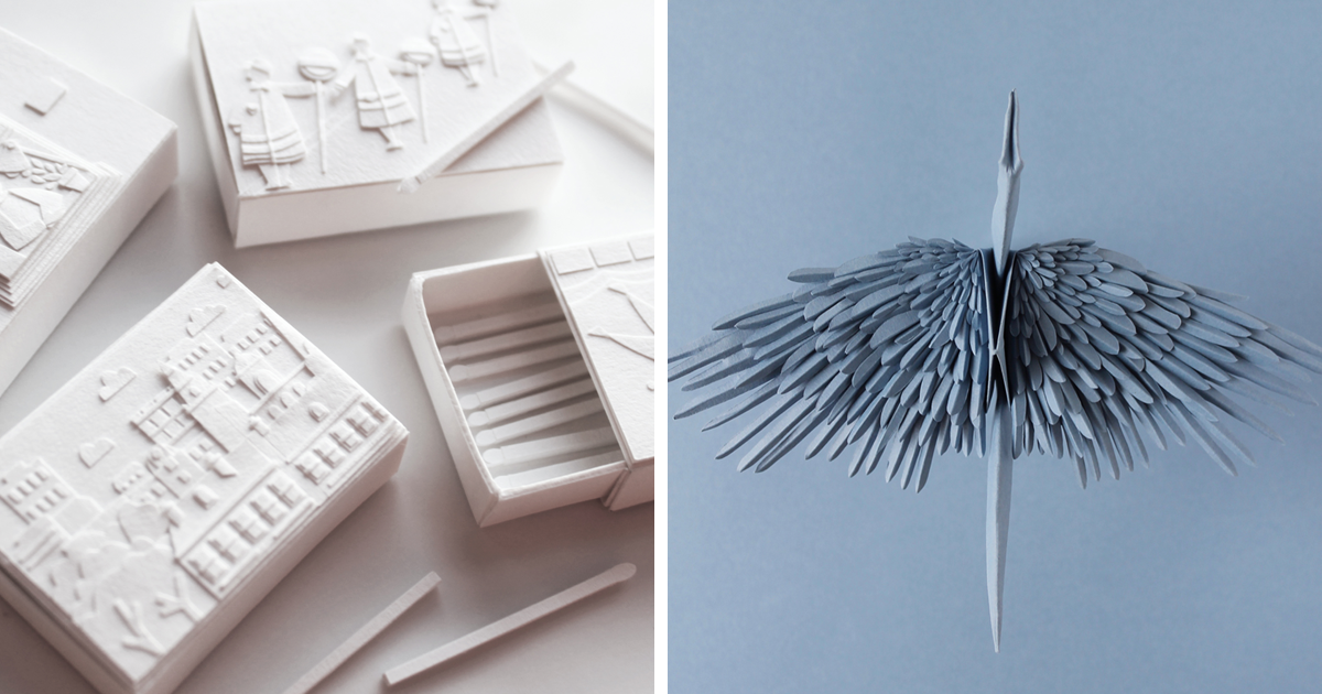
Give an artist a rainbow and they will probably make something beautiful. Give that same artist only one color, 20 sheets of paper, and a tiny spatial limit, and suddenly things get interesting. That is the delicious creative tension behind “19 Different Artists Created Paper Art Pieces Using Only One Color Each”, a paper art challenge that proves limitation is not the enemy of imagination. In fact, limitation may be imagination’s slightly annoying personal trainer.
The project brought together talented members of the Paper Artist Collective, a global community devoted to making extraordinary things from paper. Each artist received A3 sheets of a single Colorplan shade from G.F Smith and had to create a finished paper art piece using that one color only. No rainbow rescue mission. No sneaky glitter confetti uprising. Just one hue, paper, skill, patience, and the kind of steady hands that make the rest of us feel personally attacked by scissors.
What makes this challenge so compelling is not merely the technical skill, although there is plenty of that. It is the way each artist turned monochrome paper into sculpture, texture, rhythm, atmosphere, and personality. One color did not flatten the results. It sharpened them. Viewers are invited to look closer, notice edges, shadows, folds, cut lines, negative space, and delicate construction. In other words, this is paper art that whispers, “Come closer,” then casually reveals it has been doing architectural gymnastics the entire time.
What Was the One-Color Paper Art Challenge?
The challenge was simple in rules and wonderfully complex in execution: artists received paper in a single shade and created a piece that had to fit inside a compact 20 x 20 x 20 cm space. The artists reportedly came from multiple countries, and many only discovered their assigned color when they opened the parcel. That surprise element matters. A color can feel friendly, moody, difficult, loud, soft, commercial, nostalgic, or completely outside an artist’s normal comfort zone.
Instead of choosing a palette to match a concept, each artist had to let the color become part of the concept. A turquoise sheet could become playful and aquatic. A green could lean botanical, alien, mechanical, or architectural. A blue might feel calm, futuristic, or icy. This is where paper art becomes more than craft. It becomes problem-solving with a dramatic flair.
Some highlighted works included “Turquoise” by Raya Sader Bujana, “Pistachio” by Julianna Szabo, “Tabriz Blue” by Rosa Yoo, “Mars Green” by Samantha Quinn, and “Mid Green” by Adriana Napolitano. Even from the titles alone, the project begins to sound like an art supply store walked into a poetry reading. But the pieces themselves go beyond pretty color names. They show how different artistic minds can start with similar restrictions and arrive at completely different visual worlds.
Why One Color Can Make Paper Art More Powerful
At first, monochromatic paper art sounds like a limitation. After all, color contrast is one of the easiest ways to guide attention. Remove that, and an artist loses a major visual tool. But here is the twist: when color variety disappears, everything else becomes louder. The fold has to speak. The shadow has to work overtime. The cut edge becomes a line drawing. The raised layer becomes a highlight. The paper surface becomes landscape, fabric, architecture, and atmosphere all at once.
Monochromatic design is not the same as boring design. A single color can include tints, tones, shadows, and changes in perceived depth depending on light and structure. In paper sculpture, this effect becomes especially rich because the material creates real physical relief. A flat sheet can be curled, scored, cut, layered, fringed, folded, rolled, slotted, twisted, or stacked. Suddenly, one color becomes many visual experiences.
Texture Becomes the New Palette
In multicolor work, red next to blue creates instant contrast. In one-color work, contrast must come from texture. A smooth folded plane feels different from a curled strip. A tightly packed cluster of paper coils feels different from a wide open cutout. A raised paper petal casts a shadow that darkens the same color underneath it. The artist is not mixing paint; the artist is mixing surfaces.
This is why paper quilling, paper cutting, origami, kirigami, paper relief, and layered paper sculpture all adapt beautifully to monochrome. These techniques naturally produce light and shadow. Quilling uses rolled and shaped strips to create detailed patterns. Kirigami uses cutting and folding to transform a flat sheet into a dimensional structure. Paper sculpture builds form through layering and construction. Each method gives a single color more ways to perform than a caffeinated Broadway understudy.
Negative Space Becomes Part of the Artwork
One-color paper art also relies heavily on negative space. In cut paper, what is removed can be just as important as what remains. A window, gap, slit, or opening lets the viewer’s eye move through the work. It creates rhythm and breathing room. When artists cannot depend on color changes to separate elements, spacing becomes crucial.
Good monochrome paper art often feels balanced because the artist understands when to build and when to stop. That “stop” is harder than it sounds. Paper artists may be tempted to keep adding layers, but too much detail can become visual oatmeal. The best pieces know when to let the empty areas do their quiet, elegant job.
The Magic of Paper as an Artistic Medium
Paper has a strange reputation. On one hand, it is ordinary. We use it for receipts, notebooks, packaging, school projects, grocery lists, and emergency “I forgot the birthday card” situations. On the other hand, paper has a long and serious life in art history. Museums preserve drawings, prints, manuscripts, paper sculptures, cutouts, and experimental works because paper can hold memory, pressure, pigment, gesture, and form.
Contemporary artists continue to expand what paper can do. Some sculpt it into immersive installations. Others cut it into lace-like scenes. Some fold it into geometric systems, while others build organic textures that look grown rather than assembled. Paper is light, flexible, accessible, and surprisingly expressive. It can look fragile or architectural. It can behave like fabric, skin, stone, petals, feathers, or machinery. Give paper a spotlight and it stops acting like office supply material immediately.
The one-color challenge highlights this versatility beautifully. Because every work begins with the same basic material logic, viewers can compare artistic decisions more clearly. Who cuts? Who folds? Who stacks? Who builds height? Who creates softness? Who uses sharp geometry? Who makes the paper look like it is floating, blooming, exploding, or quietly plotting something in the corner?
How 19 Artists Can Interpret One Rule in 19 Different Ways
The most exciting part of a collective challenge is seeing how differently artists think. Give 19 people the same instruction and you will not get 19 versions of the same idea unless the instruction is “assemble this flat-pack chair,” and even then, let us be honest, someone will end up with two mysterious extra screws.
In this paper art project, each artist’s assigned color became a creative prompt. Some shades naturally suggested organic forms. Greens could become plants, mossy surfaces, insects, forests, or abstract growth. Blues could suggest water, ice, sky, technology, or quiet emotional space. Warmer colors could lean toward energy, humor, food, architecture, or dramatic movement. But the smartest artists do not simply obey color associations. They twist them.
For example, a green paper piece does not have to be leafy. It can become mechanical, surreal, or even slightly eerie. A blue piece does not have to be calm. It can become electric or architectural. A soft pastel can create sharp tension if cut into precise spikes. A bold hue can become gentle if folded into rounded layers. That tension between expectation and execution is where the project becomes memorable.
Small Scale, Big Pressure
The 20 x 20 x 20 cm size limit is another brilliant constraint. It prevents the artists from relying on sheer scale for impact. Instead, the drama has to happen through detail, composition, and craftsmanship. Small works can be powerful because they reward close looking. They turn the viewer into a detective. Every cut, crease, and glued seam matters.
Miniature paper art also has a kind of intimacy that large installation work may not. It feels personal, almost like peering into a tiny universe. The viewer is not overwhelmed by size; they are pulled in by precision. That is why many people respond strongly to small paper sculptures. They combine delicacy with control. They look fragile, but the planning behind them is sturdy.
Lessons Designers and Artists Can Learn from the Challenge
This project is not only fun to look at; it is also useful for anyone interested in design, illustration, sculpture, branding, or visual storytelling. A one-color challenge teaches creative discipline. It forces artists to solve problems without reaching for the easiest tools.
1. Constraints Can Improve Creativity
Too many options can make the creative process mushy. A blank page is already intimidating. A blank page plus unlimited materials, unlimited colors, unlimited styles, and unlimited directions can make an artist want to go lie down under a table. A clear constraint creates a starting point. It says, “Here is the box. Now surprise us from inside it.”
The one-color paper art challenge works because the rules are strict but not suffocating. Artists still choose subject, structure, technique, mood, and composition. The limitation gives the project unity, while individual interpretation gives it variety.
2. Material Knowledge Matters
Paper may seem simple, but experienced paper artists understand weight, grain, flexibility, thickness, surface finish, and color behavior. A paper that folds beautifully may not cut cleanly in tiny details. A thick sheet may create strong structure but resist delicate curling. A saturated color may show glue marks more easily. A pale color may reveal shadows in subtle ways.
Using one paper color makes those material qualities more visible. The artist cannot hide behind busy color combinations. Clean craftsmanship becomes essential. Edges must be sharp. Curves must be controlled. Glue must behave, which, as many crafters know, is not always glue’s favorite hobby.
3. Light Is a Co-Author
In monochrome paper art, lighting is not just presentation; it is part of the artwork. Shadows create depth. Highlights reveal form. A piece photographed from one angle can look soft and quiet, while the same piece from another angle can look dramatic and sculptural. This is especially true for layered cuts, raised reliefs, and folded structures.
Artists working in one color must think about how light will move across the object. The paper sculpture is not complete until light activates it. That is a very fancy way of saying: even paper enjoys good lighting. Relatable.
Why Viewers Love Monochrome Paper Art
There is something satisfying about monochrome paper art because it feels both simple and impossible. The viewer understands the material immediately. It is paper. We know paper. We have folded it, torn it, doodled on it, spilled coffee on it, and lost important phone numbers on it. But then an artist turns it into a detailed sculpture, and suddenly the familiar becomes surprising.
That transformation is emotionally appealing. It suggests that ordinary materials still have hidden potential. It reminds us that creativity does not always require rare supplies or expensive tools. Sometimes it requires looking at a sheet of paper and thinking, “What else can you become?” That question is small, but it can open a very large door.
Monochrome work also feels visually calm in a crowded digital world. Online feeds are full of flashing colors, quick edits, and loud images fighting for attention like toddlers in a cereal aisle. A single-color paper sculpture stands out by doing the opposite. It slows the eye. It asks for patience. It offers detail instead of noise.
Specific Examples That Show the Range of the Project
Several pieces from the challenge demonstrate how diverse one-color paper art can be. Raya Sader Bujana’s “Turquoise” suggests the precision and delicacy often associated with miniature paper sculpture. Julianna Szabo’s “Pistachio” shows how a gentle color can support intricate, almost mechanical detail. Rosa Yoo’s “Tabriz Blue” brings attention to how a strong blue can create depth through structure rather than additional color. Samantha Quinn’s “Mars Green” plays with an unexpected color name and an equally intriguing visual direction. Adriana Napolitano’s “Mid Green” shows how a middle-value hue can still feel dimensional when the surface is carefully manipulated.
These examples matter because they prove the project is not about sameness. It is about translation. Every artist translates color into form differently. Some may create botanical shapes. Others may build abstract systems. Some may lean into humor, while others create elegance, tension, or mystery. The shared rule makes the differences easier to appreciate.
How to Try a One-Color Paper Art Challenge Yourself
You do not need to be a professional paper artist to learn from this idea. A one-color paper challenge can be adapted for beginners, students, designers, illustrators, or anyone who owns scissors and believes they can be trusted with them.
Start by choosing one paper color. Do not overthink it. In fact, choosing a color you normally avoid can be more useful. Then set a small size limit, such as a square base or a shoebox-sized space. Pick one or two techniques: folding, cutting, rolling, layering, tearing, weaving, or curling. The goal is not to make a museum-ready masterpiece on the first attempt. The goal is to discover how much variety exists inside one material decision.
Try building contrast through height. Place flat areas next to raised areas. Use repeated shapes to create rhythm. Cut openings so shadows become part of the design. Photograph the piece near a window and then under a desk lamp. Notice how the same color changes depending on light. That observation alone is worth the experiment.
Added Experience: What Creating With Only One Color Teaches You
Working on a one-color paper art piece can feel awkward at first. Most people instinctively want to add another color when the composition looks plain. That urge is understandable. A second color is the creative equivalent of adding hot sauce: fast, exciting, and occasionally used to cover up deeper problems. But when you are forced to stay with one color, you begin to notice the real structure of your idea.
The first lesson is patience. Paper does not reward rushing. If you cut too quickly, corners get fuzzy. If you fold without measuring, the piece may twist out of alignment. If you add too much glue, the surface warps or shines in places you did not invite to the party. A monochrome piece exposes these mistakes because there is nowhere for them to hide. That can be frustrating, but it also makes you better.
The second lesson is observation. One color changes constantly depending on angle, light, shadow, and neighboring forms. A raised strip may look brighter on top and darker underneath. A curled piece may create a gradient without any ink or paint. A tight cluster of folds may appear darker than an open flat section. Once you start seeing these differences, the project becomes less about “only one color” and more about discovering how many versions of that color already exist.
The third lesson is restraint. Many beginners, including enthusiastic adults with dangerous access to craft stores, try to add too much. More petals. More curls. More layers. More tiny decorative bits that seemed like a good idea at midnight. But one-color paper art often improves when you remove unnecessary elements. A strong silhouette, clean repetition, and intentional spacing can be more powerful than overcrowded detail.
The fourth lesson is respect for professional paper artists. Looking at finished paper sculptures online, it is easy to think, “That is cute.” Trying to make one yourself quickly changes the sentence to, “Ah, yes, this person has the patience of a mountain and the hands of a watchmaker.” The craft requires planning, technical control, and design judgment. Even simple-looking pieces may involve prototypes, failed cuts, hidden supports, and careful photography.
The fifth lesson is that creativity thrives when the rules are clear. A one-color rule removes decision fatigue. You stop wondering which colors match and start asking better questions: How can I create movement? Where should the eye go first? What should be flat? What should rise? What should be removed? What kind of shadow do I want? These questions lead to stronger visual thinking.
There is also something emotionally satisfying about making art from modest materials. Paper is not intimidating. It does not demand a studio with dramatic north-facing windows or a mysterious artist scarf. You can begin with a small stack of colored sheets, a cutting mat, a craft knife, scissors, glue, and patience. The process is quiet and focused. It gives your hands something specific to do while your mind works through form and balance.
For students, this type of challenge is especially useful because it teaches design fundamentals without requiring expensive supplies. For professional designers, it is a refreshing exercise in visual hierarchy. For hobbyists, it is a relaxing but challenging way to build skill. For anyone who has ever bought beautiful paper and then felt too nervous to use it, this is your sign. Paper cannot fulfill its destiny from inside a drawer.
The best personal takeaway from the project is this: one color is not a limitation when you understand texture, structure, and light. It is a stage. The paper performs through edges, shadows, folds, curves, and silence. And when 19 different artists step onto that stage, the result is not repetition. It is proof that creativity does not need endless options. Sometimes it just needs one color, a sharp blade, and the courage to make the first cut.
Conclusion
“19 Different Artists Created Paper Art Pieces Using Only One Color Each” is more than a charming art challenge. It is a reminder that creativity becomes sharper when artists must work within meaningful limits. By using only one color, these paper artists turned attention toward texture, shadow, construction, and detail. The project celebrates paper as a serious artistic medium while keeping the joy of experimentation alive.
The beauty of the challenge lies in its balance: one rule, many voices. Each artist received a color, but what they made from it belonged entirely to their imagination. That is why the results feel so fresh. The works prove that paper art can be delicate, bold, architectural, playful, strange, elegant, and deeply expressive without needing a full rainbow to make its point.
Note: This article is written in original American English and synthesized from publicly available information about the Paper Artist Collective challenge, monochromatic design principles, paper sculpture, paper cutting, quilling, contemporary paper art, and museum-level discussions of paper as an artistic material. No source text has been copied.