Note: This article is provided in body-only HTML for easy publishing and copying.
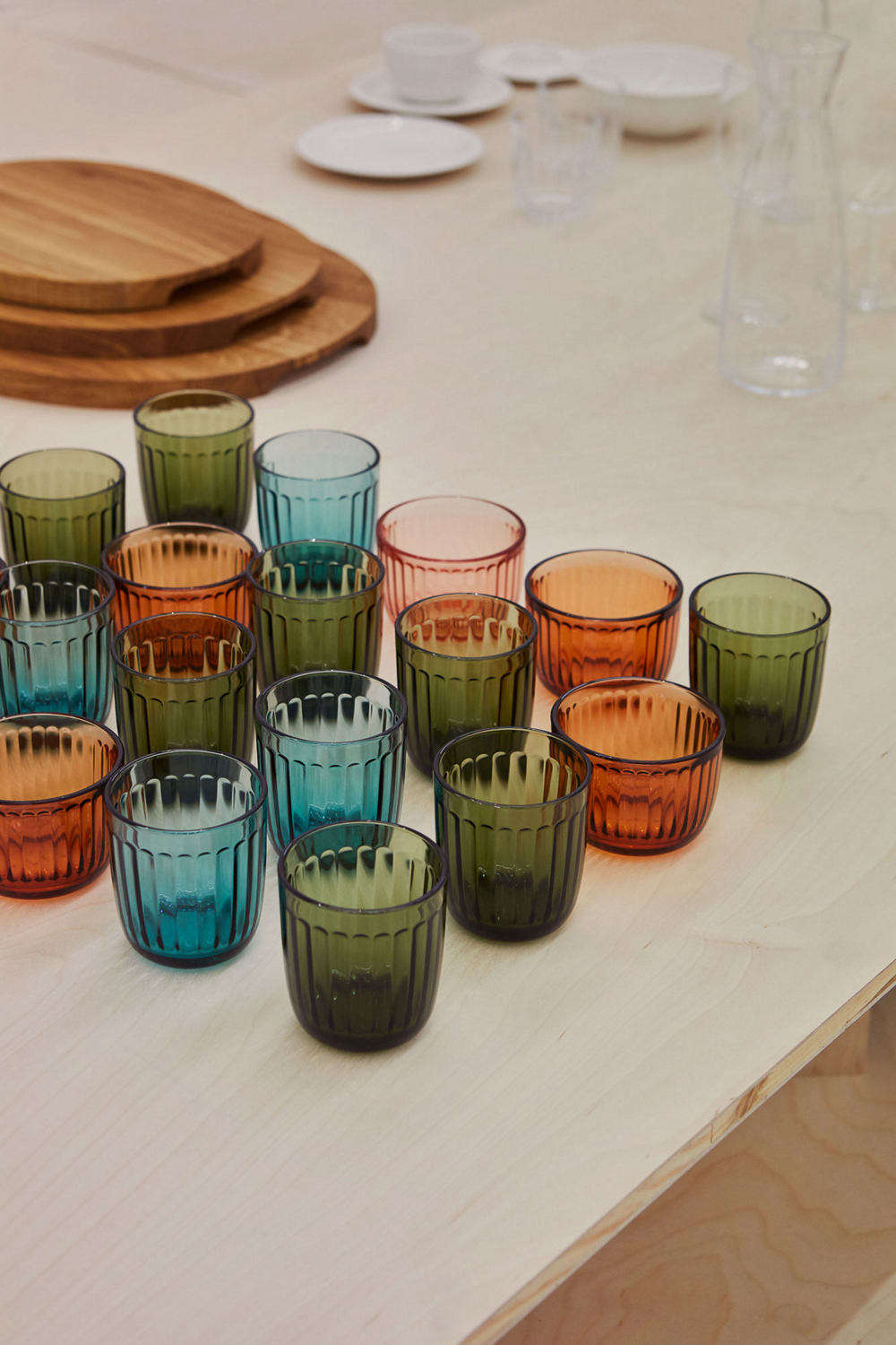
Some kitchens have a fancy espresso machine. Some have a marble island the size of a small airport. And then there are the truly evolved homes: the ones with colorful Iittala glassware glowing on the shelf like a Scandinavian sunset with excellent manners. If you have ever looked at a lineup of tumblers in aqua, linen, calluna, clear, and pine green and thought, “Can I mix these together without my table looking like a confused art project?” the answer is yes. Enthusiastically yes.
Iittala has spent generations proving that practical objects do not have to be boring. The Finnish design brand built its reputation on glassware that is simple, useful, and quietly beautiful, then added color with the confidence of someone who knows exactly where the good light hits at 5 p.m. The result is a collection of drinkware and decorative glass that makes everyday meals feel styled, but not fussy. It is polished without acting like it needs its own security team.
This is where mix-and-match colorful glassware becomes more than a decorating trick. With Iittala, it becomes a design strategy. You are not just tossing random glasses on a table and hoping for the best. You are combining shape, texture, tone, and function in a way that feels collected, effortless, and very smart.
Why Iittala Works So Well for a Mix-and-Match Table
The magic starts with Iittala’s design philosophy. Even when the pieces come from different collections, they often share a few important traits: clean silhouettes, thoughtful proportions, functional durability, and colors that feel intentional instead of sugary or loud. That matters. A random assortment of bargain-bin glassware can look chaotic fast. A thoughtful assortment of Iittala pieces tends to look layered and confident.
That balance comes from the brand’s long design history. Kaj Franck’s Kartio glasses are famous for stripping glassware down to the essentials. Aino Aalto’s tumblers use rings inspired by ripples in water. Oiva Toikka’s Kastehelmi adds droplet texture that plays with light. Tapio Wirkkala’s Ultima Thule turns icy texture into a conversation piece. Alfredo Häberli’s Essence is elegant and minimal. Jasper Morrison’s Raami brings soft character and easy everyday versatility. Different personalities, same family reunion energy.
In other words, Iittala collections do not fight each other for attention. They know how to share the stage.
The Best Iittala Collections for Colorful Layering
Kartio: The Reliable Minimalist That Loves Color
If you want the easiest entry point into colorful Iittala glassware, start with Kartio. Designed by Kaj Franck, Kartio is the kind of glass that makes restraint look glamorous. The shape is simple, balanced, and unfussy, which is exactly why color shines so well here. Aqua looks crisp and watery. Linen feels soft and warm. Dark gray adds depth. Calluna introduces a moody, dusty purple note that instantly makes the table feel more curated.
Kartio is ideal for people who want color without visual clutter. Because the form is so pared back, you can mix several shades together without the table feeling busy. Think of Kartio as the white T-shirt of Scandinavian glassware, except it comes in much better colors.
Aino Aalto: Rippled Texture with Everyday Charm
Aino Aalto glasses bring subtle pattern into the mix. Inspired by circles in water, the stacked rings add rhythm and grip without turning the glass into a novelty item. These pieces are fantastic for casual breakfasts, weekday lunches, and dinner tables that need a little texture but not a full dramatic monologue.
Because the silhouette is straightforward, Aino Aalto pairs beautifully with Kartio. Use Kartio for water glasses and Aino Aalto for juice or cocktails, and suddenly your table looks like you hired a stylist who politely declined to overdo it.
Kastehelmi: The Light Catcher
If you love sparkle, Kastehelmi is your best friend. Designed by Oiva Toikka, the collection is famous for its dewdrop pattern, which catches and scatters light in a way that makes even plain water look suspiciously expensive. The texture adds instant charm to open shelving, brunch tables, and candlelit dinners.
Kastehelmi works especially well when you want one texture-heavy accent in an otherwise simple mix. Pair clear or softly tinted Kastehelmi with solid-colored Kartio tumblers and you get contrast without conflict. It is the tabletop equivalent of wearing a tailored coat with statement earrings: refined, but not boring.
Essence: For When You Want the Grown-Up Glassware Moment
Essence, designed by Alfredo Häberli, brings elegant stemware into the picture. The bowls are shaped with purpose, the stems and bases feel balanced, and the overall effect is clean and modern. If your mix-and-match setup includes wine glasses, cocktail bowls, or a sleek carafe, Essence adds sophistication without becoming stiff or overly formal.
It also pairs surprisingly well with chunkier or more textured pieces. A table with Essence wine glasses, Kartio tumblers, and a Kastehelmi serving bowl feels collected, layered, and very intentional. Like someone who owns both linen napkins and a playlist for dinner parties.
Raami: Relaxed and Sociable
Raami, designed by Jasper Morrison, was practically born for shared meals. The name means “frame” in Finnish, and that idea fits beautifully: these pieces frame the gathering rather than stealing attention from it. The tumblers and carafes have just enough visual character to feel special, especially when you bring in gentle color.
Raami is ideal for homes where the dining table has to do everything. Tuesday pasta, Saturday friends, Sunday pancakes, last-minute salad dinner, and one overly ambitious cheese board you assembled while pretending to be calm. It can handle all of that.
Ultima Thule: The Dramatic One, in a Good Way
Ultima Thule is what happens when texture becomes theater. Inspired by melting ice, the collection has an organic, almost frozen surface that feels sculptural and distinctly Nordic. It is usually clearer and more dramatic than colorful, but it mixes beautifully with colored pieces because it adds visual weight and sparkle.
Use Ultima Thule as the icy anchor beside softer tinted glassware. Suddenly the whole table feels deeper and more dimensional. It is a strong supporting character, not the whole plot.
How to Mix Iittala Colors Without Making the Table Look Overdressed
Pick a Color Temperature First
The easiest way to create a cohesive look is to stay in one temperature lane. Cool tones like aqua, water green, and gray feel fresh and airy. Warm tones like linen, calluna, or amber-leaning shades feel cozy and grounded. You can absolutely mix warm and cool colors, but doing so works best when one side clearly leads and the other acts as an accent.
For beginners, try two main shades and one neutral. Example: aqua + linen + clear. That formula gives you contrast, softness, and breathing room.
Mix Shape with Purpose
Color alone is not enough. The shape story matters. If you use all textured glasses in different colors, the table can get visually noisy. Instead, combine one smooth collection with one textured collection. Kartio plus Kastehelmi is excellent. Aino Aalto plus Essence also works. Raami plus clear Ultima Thule can look unexpectedly polished.
Think like a good host: not every guest has to be the loudest person in the room.
Repeat at Least One Element
Repetition creates calm. Maybe every place setting gets a colored tumbler and a clear stemmed glass. Maybe every seat gets a different color, but the shape stays the same. Maybe all serving pieces are clear while the drinkware carries the color story. Repeat one variable so the eye can relax.
Use Clear Glass as a Design Buffer
Clear glass is the unsung hero of a mix-and-match table. It breaks up blocks of color, keeps the setting from feeling heavy, and lets food remain the star. This is especially useful when your plates, linens, or flowers already bring in strong hues.
If you are nervous about colorful glassware, start with mostly clear pieces and add two or three tinted glasses. That is not cheating. That is smart design.
Styling Ideas for Real Homes
The Effortless Weeknight Table
Use Kartio tumblers in two alternating colors, stack simple white or stoneware plates, and add a clear Raami carafe in the center. No ironed tablecloth. No floral arrangement requiring emotional commitment. Just a neat, modern table that makes takeout noodles look far more organized than they are.
The Weekend Brunch Table
Bring in Kastehelmi for sparkle. Use clear or lightly tinted stemmed glasses for juice, colorful tumblers for water, and a small vase with casual stems. The dewdrop texture catches morning light beautifully, and the whole setup feels cheerful without sliding into pastel chaos.
The Dinner Party Table
Layer Essence stemware with colored Kartio or Raami tumblers, then use clear serving pieces or one dramatic Ultima Thule bowl. Add candles, linen napkins, and a low centerpiece. The glassware does a lot of the decorative work, which means you do not need to panic-buy twelve extra styling props an hour before guests arrive.
The Open Shelf Display
Iittala glassware is not meant to hide in a dark cabinet like it owes someone money. On open shelves, group by color gradient rather than by product line. Move from clear to pale linen to aqua to gray. Or keep all shapes mixed but repeat colors in small clusters. The result feels collected and decorative while staying functional.
Why Colorful Iittala Glassware Is More Than a Trend
One reason colorful Iittala pieces remain so appealing is that they are not trying to be trend bait. The forms are timeless, the colors are often nuanced rather than loud, and the design language favors longevity over novelty. That makes a big difference in a world where many tabletop trends last about as long as a cut avocado.
Scandinavian design is often associated with pale woods, white walls, and disciplined restraint, but that does not mean it rejects color. Good Nordic design uses color carefully, giving it space to breathe. Iittala understands this better than most. A single aqua tumbler beside a clear carafe can feel fresher than an entire rainbow of trend-driven tableware. A dusty purple glass on a neutral table can look both playful and composed.
That is the charm. The pieces are useful enough for everyday life, but beautiful enough to lift the mood of ordinary routines. Water tastes the same, of course. It just feels emotionally more successful in a good glass.
Buying Strategy: How to Build a Collection Without Regrets
Start with one workhorse collection. Kartio or Aino Aalto is a smart choice. Then add one accent collection, such as Kastehelmi or Ultima Thule, for texture. After that, bring in stemware like Essence if you entertain often or simply enjoy drinking sparkling water like it is a special event. Which, frankly, it can be.
Do not feel pressure to buy everything in one color or all at once. Iittala works best when it evolves. A couple of aqua tumblers now, a pair of linen glasses later, a clear Kastehelmi bowl when you feel fancy, maybe a Raami carafe when your current pitcher starts looking tired. This gradual approach makes the collection feel personal rather than showroom-perfect.
And that is really the point of mix-and-match styling. It should look lived with, not staged within an inch of its life.
Experience: Living with Mix-and-Match Iittala Glassware
What surprises many people about colorful Iittala glassware is how quickly it changes the rhythm of a room. At first, you notice the color. Then you notice the light. Then you notice that you have become the sort of person who thinks, “The late afternoon sun is really doing wonderful things for the tumblers today,” which is both delightful and mildly hilarious.
In real life, the experience is less about formal entertaining and more about small, repeated moments. A pale aqua glass beside your desk somehow makes plain water feel less like homework. A linen tumbler at breakfast softens a rushed morning. Clear Kastehelmi catches candlelight at dinner and makes a Tuesday meal feel oddly cinematic. You are still eating leftovers, of course, but now the leftovers seem to have received better representation.
There is also a tactile pleasure to these pieces that photos do not fully capture. Kartio feels balanced and dependable in the hand. Aino Aalto’s rippled rings make even a simple glass feel thoughtful. Kastehelmi has that wonderful textured shimmer that invites you to turn it slightly and watch the light move. Essence feels refined without being fragile in personality. Raami has an easy comfort that makes it suitable for everyday use, not just “good company.” Ultima Thule, meanwhile, is pure mood. It does not simply sit on a table; it performs.
Another pleasure is the freedom from perfection. Matching sets can be lovely, but they can also feel rigid. With Iittala, the charm grows when pieces are allowed to interact. One person gets aqua, another gets clear, someone else gets calluna, and suddenly the table feels more welcoming. It suggests that individuality is part of the design, not a mistake to correct. The setting looks thoughtful, but never uptight.
Open shelving becomes more interesting, too. Instead of stacking identical glasses in neat rows like obedient little soldiers, you can create color groupings that shift with the seasons or your mood. In summer, cooler shades like aqua and gray feel crisp and refreshing. In fall and winter, linen, calluna, and clear glass with candlelight bring warmth without visual heaviness. Reorganizing the shelf becomes a low-stakes design ritual, which is much more satisfying than doom-scrolling for home inspiration and buying something you do not need.
There is also a social side to it. Guests notice Iittala glassware. Not always in a loud, “Where did you get this?” way, but in a quieter, more interesting way. They pick up a glass and comment on the feel. They notice the color under the light. They ask whether the pieces are all from the same line. It becomes an easy entry point to conversation because the objects are both beautiful and approachable. Nobody is afraid to use them, which is exactly how good design should work.
Over time, the collection starts to hold memory. The pair you bought for a new apartment. The bowl you found when you decided your dining table deserved better than random impulse purchases. The glass that always ends up in your hand when friends come over. That is when the mix-and-match idea becomes something richer than styling. It becomes part of how a home feels: flexible, welcoming, a little playful, and very much alive.
That is the real experience of living with Iittala. It is not about pretending every meal is a magazine shoot. It is about creating everyday visual pleasure with objects that earn their place through use. The best colorful glassware does not just decorate the table. It changes how you enjoy being around it. And honestly, if a tumbler can do that while holding iced tea, it deserves a little respect.
Final Thoughts
Mix-and-match colorful glassware from Iittala works because it gives you the best of both worlds: order and personality, usefulness and beauty, color and calm. Whether you lean minimalist with Kartio, textured with Kastehelmi, elegant with Essence, relaxed with Raami, or dramatic with Ultima Thule, the collections offer enough harmony to blend and enough individuality to keep things interesting.
The smartest tables are rarely the most rigid ones. They are the ones that feel easy, lived-in, and quietly confident. Iittala makes that look almost suspiciously effortless. Which is rude, really, but also deeply inspiring.