Most people look at a fried egg and think, “Breakfast.” Jaime Sanchez looks at it and apparently wonders, “What would happen if the yolk were a LEGO stud?” That tiny change of perspective explains much of the charm behind his colorful 3D artwork.
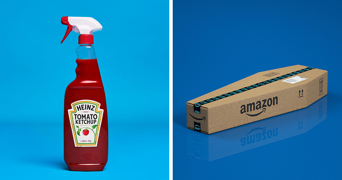
Sanchez transforms familiar logos, household products, food, packaging, and LEGO pieces into polished visual jokes. An Amazon box becomes a giant cardboard brick. A transparent minifigure head is packed with dozens of anxious yellow heads. A cow-patterned LEGO character appears to have spent two million digital hairs preparing for its close-up. Nothing is entirely normal, but everything is recognizable enough to make the joke land immediately.
The 33 images collected here demonstrate how playful 3D design can turn ordinary objects into miniature stories. They are simple enough to understand in seconds, yet carefully constructed enough to reward a closer look. The result is a colorful collision of nostalgia, branding, product photography, and the sort of humor that makes viewers groan, smile, and share the image anyway.
Who Is Jaime Sanchez?
Jaime Sanchez is a Spanish art director and 3D artist based in Málaga. His professional work combines art direction, illustration, digital photography, typography, and CGI. His portfolio includes personal projects as well as campaigns and collaborations associated with brands such as Nissan, Estée Lauder, Wilson Sports, OnePlus, UGG, Happy Socks, and Affinity Photo. His work has also appeared on major creative platforms and in international design publications.
Those credentials sound serious, but Sanchez’s personal art rarely behaves itself. His portfolio contains projects with names such as Minimal LEGO, LEGO Bricks, Logo Food, Brandmaniac, and The Brandphabet. These titles reveal his favorite playgrounds: famous symbols, common products, bold colors, and ideas that can be understood before the viewer has time to scroll away.
Why LEGO Works So Well as a Visual Language
A LEGO brick is one of those rare objects that remains recognizable after radical transformation. Change its material, enlarge it, cover it in fur, turn it into food, or attach it to a famous logo, and the basic form still announces itself.
That recognition has deep cultural roots. The LEGO Group was founded in 1932, while the familiar interlocking brick design reached its modern form in 1958. The stud-and-tube system was created to let pieces connect reliably while remaining reusable, giving generations of builders a standardized vocabulary for making almost anything.
Sanchez treats that vocabulary almost like punctuation. One brick can become the punchline. A grid of studs can transform a shipping box into an oversized toy. A minifigure head can serve as both a container and its contents. The humor depends on our ability to identify the LEGO form instantly, even when it has been pushed into an absurd new context.
There is also a powerful dose of nostalgia. Adults who grew up snapping bricks together already know the tactile language of studs, tubes, plastic seams, stiff hands, and cylindrical heads. Sanchez does not need to explain the rules. He simply breaks them.
The Best Visual Jokes Have a Simple Setup
Many of the artworks follow the structure of a good one-line joke. First, Sanchez presents something familiar. Then he introduces a single unexpected substitution.
A Fried Egg With a LEGO Yolk
In one delightfully unnecessary breakfast invention, a fried egg sits on a yellow plate while the yolk has been replaced by a round orange LEGO element. The colors feel natural, which allows the substitution to register a fraction of a second late. Your brain sees “egg,” pauses, and then notices that breakfast has apparently been manufactured in Billund.
The image is funny because the alteration is restrained. Sanchez does not build an entire kitchen out of bricks. He changes one component and lets the contrast do the work.
The Amazon Package That Became a Brick
Another composition turns an Amazon shipping package into a chunky LEGO block. Cardboard-colored studs rise from the top, while the company’s familiar tape and lettering preserve the identity of the original box.
The joke connects two systems built around assembly and anticipation. LEGO pieces arrive ready to become something new, while an unopened delivery box promises something that may improve your lifeor turn out to be three phone cables you forgot ordering at midnight.
A LEGO Head Full of LEGO Heads
One of Sanchez’s more surreal concepts features a transparent minifigure head stuffed with smaller yellow heads. A cartoon face added to the outside makes the container appear appropriately alarmed about the crowded situation happening inside it.
It is cute, strange, and mildly existential. Is it a portrait of overthinking? A visual metaphor for social anxiety? A warning about storing spare minifigure parts incorrectly? Sanchez wisely leaves the interpretation open.
The Hairiest LEGO Cow in Digital History
A cow-patterned minifigure demonstrates how material can become the entire joke. Instead of smooth plastic, the character is covered with soft white fibers and black patches. Sanchez described the piece as requiring nearly two million hairs, turning a simple LEGO figure into a remarkably committed bovine.
The humor comes from contradiction. LEGO characters are usually shiny, hard, and obviously artificial. Covering one in realistic fur makes it look both more alive and much more ridiculous.
Brand Logos Become Ingredients
Sanchez’s logo-based art works because famous brand marks function like a shared visual shorthand. A swoosh, a bitten apple, a striped package, or a familiar type treatment can identify a company without requiring a complete product photograph.
Logo recognition, however, is not the same as perfect visual memory. Research discussed by Smithsonian Magazine found that people can recognize extremely familiar logos while still struggling to reproduce their exact details. That gap gives artists room to modify a symbol while preserving its identity.
In Sanchez’s hands, logos are not sacred corporate artifacts. They are ingredients. He stretches them, builds them from unexpected materials, attaches them to food, or converts their recognizable shapes into three-dimensional objects.
Logo Food and Edible Branding
The Logo Food project blends popular brand identities with edible forms. This pairing works because packaging and food advertising already spend enormous effort making products look irresistible. Sanchez simply removes the final layer of restraint and lets the logo become the snack.
The results resemble advertisements from an alternate universe where branding teams are allowed to work immediately after lunch. Logos become soft, sticky, crunchy, glossy, or suspiciously nutritious. Corporate identity is no longer printed on the package; it has become the product itself.
Brandmaniac and the Pleasure of Recognition
Brandmaniac expands the same concept into a colorful series of playful 3D interpretations of iconic brands. The project illustrates how quickly viewers participate in the joke. We mentally compare the modified object with the original logo, identify the difference, and enjoy being clever enough to recognize it.
This interaction turns the viewer into a collaborator. Sanchez supplies the altered symbol, but the audience completes the punchline from memory.
Everyday Items Are Funniest When They Almost Make Sense
Sanchez frequently begins with household items so ordinary that they normally disappear into the background. Toilet paper, boxes, fire extinguishers, food, clothing, containers, and toys become interesting only after their expected materials or functions are disturbed.
A roll of toilet paper rendered in LEGO form is funny because the object remains perfectly identifiable while becoming spectacularly impractical. Plastic bricks may solve many problems, but softness is not among their celebrated qualities. The imagined user experience does half the comedic work.
This technique has a long relationship with modern art. Pop artists regularly borrowed consumer products, advertising imagery, and ordinary commodities, while Surrealist artists disrupted familiar objects by changing their materials or contexts. Sanchez uses a cheerful digital version of that strategy: make the ordinary strange, but keep it attractive enough to belong in an advertising campaign.
Bright Colors Make the Absurdity Feel Friendly
The humor in these artworks is amplified by Sanchez’s color choices. Many compositions use clean backgrounds, saturated yellows, bright blues, vivid reds, and glossy product-style lighting. The images rarely feel chaotic, even when the idea is completely bonkers.
Color gives each object a clear silhouette and emotional temperature. Yellow creates an immediate connection to traditional minifigure heads. Red adds appetite, urgency, or cartoonish drama. Blue backgrounds separate warm-colored objects and help them pop from a small social-media thumbnail.
The polished palette also creates a productive mismatch. The images look like expensive commercial campaigns, but the products being advertised may include a furry LEGO cow or an egg with a plastic yolk. The more professionally the nonsense is presented, the funnier it becomes.
How the 3D Illusions Are Made
Sanchez has identified Cinema 4D and Octane Render as tools used for projects such as Logo Food and his LEGO-inspired compositions. Cinema 4D supports modeling, texturing, animation, simulation, lighting, and rendering, while OctaneRender is a GPU-based rendering engine designed to produce physically detailed lighting and materials.
Modeling the Central Idea
The process likely starts with the visual concept rather than the software. A strong Sanchez-style image can often be summarized in one sentence: an Amazon box is a LEGO brick; a minifigure is covered in cow hair; a logo is made from food.
Once the premise is clear, basic forms can be modeled or assembled. Familiar objects require enough accurate detail to remain recognizable, but not so much complexity that the joke becomes buried under technical showing off.
Materials Sell the Joke
Materials are crucial because many compositions depend on the collision between what an object looks like and what it appears to be made from. Plastic needs subtle reflections. Cardboard needs fibers and roughness. Food needs moisture, translucency, irregular edges, or believable softness. Fur requires thousandsor apparently millionsof strands.
Without convincing materials, the concepts would feel like sketches. With them, the impossible objects look almost ready to be photographed, shipped, eaten, or returned for store credit.
Lighting Creates a Commercial Finish
Sanchez often uses lighting associated with studio product photography: soft shadows, bright highlights, controlled reflections, and uncluttered backgrounds. This makes each artwork easy to read while giving it the authority of a real campaign image.
The lighting is not merely decorative. It is part of the misdirection. For a moment, the viewer accepts the object as a legitimate product before realizing that no sensible factory would manufacture it.
Why These Pictures Work So Well Online
Social platforms reward images that can communicate before a viewer finishes moving a thumb. Sanchez’s compositions typically feature one central object, strong contrast, a simple background, and a joke that can be decoded without reading a caption.
That visual economy is important on small screens. Design analysis published by AIGA has noted how reduced forms and immediate recognition help images remain memorable when they circulate as tiny social-media thumbnails. Sanchez’s work is practically built for that environment.
His pictures also invite lightweight participation. Viewers can identify the reference, tag a friend, debate which image is funniest, or offer another object for the artist to transform. The work creates conversation without demanding a graduate seminar first.
Most importantly, the images are generous. They do not punish viewers for lacking specialist knowledge. Recognizing a delivery box, a LEGO head, a piece of food, or a famous logo is enough to enter the joke.
What Designers Can Learn From Jaime Sanchez’s Art
Start With One Clear Twist
A composition does not need twelve competing ideas. Sanchez’s strongest images can usually be reduced to one unexpected substitution. The object stays familiar, while one feature changes dramatically.
Use Recognition Before Reinvention
Complete randomness rarely produces a satisfying visual joke. The audience needs a stable reference point. A recognizable logo, toy, package, or household item gives the artist something solid to disrupt.
Make Technique Serve the Concept
Photorealistic materials and careful lighting are impressive, but they remain supporting actors. The central idea must work before the render begins. A weak joke with perfect reflections is still a weak jokeonly shinier.
Build a Consistent Visual World
Sanchez moves between logos, toys, food, and household products, yet the artwork remains recognizable as his. Repeated visual habitsbold color, isolated objects, smooth studio lighting, tactile materials, and playful contradictionscreate a consistent creative identity.
Experiencing the 33 Pictures Without Rushing Past Them
The best way to experience this collection is to resist treating it as another pile of images to be consumed at scrolling speed. The jokes are immediate, but the craftsmanship becomes clearer when each composition receives a few extra seconds.
Begin by looking only at the silhouette. Sanchez often chooses objects that remain readable even when reduced to their outer shape. A minifigure head, a brick, a shipping package, or a famous mouth logo can be identified before the textures become important. This is a useful reminder that good visual communication begins with structure, not decorative detail.
Next, notice the moment when the image stops making sense. Perhaps the surface material is wrong. Maybe a logo has become food. A product has grown studs. A container is filled with miniature versions of itself. That moment of contradiction is where the humor lives.
After the joke lands, examine the details that make the object believable. Look at the tiny shadows around a LEGO stud, the rough edge of cardboard, the soft fibers on a furry figure, or the reflections on a transparent plastic head. These details may not be the first thing viewers notice, but they prevent the artwork from feeling disposable.
A fun viewing exercise is to cover the caption and guess the concept before reading anything. Most of the pictures communicate successfully without explanation. When an image does require an extra second, the delayed recognition often produces an even stronger laugh.
The collection can also change the way ordinary surroundings look afterward. A soap dispenser begins to resemble a minifigure torso. A six-pack carton looks suspiciously compatible with LEGO studs. The rounded corner of an appliance starts to suggest a giant toy component. Sanchez’s art encourages the viewer to play the same mental game: What is this object, and what else could it become?
For designers and illustrators, another useful experience is attempting to write ten Sanchez-style concepts without opening any 3D software. Choose an object on the desk and combine it with an unrelated brand, material, or function. A keyboard made from chocolate might be obvious. A coffee mug with sneaker soles could be stranger. A roll of tape modeled as a glazed doughnut may already sound like something the internet would enthusiastically misunderstand.
Most of those ideas will be terrible. That is part of the process. Visual humor requires editing. The strongest concepts are usually the ones that can be described quickly and recognized instantly. If the explanation takes longer than the render, the idea probably needs another pass.
Viewing all 33 pictures together also reveals the value of working in a series. One humorous transformation is entertaining. Dozens of transformations establish a world with its own logic. The audience begins anticipating the next collision between LEGO, branding, food, and daily life.
By the final image, the collection has done more than deliver individual jokes. It has trained the viewer to see familiar objects as flexible ingredients. That playful shift in perception may be the most memorable part of Sanchez’s work.
Conclusion: A Colorful Reminder Not to Take Objects Too Seriously
Jaime Sanchez’s humorous 3D art succeeds because it combines technical precision with uncomplicated curiosity. He looks at the visual worldlogos, toys, packages, food, and domestic objectsand asks the question that serious adults frequently forget: “Wouldn’t it be funny if this were something else?”
His LEGO-inspired artwork is nostalgic without being trapped in nostalgia. His brand experiments use recognition without feeling like conventional advertising. His everyday objects remain familiar enough to understand but strange enough to deserve a second look.
The 33 pictures offer quick laughs, but they also demonstrate valuable lessons about simplicity, materials, color, composition, and visual storytelling. Most of all, they prove that a highly polished piece of digital art can still have the mischievous energy of someone clicking two unrelated bricks together just to see what happens.
Note: This independent editorial analysis was informed by the artist’s official portfolio and professional profiles, project pages, LEGO historical materials, 3D software documentation, museum resources, and established art and design publications. LEGO and the other brand names discussed remain the property of their respective owners.