Matching colors can feel like one of those mysterious talents people are either born with or permanently deniedlike parallel parking or folding a fitted sheet. Fortunately, color coordination is not magic. It is a practical skill built from a few dependable principles, a little observation, and the willingness to test a combination before painting an entire living room electric lime.
Whether you are decorating a home, assembling an outfit, designing a website, creating a presentation, or choosing colors for a brand, the same fundamentals apply. You need to understand how hues relate, how light and darkness affect balance, and how much of each color to use. Once those ideas click, choosing attractive color combinations becomes far easierand considerably less dangerous to your walls.
Start With the Basic Language of Color
Before learning how to match colors, it helps to understand what you are actually matching. People often use words such as “shade,” “tone,” and “color” interchangeably, but each describes a different characteristic.
Hue
Hue is the basic color family: red, orange, yellow, green, blue, or violet. Burgundy and cherry are different versions of red, but they belong to the same general hue.
Value
Value describes how light or dark a color appears. Baby blue has a light value, while navy has a dark value. A palette containing different values usually looks more dimensional than one in which every color has roughly the same brightness.
Saturation
Saturation refers to a color’s intensity. A vivid emerald is highly saturated; a dusty sage is more muted. Colors with similar saturation levels tend to feel naturally connected. A neon orange placed beside a faded mauve may look accidental unless one is deliberately used as a small, dramatic accent.
Tints, Shades, and Tones
A tint is created by lightening a hue, traditionally by adding white. A shade is a darker version, traditionally made by adding black. A tone is softened by adding gray or otherwise reducing intensity. These variations explain why a monochromatic blue room can include powder blue, denim, slate, and midnight without looking as if a single paint can exploded.
Color theory organizes these relationships so artists and designers can create combinations that feel harmonious, energetic, calm, or deliberately uncomfortable. Color is also affected by human perception, surrounding surfaces, materials, and light, which is why a sample can look perfect in a store and strangely suspicious at home.
Use the Color Wheel as Your Matching Map
The color wheel is one of the simplest tools for finding colors that work together. It arranges hues according to their visual relationships, making it easier to identify several proven color schemes. Adobe and Canva both use these traditional relationships in their color-palette tools, including monochromatic, analogous, complementary, and triadic combinations.
Monochromatic Color Schemes
A monochromatic palette uses lighter, darker, brighter, and softer versions of one hue. For example, a blue scheme might combine pale sky-blue walls, a denim sofa, navy pillows, and blue-gray curtains.
This is one of the easiest approaches for beginners because the colors already share a common identity. The secret is introducing enough contrast in value, texture, and material. Without variation, a monochromatic room or outfit can look flatless “sophisticated design” and more “everything was on sale in the same aisle.”
Analogous Color Schemes
Analogous colors sit next to one another on the wheel, such as blue, blue-green, and green. Because neighboring colors share visual ingredients, they create smooth transitions and generally feel calm and cohesive.
Use one hue as the dominant color and the others as support. A bedroom could feature sage walls, teal bedding, and small blue accents. In clothing, olive pants, a forest-green jacket, and a muted yellow-green scarf can produce a layered outfit without creating visual chaos.
Complementary Color Schemes
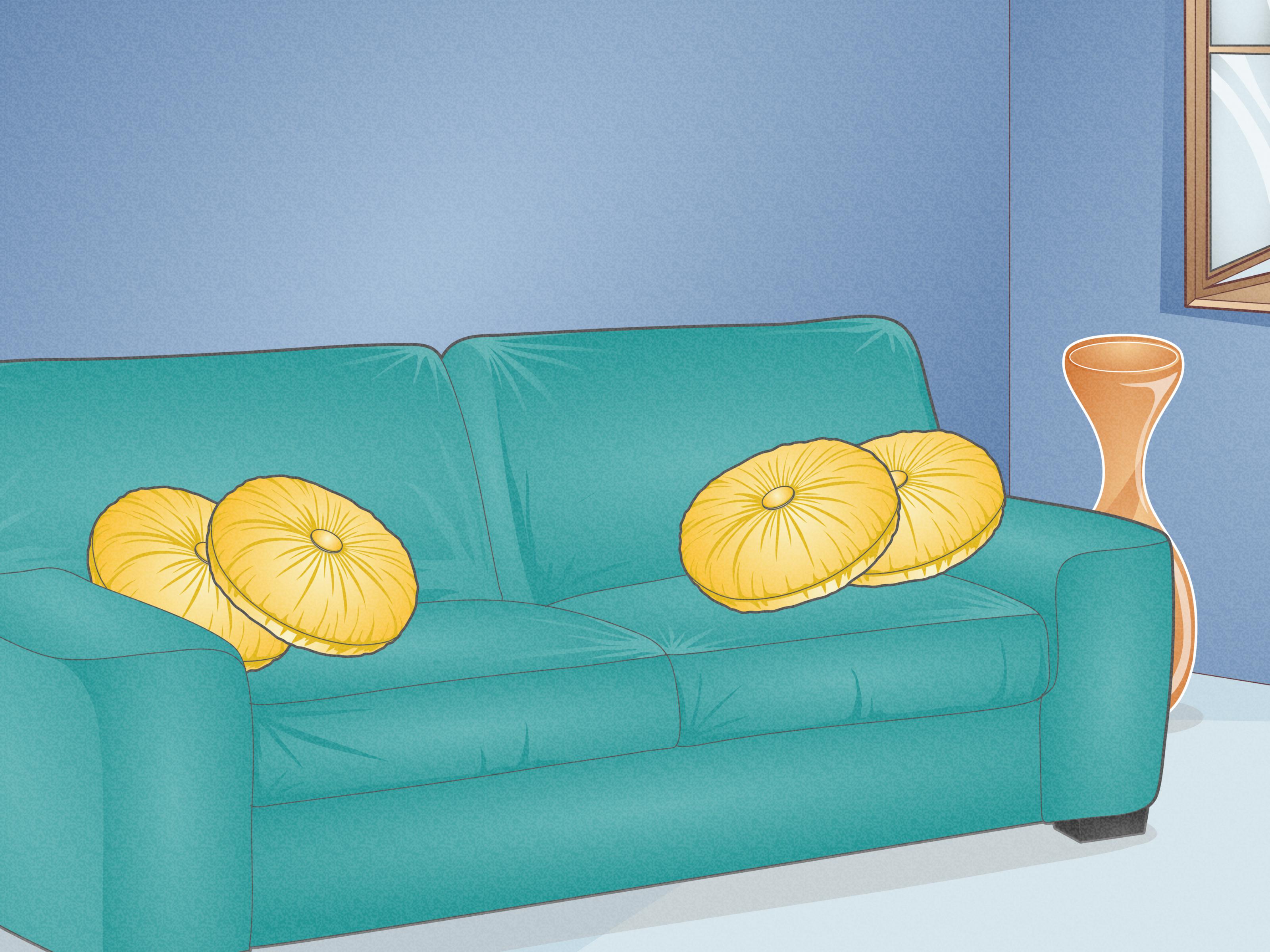
Complementary colors sit opposite each other on the color wheel. Familiar pairs include blue and orange, red and green, and yellow and violet. They create strong contrast because each color makes the other appear more intense.
The safest method is to let one color dominate while using its complement as an accent. Instead of dividing a room equally between bright blue and blazing orange, try deep navy walls with rust-colored pillows or artwork. You get the energy without making visitors wonder whether they have entered a sports mascot convention.
Split-Complementary Color Schemes
A split-complementary scheme begins with one main color and adds the two hues located beside its direct opposite. If blue is the primary color, the supporting colors might be yellow-orange and red-orange.
This approach keeps much of the contrast of a complementary palette but gives you more flexibility. It works especially well when you want a colorful design that feels lively rather than confrontational.
Triadic Color Schemes
A triadic palette uses three colors spaced evenly around the wheel, such as red, yellow, and blue. These combinations can be playful and vibrant, but equal amounts of all three may become overwhelming.
Choose one dominant color, use the second in a smaller supporting role, and reserve the third for highlights. A mostly blue children’s room, for example, could include a yellow rug and small red accessories. The same formula works for presentation slides, packaging, and casual outfits.
Match Undertones, Not Just Color Names
Two objects can both be labeled beige and still look terrible together. The usual culprit is undertonethe subtle warm or cool color beneath the main surface color.
Warm undertones lean toward yellow, gold, peach, orange, or red. Cool undertones lean toward blue, violet, or green. A warm cream may clash with a cool, blue-based gray even though both are technically neutrals. By contrast, warm cream often pairs naturally with camel, olive, terracotta, or chocolate brown.
Undertones are particularly important when choosing whites, grays, woods, metals, makeup, and clothing. Compare samples directly instead of relying on product names. Place the colors beside fixed elements such as flooring, countertops, tile, or furniture. The undertone usually becomes much easier to see when two similar colors are positioned next to each other.
Paint specialists also recommend looking at darker colors on the same sample strip because their undertones are often more obvious. Existing materials matter as well: reddish wood cabinets, golden flooring, or cool stone surfaces may influence which wall colors look balanced.
Balance Warm and Cool Colors
Warm colors such as red, orange, and yellow often feel energetic, sunny, and visually forward. Cool colors such as blue, green, and violet tend to feel calmer and may appear to recede.
You do not have to choose one side and swear lifelong loyalty to it. Many attractive palettes combine warm and cool colors. A cool blue room can feel more welcoming with warm oak, brass, tan leather, or rust-colored textiles. A warm terracotta outfit can be balanced with cool denim or a muted teal accessory.
Neutrals can also lean warm or cool. Ivory, camel, warm taupe, and chocolate belong comfortably with earthy colors. Crisp white, charcoal, blue-gray, and cool stone often work with jewel tones or icy pastels. Matching the temperature of your neutrals is one of the fastest ways to make a palette look intentional.
Use the 60-30-10 Rule
Finding compatible colors is only half the job. You must also decide how much of each one to use. The 60-30-10 rule offers a practical starting point:
- 60 percent: the dominant color that creates the overall foundation
- 30 percent: a secondary color that adds contrast and interest
- 10 percent: an accent color used for emphasis
In a living room, the walls and large rug might represent the dominant 60 percent. Upholstery and curtains could form the secondary 30 percent. Pillows, lamps, books, and artwork provide the final 10 percent.
The same principle applies elsewhere. In an outfit, a navy suit might dominate, a pale blue shirt provides support, and a burgundy tie becomes the accent. On a website, a neutral background can dominate, the brand color can guide navigation and sections, and a contrasting accent can identify important buttons.
The percentages are guidelines rather than legally binding color contracts. Their real purpose is to prevent every color from competing for equal attention.
Let Value Do Some of the Heavy Lifting
A successful palette needs differences in lightness and darkness. Even colors that harmonize beautifully on the wheel can become difficult to distinguish when they share nearly identical values.
One easy test is to photograph your palette and view the image in grayscale. When every element turns into a similar patch of gray, the design may lack hierarchy. Introduce a lighter tint, a deeper shade, or a dark neutral to create structure.
Value is especially important in digital design. Text must remain readable against its background, and information should not rely on hue alone. W3C accessibility guidance calls for a contrast ratio of at least 4.5:1 for most standard text and at least 3:1 for qualifying large text. Icons, controls, charts, and status messages should also remain understandable for people who perceive colors differently.
Consider Lighting Before Making a Final Decision
Color does not exist in isolation. Natural light, artificial light, room direction, surface texture, and finish can all change its appearance.
North-facing rooms often receive cooler, less direct light, while south-facing rooms generally receive warmer, stronger illumination. Morning and afternoon light can also alter the same color throughout the day. A gray that appears balanced at noon may look blue in the morning and slightly violet after sunset.
Lightbulbs matter too. Warm bulbs can emphasize yellow or red undertones, while cooler bulbs may strengthen blue and green notes. Glossy finishes reflect more light and can make color appear richer or brighter; matte surfaces absorb more light and often look softer.
Always test important colors where they will actually be used. Paint a large sample board, move it around the room, and examine it during the morning, afternoon, and evening. For clothing, check an outfit in natural daylight as well as indoor lighting. Computer screens are useful planning tools, but they are not sworn witnesses.
How to Match Colors Step by Step
1. Choose an Inspiration Piece
Start with something that already contains colors you enjoy: a rug, painting, patterned shirt, photograph, fabric, logo, or landscape. Extract three to five colors from it rather than inventing a palette from nothing. Palette generators from Adobe, Canva, and Coolors can help identify hues in an uploaded image.
2. Select a Dominant Color
Choose the color that best supports the desired mood and purpose. A calming bedroom may benefit from a muted blue-green. A call-to-action button may need a stronger, more noticeable accent. A professional outfit might begin with navy, charcoal, camel, or cream.
3. Identify the Undertone
Decide whether the dominant color is warm, cool, or relatively neutral. Match other large elements to that temperature unless you are deliberately creating contrast.
4. Pick a Color Relationship
Choose monochromatic for simplicity, analogous for gentle harmony, complementary for energy, or triadic for playful variety. This eliminates random guessing and provides a logical framework.
5. Adjust Saturation and Value
Do not use every color at maximum intensity. Muting one or more hues makes a bold palette easier to live with. Include both light and dark values to create depth.
6. Add a Neutral
White, cream, gray, tan, brown, navy, and black give the eye somewhere to rest. Neutrals are not boring; they are the responsible adults supervising the brighter colors.
7. Test the Palette in Context
Place physical samples together, create a mood board, or build a digital mockup. Look at the combination from a distance and under real lighting. Change one variable at a time so you can identify what improves or weakens the result.
How to Match Colors in Clothing
For an easy outfit, begin with one neutral and one color. Navy with rust, charcoal with lavender, cream with forest green, or camel with denim are dependable combinations.
For a tonal outfit, wear several values of one hue, such as a light blue shirt, medium-wash jeans, and a navy jacket. Texture prevents the outfit from looking overly uniform.
When wearing a print, pull one smaller color from the pattern and repeat it in your shoes, bag, jacket, or jewelry. The repeated color creates connection without requiring every accessory to match exactly.
Skin undertones can be a useful guide, but they should not become a prison sentence. Cool complexions often harmonize easily with blue-based colors, while warm complexions may suit golden, earthy, and orange-based hues. Personal preference, contrast, hair color, fabric, and makeup also affect the final result. Fashion guidance generally recommends using the color wheel as a tool rather than following outdated rules that demand perfectly matching shoes, belts, and bags.
Common Color-Matching Mistakes
Using Too Many Equal-Strength Colors
When every color is bright, bold, and used in equal amounts, there is no visual hierarchy. Choose a leader and assign the other colors supporting roles.
Ignoring Fixed Elements
Flooring, countertops, stone, wood, and large furniture already contribute color. A palette that looks beautiful on a blank screen may conflict with materials that cannot be changed easily.
Matching Names Instead of Samples
“White,” “beige,” “navy,” and “gray” can describe hundreds of different colors. Compare actual samples because product names are marketing, not scientific evidence.
Forgetting Contrast
Harmony is important, but excessive similarity can make a design muddy or unreadable. Add contrast through value, texture, scale, finish, or a controlled accent color.
Following Trends Instead of Purpose
A fashionable palette is not automatically appropriate for your home, wardrobe, audience, or brand. Trends can provide inspiration, but the best color combination is one that supports the intended mood and remains useful after the internet discovers a new favorite beige.
Practical Color Combinations to Try
- Navy, cream, and rust: classic, warm, and polished
- Sage, ivory, and natural wood: soft and organic
- Charcoal, blush, and brass: modern with gentle warmth
- Teal, terracotta, and sand: balanced cool and warm tones
- Olive, camel, and burgundy: rich and earthy
- Powder blue, chocolate brown, and white: fresh but grounded
- Black, warm white, and mustard: graphic with a lively accent
- Plum, taupe, and dusty rose: sophisticated and tonal
Experience-Based Lessons From Matching Colors
One of the first lessons color teaches is that confidence often arrives immediately after a mistake. A palette may look flawless when the samples are neatly arranged on a desk. Then the wall is painted, the curtains are hung, and the “subtle gray” suddenly reveals that it has been lavender all along.
The most useful habit I have learned is to begin with the least flexible element. In a room, that might be flooring, tile, a sofa, or an expensive countertop. In an outfit, it could be a patterned dress or a statement jacket. In branding, it may be an existing logo. Matching smaller, replaceable elements to that anchor is much easier than falling in love with a color first and attempting to force everything else into cooperation.
Large samples are another major improvement. Tiny paint chips are helpful for narrowing choices, but they cannot show how a color behaves across an entire wall. The same problem occurs with fabric swatches and digital palettes. A color occupying two square inches may seem restrained; covering a twelve-foot wall, it may develop the personality of a parade float. Testing on a larger board reveals intensity, undertone, and reflection more honestly.
I have also found that reducing saturation solves many combinations that initially appear incompatible. Bright blue and orange can feel aggressive when both are fully saturated. Change them to dusty denim and burnt terracotta, however, and the relationship becomes warm, balanced, and surprisingly versatile. The underlying complementary structure remains, but the volume has been turned down.
Another reliable lesson is to repeat colors, but not mechanically. A small amount of the wall color can appear in artwork. A rug color can return in a pillow. The metal finish of a lamp can be echoed in a frame or cabinet handle. These repetitions act like visual punctuation, helping separate objects feel related. They do not need to match perfectly; slight variation often makes a design look more natural.
When a palette still feels wrong, I check value before replacing the hues. Several beautiful mid-value colors can blend into an indecisive soup when placed together. Adding a deep charcoal, crisp white, or pale neutral may create the missing structure. In outfits, dark shoes or a light shirt can provide the same anchoring effect. On a website, darker text and a clearly contrasting button can transform a vague palette into an organized interface.
Photographs are excellent diagnostic tools. Looking directly at a room or outfit, the brain adapts and excuses small problems. A photograph creates distance. Converting it to grayscale reveals whether the composition has enough light-dark contrast. Viewing it as a thumbnail shows which color dominates and whether the intended focal point is actually noticeable.
Finally, personal preference deserves more authority than rigid color rules. Color theory explains why combinations behave as they do, but it does not require everyone to desire the same result. Some people love muted, low-contrast palettes. Others feel happiest surrounded by crimson, cobalt, emerald, and enough pattern to make a minimalist request emergency assistance.
The strongest results come from understanding the rules and then adjusting them deliberately. When a bold combination works, it is usually because proportion, undertone, saturation, value, or repetition is quietly holding everything together. What looks effortless is often simply well balanced.
Conclusion
Learning how to match colors begins with a few practical principles: use the color wheel, pay attention to undertones, vary light and dark values, control saturation, and give each color a clear role. Monochromatic and analogous palettes provide easy harmony, while complementary and triadic combinations create more energy. Neutrals add breathing room, and the 60-30-10 rule helps prevent a colorful free-for-all.
Most importantly, test colors in their real environment. Light, material, scale, and surrounding objects can change how a color appears. With practice, you will stop asking whether two colors are technically allowed to go together and start recognizing what they needmore contrast, less saturation, a better proportion, or perhaps a polite amount of beige supervision.
Note: Color perception varies with lighting, screens, materials, finishes, and individual vision. Always test physical samples and verify digital contrast before making a final decision.