If Excel feels like a giant digital filing cabinet that occasionally judges your formatting choices, you are not alone. The good news is that making a pie chart in Excel is much easier than it looks. Once your data is set up correctly, Excel can turn a plain little table into a colorful chart that instantly shows which category takes the biggest slice of the pie. Literally.
This step-by-step guide walks you through exactly how to make a pie chart in Excel, how to customize it, and how to avoid the mistakes that make pie charts look like a confusing pizza menu. Whether you are building a chart for a report, presentation, budget breakdown, sales recap, or classroom project, this guide will help you make an Excel pie chart that is clean, readable, and actually useful.
What Is a Pie Chart in Excel?
A pie chart is a circular chart divided into slices. Each slice represents a category, and the size of that slice shows how much it contributes to the total. In other words, a pie chart is best for showing parts of a whole. If one category is half of the total, that slice should look like half the pie. No math drama required.
In Excel, pie charts are especially handy for visualizing simple comparisons such as:
- Monthly household spending by category
- Market share by brand
- Survey responses by choice
- Department budget allocations
- Website traffic by source
When a Pie Chart Works Best
Before you make a pie chart in Excel, it helps to know when this chart type actually makes sense. A pie chart works best when you have one data series, a limited number of categories, and values that represent pieces of one complete total. If your data includes a dozen tiny categories, negative values, or a time trend, a bar chart or line chart may do a much better job.
Here is the sweet spot for an Excel pie chart:
- You want to show proportions or percentages
- Your categories add up to one whole
- You have a small number of categories
- Your values are positive and easy to compare
- You want a quick visual summary, not a statistical dissertation
If your chart starts looking like confetti, that is Excel’s polite way of saying, “Maybe use a bar chart instead.”
How to Prepare Your Data for a Pie Chart
The most important step happens before you click anything in the Insert tab. Excel pie charts need simple, clean data. Usually that means one column for category labels and one column for values.
| Category | Value |
|---|---|
| Rent | 1200 |
| Groceries | 450 |
| Utilities | 200 |
| Transportation | 150 |
| Entertainment | 100 |
That is the kind of data Excel loves. It is clean, direct, and not trying to be mysterious.
Best Practices for Data Setup
- Use one column for category names
- Use one column for numeric values
- Avoid blank rows or columns in the selected range
- Keep the number of categories limited
- Make sure values are not negative
- Remove or rethink categories with zero values when possible
How to Make a Pie Chart in Excel: Step by Step
Step 1: Enter Your Data
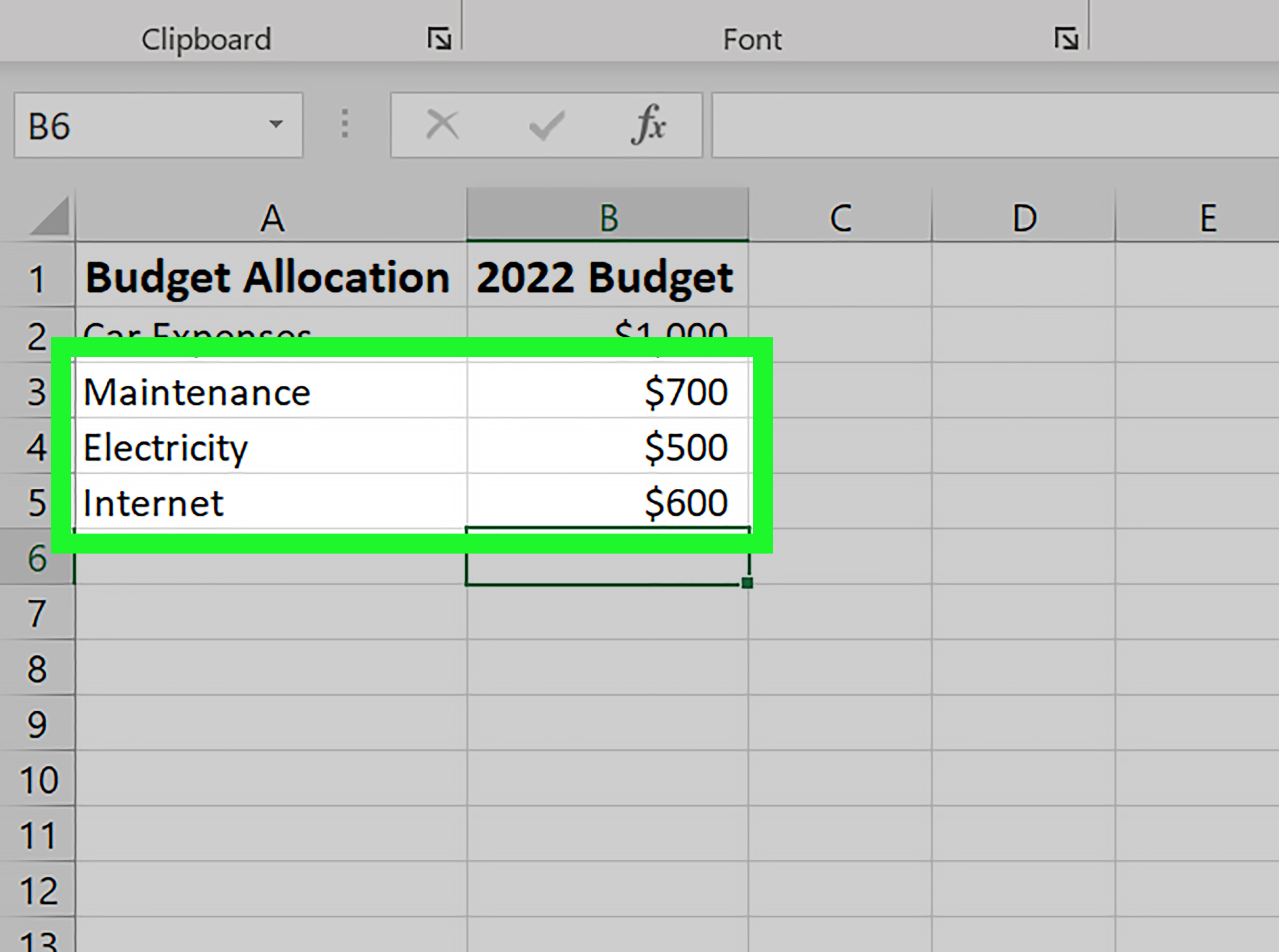
Open Excel and type your data into the worksheet. Put your category names in the first column and your values in the second column. Include clear headers such as Category and Amount. Excel uses these headers to help label your chart, so this is not the time to name a column “Stuff.”
Step 2: Highlight the Data Range
Click and drag to select the full data range, including the headers. For the example above, that would include both the category names and the values. If you only select the numbers, Excel may produce a chart with unlabeled slices, which is about as helpful as a map with no city names.
Step 3: Go to the Insert Tab
Once your data is selected, go to the Insert tab on the Excel ribbon. In the Charts group, look for the pie chart icon. Click it to open the menu of available pie and doughnut chart types.
Step 4: Choose a Pie Chart Type
Excel usually gives you several options, including:
- 2-D Pie
- 3-D Pie
- Pie of Pie
- Bar of Pie
- Doughnut
For most users, the standard 2-D Pie is the best choice. It is cleaner, easier to read, and less likely to make your chart look like it escaped from a 2007 sales meeting.
Step 5: Let Excel Insert the Chart
After you choose the chart type, Excel will place the pie chart into your worksheet automatically. At this point, you have officially made a pie chart in Excel. Victory. Tiny, circular victory.
The chart will usually include default colors, a legend, and a generic title. It works, but it probably does not look ready for a report yet. That is where customization comes in.
Step 6: Add a Chart Title
Click the default chart title and replace it with something specific. A good title tells readers what they are looking at immediately.
Weak title: Chart 1
Better title: Monthly Household Budget Breakdown
Be clear and direct. Your future self will thank you when you open the file two weeks later and do not have to guess what “Chart 1” was supposed to mean.
Step 7: Add Data Labels
Data labels are one of the best upgrades you can make to an Excel pie chart. They show values, category names, percentages, or a combination of these directly on the slices.
To add them:
- Click the chart
- Click the Chart Elements button next to it
- Check Data Labels
Then right-click the labels and choose Format Data Labels to decide what you want to display.
Step 8: Show Percentages
If your goal is to show each category’s share of the whole, percentages are usually the most useful label format. Inside the Format Data Labels pane, check Percentage. You can also show both the category name and percentage if you want maximum clarity.
For example:
- Rent 57%
- Groceries 21%
- Utilities 10%
- Transportation 7%
- Entertainment 5%
That is much easier to read than forcing people to bounce between a legend and a mystery-colored slice.
Step 9: Format the Colors and Style
Click the chart, then use the Chart Design and Format tabs to customize the appearance. You can change colors, apply styles, and improve readability.
Here are a few smart formatting tips:
- Use contrasting but simple colors
- Avoid overly bright neon combinations unless chaos is your brand
- Use direct slice labels when possible
- Keep the background clean
- Choose larger text for presentations
Step 10: Move or Remove the Legend
Excel usually adds a legend automatically. That can be helpful, but if your chart already has data labels on each slice, the legend may be redundant. You can move it, resize it, or remove it entirely.
Sometimes less is more. Sometimes less is just less clutter.
Step 11: Explode a Slice for Emphasis
If you want to highlight one category, you can “explode” a slice by pulling it slightly away from the center. This is useful when you want to draw attention to a specific segment, such as the largest expense or the most important survey result.
To do this:
- Click the pie chart
- Click the slice again to select just that slice
- Drag it outward slightly
Use this sparingly. One emphasized slice looks intentional. Three emphasized slices look like the pie chart is falling apart emotionally.
How to Make a Better Pie Chart in Excel
Creating the chart is easy. Creating a good chart is where the magic happens.
Sort Categories by Size
When categories are arranged from largest to smallest, readers can scan the chart faster. The chart feels more organized, and percentages are easier to understand at a glance.
Group Tiny Categories
If you have several tiny slices, consider combining them into an Other category. This keeps the chart readable and prevents the dreaded multicolored sprinkle effect.
Use Pie of Pie for Small Segments
If you truly need to show many small segments, Excel offers Pie of Pie and Bar of Pie chart types. These separate small values into a secondary chart so they are easier to distinguish. It is a nice option when the standard pie chart becomes too crowded.
Rotate the Pie for Better Visibility
Excel lets you rotate the chart so smaller slices appear in a better viewing position. This can improve readability without changing the data itself. It is a subtle trick, but a good one.
Common Mistakes to Avoid
- Using too many categories
- Using negative values in a pie chart
- Leaving slices unlabeled
- Relying only on a legend when direct labels would be clearer
- Using 3-D effects that distort slice sizes
- Choosing a pie chart when a bar chart would compare values more clearly
If your main goal is comparing categories precisely, a bar chart is often stronger. Pie charts are great for showing broad proportions, but they are not always the champion of detailed comparison.
Example: Making a Pie Chart for a Budget Report
Let’s say you are preparing a household budget report in Excel. Your data includes rent, groceries, utilities, transportation, and entertainment. You want to show where the money goes each month.
You enter the data, highlight the range, choose Insert > Pie > 2-D Pie, and then add percentage labels. Next, you change the title to Monthly Household Budget Breakdown and use muted colors instead of the default rainbow circus. The result is a clean, useful visual that instantly shows rent as the dominant expense.
That is exactly where Excel pie charts shine. They turn ordinary numbers into an immediate visual story.
Troubleshooting Excel Pie Chart Problems
Why Are My Labels Missing?
You may not have turned on data labels, or the chart may be too crowded. Reduce categories or move labels outside the slices.
Why Does the Chart Look Wrong?
Check your source data. Blank cells, zero values, missing headers, or extra rows can all confuse Excel.
Why Is a Pie Chart Not the Best Choice?
If your data tracks changes over time or compares many categories, switch to a line chart or bar chart instead. Excel has plenty of chart types, and the best one depends on what story your data needs to tell.
Practical Experience and Real-World Tips for Making Pie Charts in Excel
After working with Excel charts in reports, presentations, and content projects, one thing becomes obvious very quickly: making a pie chart in Excel is easy, but making one that people understand in three seconds is the real skill. In real-world use, most people do not stare at your chart with scholarly patience. They glance at it, form an opinion, and move on. That means your Excel pie chart has to do its job fast.
One of the biggest lessons from experience is that less almost always wins. The first instinct is often to include every category because “more detail” feels smarter. In practice, that usually makes the pie chart weaker. A chart with four or five clearly labeled slices is far more powerful than a chart with eleven microscopic wedges that require detective work. If small categories matter, grouping them into Other often produces a chart that communicates better without hiding the truth.
Another practical tip is to think about where the chart will live. A pie chart that looks fine on your laptop may become unreadable in a slide deck or on a mobile screen. If your chart is going into a presentation, use larger fonts, shorter labels, and high-contrast colors. If it is for a web article, keep the title specific and make sure the labels are legible even when the image is scaled down. Excel gives you lots of formatting controls, but restraint matters more than decoration.
There is also a big difference between showing values and showing percentages. In most business and editorial settings, percentages tell the story faster. A slice labeled 42% is easier to understand than a slice labeled 8,450 unless the raw value itself is the point. In many cases, the best approach is to show both category names and percentages. That removes guesswork and reduces the need for a separate legend.
Experienced Excel users also learn not to fall in love with 3-D pie charts. They may look dramatic, but they often distort visual proportions. A front slice can appear larger than it really is, while a slice in the back looks smaller. If your goal is clarity, the plain 2-D pie chart is usually the better choice. It is not flashy, but it is honest, and honesty is underrated in spreadsheets.
Finally, the smartest chart-makers are not loyal to the pie chart at all. They use it when it fits and abandon it when it does not. That is probably the most valuable experience-based tip of all. If your data is not telling a part-to-whole story clearly, do not force it into a pie. Excel offers bar charts, column charts, line charts, and more for a reason. The best chart is not the fanciest one. It is the one your audience understands immediately.
Final Thoughts
Learning how to make a pie chart in Excel is one of those small skills that pays off again and again. It helps you present data more clearly, communicate faster, and make your spreadsheets look much more polished. The process is simple: organize your data, highlight it, insert the chart, then improve it with labels, percentages, and thoughtful formatting.
Keep your categories limited, make your labels clear, and remember that a good pie chart should answer a question at a glance. If your audience has to squint, guess, or interpret ten similar slices, it is time to simplify. Excel is powerful, but your chart should still feel friendly. Like a pie. Not like homework.