Editorial note: This guide is written in a 2018 marketing context. The principles still matter, but always test your campaign against your current privacy, accessibility, email, and search requirements.
Exit popups have a reputation problem. To some visitors, they are helpful little reminders. To others, they are the digital equivalent of a store clerk sprinting after you in the parking lot shouting, “Wait! You forgot to join our newsletter!”
The truth sits somewhere in the middle. An exit popup can help recover leads, email subscribers, abandoned carts, and hesitant buyers. But it only works when it appears at the right moment, offers something genuinely useful, and lets people say “no thanks” without needing a detective, a magnifying glass, and three cups of coffee to find the close button.
In 2018, smart marketers were moving away from the “show everyone the same giant discount box” approach. The better strategy was behavioral targeting: show a relevant message to a visitor who has demonstrated interest and appears ready to leave. Done well, an exit popup becomes a final helpful nudge. Done badly, it becomes a tiny hostage situation with rounded corners.
What Is an Exit Popup?
An exit popup, also called an exit-intent popup or exit-intent overlay, is a message that appears when a visitor shows signs of leaving a website. On desktop, this commonly happens when the cursor moves toward the browser tab, close button, address bar, or back button area.
The purpose is not to trap visitors. It is to offer one final, relevant reason to stay, subscribe, shop, request a demo, download a resource, or answer a quick question.
For example, a visitor may be leaving a product page after viewing a pair of running shoes. Rather than showing a generic “Join Our Newsletter!” message, a smarter exit popup could say:
Not ready to race yet?
Get 15% off your first pair of running shoes, plus our beginner half-marathon checklist.
That message matches the page, the visitor’s likely interest, and the moment. It does not feel completely random. That is the difference between conversion optimization and digital door-to-door salesmanship.
Why Exit Popups Can Improve Conversions
Most website visitors leave without completing the action you hoped for. They may be comparing prices, researching options, waiting for payday, getting distracted by a meeting, or suddenly remembering that they left a pizza in the oven. An exit popup gives your brand another chance to stay connected before the visitor disappears into the internet wilderness.
For ecommerce businesses, exit popups can help recover visitors who abandon a cart or product page. For B2B companies, they can collect demo requests or encourage a free trial. For publishers and bloggers, they can grow an email list with a useful guide, checklist, template, or exclusive newsletter.
However, an exit popup should not be used as a bandage for a broken website. If visitors leave because your shipping fees appear too late, your checkout form asks for their childhood nickname, or your product page explains nothing useful, fix that first. A popup can recover some losses, but it cannot turn a confusing buying experience into a magical conversion unicorn.
Start With One Clear Conversion Goal
Before designing anything, decide what one action matters most. A popup that tries to collect an email address, sell a product, promote Facebook, request a phone number, schedule a demo, advertise an ebook, and ask for a review is not ambitious. It is confused.
Common Exit Popup Goals
- Collect email subscribers for a newsletter or marketing sequence.
- Reduce cart abandonment with a discount, free shipping, or reassurance.
- Offer a lead magnet such as a checklist, guide, template, or calculator.
- Encourage a demo request or consultation for a high-value service.
- Guide visitors to a more relevant page, category, or product.
- Ask one short feedback question to understand why people are leaving.
Pick the conversion that best matches the page. A visitor leaving a pricing page may need a demo, an FAQ, or a case study. A visitor leaving a recipe article may be more interested in a free weekly meal plan. A visitor leaving a shopping cart may need free shipping or a reminder that returns are easy.
Match the Offer to the Visitor’s Intent
The most effective exit popups feel connected to what the visitor was already doing. Relevance matters more than animation, gradients, stock photos, and excessive exclamation points.
Use Page-Level Targeting
Create different exit campaigns for different sections of your site. A visitor reading an article about email marketing should not receive an offer for dog sweaters, unless your company has discovered a very unusual overlap in its audience.
Try segmenting exit popups by:
- Page category or URL.
- Product viewed.
- Cart value.
- Traffic source.
- New versus returning visitor status.
- Location, language, or device type.
- Whether the visitor already subscribes to your list.
Offer Something Worth the Interruption
A visitor is already leaving. Your offer must answer one fast question: “Why should I care?” A vague promise such as “Get updates” rarely creates excitement. People have enough updates. Their inbox already contains newsletters from stores they forgot existed in 2014.
Instead, make the benefit specific. Offer a discount, product guide, buying checklist, free shipping, sample chapter, consultation, limited-time bonus, comparison chart, or useful educational resource.
Here are stronger examples:
- For ecommerce: “Waitget free shipping on your first order today.”
- For SaaS: “Before you go, download the 12-point onboarding checklist.”
- For a service business: “Get a free website conversion audit in five minutes.”
- For a content site: “Enjoying this guide? Get the printable version and weekly tips.”
- For a travel site: “Planning a trip? Download the three-day packing checklist.”
Write Exit Popup Copy That Gets Attention Fast
Visitors do not read exit popups the way they read novels. They scan them in a hurry. Your copy should be brief, concrete, and easy to understand in about two seconds.
Use a Simple Copy Formula
A reliable exit popup structure includes:
- A clear headline: State the benefit or acknowledge the visitor’s hesitation.
- A short supporting line: Explain what they receive and why it matters.
- A direct call to action: Tell them exactly what happens next.
- An easy way to close: Respectful design builds trust.
For instance:
Still deciding?
Get our free comparison guide before choosing your next project-management tool.
Button: Send Me the Guide
Notice that the button does not say “Submit.” Nobody wakes up excited to submit something. Use action-oriented language such as “Get My Discount,” “Show Me the Checklist,” “Send the Guide,” or “Reserve My Spot.”
Avoid Guilt-Trip Buttons
In 2018, many popups used decline buttons such as “No, I Hate Saving Money” or “No Thanks, I Prefer to Fail.” These lines may earn a quick laugh in a marketing meeting, but they can also make a brand seem pushy or insecure.
Use a polite alternative instead:
- “No thanks, I’ll continue browsing.”
- “Maybe later.”
- “I’m not ready yet.”
The goal is not to win an argument with the visitor. The goal is to create a comfortable next step.
Design an Exit Popup That Looks Trustworthy
Your popup should look like it belongs on your website. A completely different font, noisy color scheme, or suspicious stock image can make the message feel like an ad that escaped from another dimension.
Keep the Layout Clean
Use one primary message, one action, and enough white space for the visitor to understand the offer quickly. Avoid filling the popup with paragraphs, multiple buttons, unrelated links, and tiny legal text that looks like it was printed on a grain of rice.
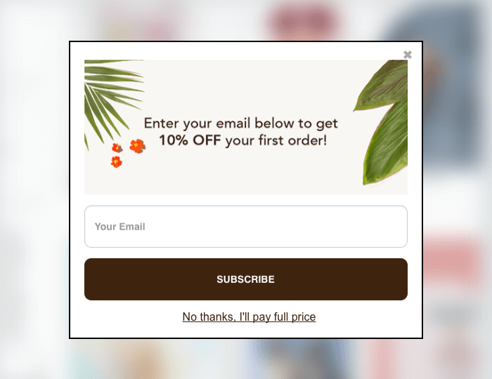
A strong layout often includes:
- A bold headline.
- One short value statement.
- A single email field or short form.
- One visible call-to-action button.
- A clear close icon.
Use Visuals Only When They Help
An image can strengthen a popup when it shows the lead magnet, product, or benefit. For example, displaying the cover of a downloadable ebook can make the offer feel more real. But do not add a photo simply because the design template looked lonely.
On small screens, a compact popup often performs better than a giant overlay that blocks the entire page. Mobile users have limited space and limited patience. Treat both as valuable resources.
Do Not Ignore Mobile Experience
Exit intent works differently on mobile because visitors use fingers instead of cursors. A desktop-style cursor trigger cannot be copied perfectly to a phone. In 2018, marketers often used alternative triggers on mobile, such as scroll depth, inactivity, back-button behavior, page engagement, or time spent on a page.
Be especially careful with full-screen mobile overlays. Visitors arriving from search expect to see the content they clicked. If your popup blocks the page before they can read anything, you risk harming both user experience and trust.
Use a smaller mobile-friendly message, delay it until the visitor has engaged, and make it effortless to close. A popup should never require a precision-tap mission worthy of a video game speedrunner.
Set Smart Display Rules
Timing can make the difference between a helpful final offer and an annoying interruption. Do not show an exit popup to every visitor, on every page, during every visit. Frequency fatigue is real. People may forgive one polite message. They will not enjoy seeing the same message seventeen times while trying to read a single blog post.
Useful Display Rules for 2018 Campaigns
- Show the popup only after a visitor spends a minimum amount of time on the page.
- Exclude visitors who already subscribed or completed the offer.
- Do not show the same popup again for several days after dismissal.
- Use a separate campaign for cart abandoners and content readers.
- Display discounts only on pages where a purchase decision is likely.
- Exclude checkout confirmation pages and customer account pages.
- Limit campaigns to new visitors when the offer is intended for first-time buyers.
These rules protect your brand from popup overload. They also make campaign data more useful because you can see which audience, page type, and offer produces the strongest results.
Make Forms Friction-Free
Every extra field creates another reason to leave. For a simple newsletter or lead magnet, ask for an email address and nothing more. Adding name, company, job title, phone number, industry, shoe size, and favorite dinosaur may provide more data, but it can also provide fewer leads.
For higher-value offers, such as a demo request, additional fields can make sense. Even then, ask only for information your sales team will truly use. If you cannot explain why a field exists, remove it.
Tell people what they are signing up for. A line such as “Get one practical growth tip each Friday” sets expectations better than “Join our list.” Honest expectations also improve the quality of your leads and reduce the risk of unsubscribes later.
Test Before You Declare Victory
A popup that converts at 3% may be excellent for one audience and disappointing for another. The number alone does not tell the whole story. You need to compare results against the value of the leads, sales, and customer experience the popup creates.
What to Test
- Headline and supporting copy.
- Offer type, such as a discount versus a free guide.
- Call-to-action wording.
- Image versus no image.
- Form length.
- Popup size and layout.
- Audience segment.
- Timing and frequency settings.
Test one major variable at a time. If you change the headline, design, discount, button color, form length, and trigger at once, you may get a winner but have no idea why it won. That is not optimization. That is marketing roulette.
Track more than popup conversions. Watch bounce rate, completed purchases, revenue per visitor, email engagement, unsubscribe rate, return visits, and complaints. A popup that collects thousands of low-quality email addresses may look impressive in a spreadsheet while quietly damaging your list.
Common Exit Popup Mistakes to Avoid
Showing the Same Popup Everywhere
A generic offer may be better than no offer, but targeted offers are usually stronger. Match the message to the visitor’s stage in the journey.
Using Discounts as the Only Strategy
Discounts can work, but constant coupons train visitors to wait for one. Mix in useful content, product guidance, free shipping, social proof, comparison tools, or customer support offers.
Making the Popup Hard to Close
Always provide a visible close icon. Allow the Escape key to close desktop overlays where possible. Make sure keyboard and mobile users can dismiss the message easily.
Ignoring What Made Visitors Leave
Use analytics, surveys, heatmaps, session recordings, customer support tickets, and checkout data to understand friction. An exit popup can recover a few people, but a better product page, clearer price, faster site, or simpler checkout can help everyone.
Practical Experience Notes: What Exit Popup Campaigns Often Teach You
Experience with exit popup campaigns tends to reveal an uncomfortable truth: the popup is rarely the hero of the story. The real hero is usually relevance. A beautifully designed popup with a weak offer can perform worse than a plain-looking message that solves a specific problem at the exact right moment.
Consider an online store selling skincare products. Its first attempt may use a generic exit offer: “Get 10% Off Today.” That campaign can attract some email addresses, but it says nothing about why the shopper was browsing. A more thoughtful campaign might appear only on acne-treatment pages and offer a “Seven-Day Sensitive-Skin Routine” along with a small discount. That version can feel more helpful because it responds to the visitor’s actual concern instead of throwing a coupon into the air and hoping it lands somewhere useful.
Another common lesson is that fewer fields usually create more action. A company may initially request an email address, first name, last name, company name, job title, phone number, annual revenue, and preferred lunch sandwich. After simplifying the form to email address plus one optional field, signups often become easier. The sales team may receive less detail at the start, but it gains more opportunities to learn about qualified prospects through follow-up.
Campaign timing can also surprise people. Many marketers assume that an exit popup should appear the instant a cursor heads upward. In reality, showing it too quickly can annoy visitors who were merely opening another tab, switching windows, or trying to use the browser controls. Adding a minimum time-on-page rule or showing the campaign only after the visitor has viewed a product, scrolled through an article, or added an item to a cart can improve the quality of the interaction.
Cart campaigns frequently reveal that price is not the only reason shoppers leave. Some visitors hesitate because they are unsure about delivery speed, return policies, sizing, compatibility, or product quality. A popup that says “Need help choosing the right size?” may outperform a discount for certain products because it removes uncertainty rather than simply lowering the price. Sometimes the best conversion tool is not a coupon. It is a clear answer.
There is also a branding lesson. A popup can create a small emotional moment. If it feels polite, useful, and consistent with the rest of the site, visitors may remember the brand positively even when they do not convert immediately. If it feels aggressive, misleading, or impossible to close, they may remember it toobut not in the charming, “I should buy from them” way.
Finally, exit popup testing teaches patience. A single week of data may not be enough, especially for sites with lower traffic or long buying cycles. Review performance over a meaningful period, compare similar audience segments, and look beyond raw signup numbers. The best exit popup is not necessarily the one with the highest opt-in rate. It is the one that creates the most valuable next step without making the website feel like a carnival booth that learned JavaScript.
Conclusion
An effective exit popup is a last chance to be useful, not a last chance to be loud. Start with a clear conversion goal, target the message to the visitor’s intent, offer something worth accepting, keep the design clean, make dismissal easy, and test every important assumption.
When your popup helps a visitor solve a problem, save money, get useful information, or make a confident decision, it can improve conversions without damaging trust. That is the goal: not more interruptions, but better-timed opportunities.