Blending colors in Photoshop sounds simple until your “soft sunset glow” looks like someone spilled orange soda on a family photo. The good news? Photoshop gives you several ways to blend colors smoothly, naturally, and professionallywhether you are retouching a portrait, painting digital art, designing a poster, creating a dreamy gradient background, or making two colors melt together like butter on toast.
The secret is knowing which blending method to use. A soft Brush gives you control. The Mixer Brush behaves more like real paint. The Smudge Tool pushes pixels around. Gradients create clean transitions. Blend Modes combine colors mathematically. Layer masks let you blend without destroying the original image. In other words, Photoshop is not short on optionsit is more like a buffet where every tool is wearing a tiny artist beret.
In this guide, you will learn how to blend colors in Photoshop step by step, including the best tools, practical settings, common mistakes, and real-world examples. By the end, you will know how to create smooth color transitions without muddy edges, harsh lines, or that dreaded “beginner airbrush cloud” effect.
What Does Color Blending Mean in Photoshop?
Color blending in Photoshop means creating a smooth transition between two or more colors. Instead of having a hard border where red suddenly becomes yellow, blending lets red shift gradually into orange, then into yellow. This can be done by painting, smudging, masking, adjusting opacity, using gradients, or applying blend modes.
Blending is used in many types of Photoshop work. Digital painters use it for skin, fabric, hair, light, and shadow. Photo editors use it to match skin tones, repair color casts, and create natural lighting. Graphic designers use it for backgrounds, overlays, typography effects, and modern web visuals. Product editors use it to smooth reflections and make objects look polished. If Photoshop had a “make this look less awkward” button, color blending would probably be inside it.
Before You Start: Set Up Your Photoshop File Correctly
Good blending starts before you touch the Brush Tool. If your file is messy, your blend will fight back. Start by opening your image or creating a new document in Photoshop. Then make a new layer for your blending work. This keeps your original image safe and gives you the freedom to adjust opacity, change blend modes, erase mistakes, or delete the layer entirely if your artistic experiment becomes a crime scene.
Use Separate Layers
Always blend on a new layer when possible. Click the New Layer icon in the Layers panel, or press Shift + Ctrl + N on Windows or Shift + Command + N on Mac. Naming your layers is also helpful. “Warm glow,” “skin tone fix,” or “blue shadow blend” is far better than “Layer 37 copy final final maybe.”
Choose the Right Color Mode
For most web and digital design projects, use RGB Color. For print work, you may need CMYK, but RGB usually gives you a wider and more flexible color range while editing. You can check this by going to Image > Mode.
Zoom In and Out Often
Color blending can look smooth at 300% zoom and bizarre at normal size. Zoom in to refine details, then zoom out to judge the overall effect. Your audience will usually view the final image at a normal size, not with their face pressed against the pixels like a detective in a Photoshop crime drama.
Method 1: Blend Colors with the Brush Tool
The Brush Tool is one of the easiest and most flexible ways to blend colors in Photoshop. It is especially useful for digital painting, soft lighting, skin retouching, shadows, highlights, and manual color transitions.
Step-by-Step: Soft Brush Blending
- Open your image or create a new canvas.
- Create a new blank layer above your image.
- Select the Brush Tool by pressing B.
- Choose a soft round brush from the Brush Preset Picker.
- Set brush Hardness to 0% for a feathered edge.
- Lower the Opacity to around 10% to 30%.
- Lower the Flow to around 5% to 20% for gradual buildup.
- Paint gently over the transition area, using repeated strokes.
The key here is patience. Low opacity and low flow let you build color slowly. Think of it like adding seasoning to soup. You can always add more, but if you dump in the whole salt shaker, dinner is canceled.
Best Brush Settings for Smooth Blending
For soft color blending, start with a round brush, 0% hardness, 15% opacity, and 10% flow. If you are using a drawing tablet, turn on pressure sensitivity for opacity or flow. This lets your hand pressure control how strongly the color appears, which feels much more natural than painting with a mouse.
For more realistic texture, avoid using only a giant soft brush. A soft brush is helpful, but overusing it can make images look blurry or plastic. Mix in textured brushes, smaller strokes, and subtle noise when needed. Real surfaces have texture. Even a perfectly smooth apple has more character than a plastic bowling ball.
Method 2: Blend Colors with the Mixer Brush Tool
The Mixer Brush Tool is one of Photoshop’s best tools for realistic color blending. Unlike the regular Brush Tool, the Mixer Brush can mix colors already on the canvas, much like wet paint. It is excellent for digital painting, painterly portraits, soft backgrounds, and blending visible brush strokes.
How to Use the Mixer Brush
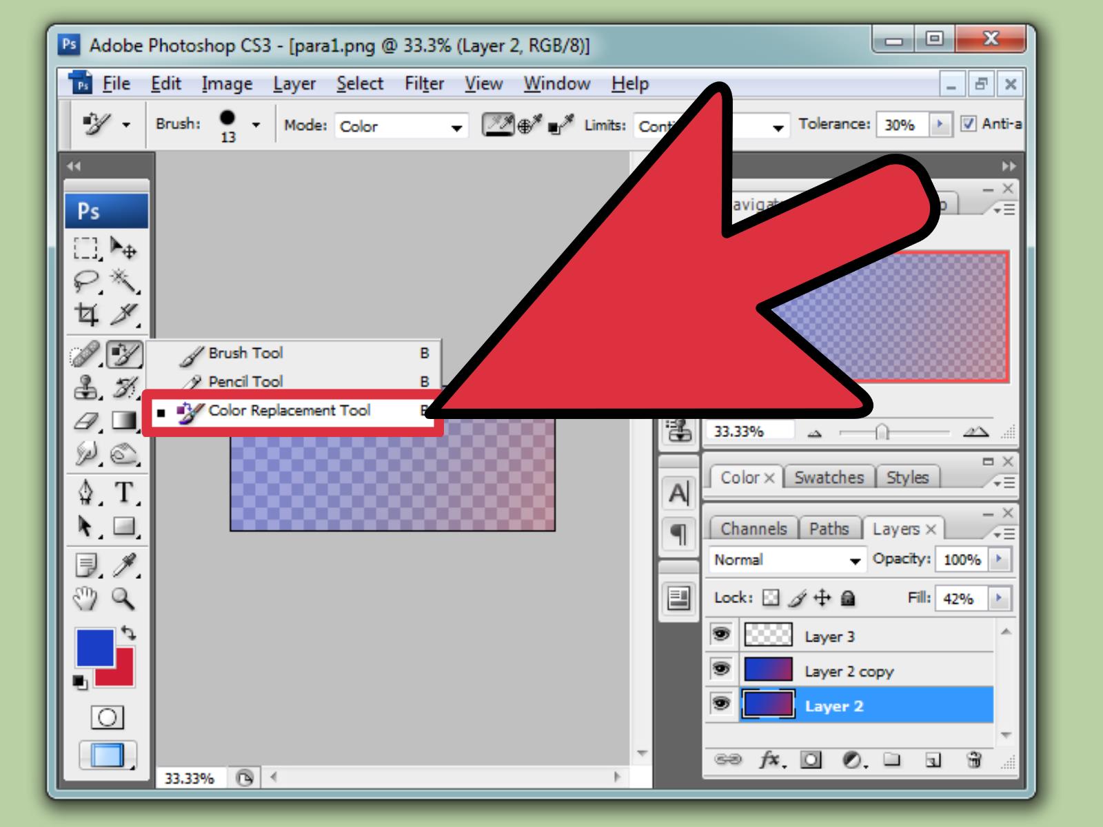
- Select the Mixer Brush Tool. It may be hidden under the Brush Tool in the toolbar.
- Choose a soft or textured brush tip.
- Use the preset menu in the Options bar, such as Wet, Moist, or Dry.
- Adjust Wet, Load, Mix, and Flow.
- Paint across the boundary where two colors meet.
The Wet setting controls how much the brush picks up color from the canvas. Load controls how much paint is on the brush. Mix controls how much the brush color mixes with canvas color. Flow controls how quickly paint is applied.
Recommended Mixer Brush Settings
For smooth blending, try Wet at 40% to 70%, Load at 20% to 50%, Mix at 50% to 80%, and Flow at 10% to 30%. These settings are not magic numbers, but they are a strong starting point. If the colors look too smeared, lower Wet or Mix. If nothing seems to happen, increase Wet, Flow, or brush size.
The Mixer Brush is especially useful for blending skin tones. For example, if a portrait has a harsh red patch on the cheek, you can sample nearby skin colors and gently blend the red area into the surrounding tone. Use small strokes and avoid dragging color too far, or the skin may start to look like melted wax. Unless you are editing a candle portrait, that is usually not the goal.
Method 3: Blend Colors with the Smudge Tool
The Smudge Tool pushes pixels around. It does not add new paint by default; it drags existing color from one area into another. This makes it useful for smoothing edges, softening painted transitions, blending hair strands, and creating stylized effects.
How to Use the Smudge Tool
- Select the Smudge Tool. It may be grouped with the Blur and Sharpen tools.
- Choose a soft brush for smooth blending or a textured brush for painterly effects.
- Set Strength between 10% and 30% for subtle blending.
- Drag gently across the edge where two colors meet.
- Use short strokes instead of long streaks.
Keep the Strength low unless you want a dramatic smear. High Strength can quickly turn detailed artwork into digital pudding. For natural results, use short controlled strokes, follow the form of the subject, and sample the direction of light and shadow.
When to Use Smudge Instead of Mixer Brush
Use the Smudge Tool when you already like the colors and simply want to soften the transition. Use the Mixer Brush when you want colors to behave more like paint and actively mix together. In simple terms, Smudge moves color; Mixer Brush mixes color.
Method 4: Blend Colors with the Gradient Tool
The Gradient Tool is perfect for clean, controlled color transitions. If you want a smooth background, a sunset sky, a modern website hero image, a product glow, or a subtle color fade, gradients are your best friend.
How to Create a Basic Color Gradient
- Select the Gradient Tool by pressing G.
- Click the gradient preview in the Options bar.
- Choose a preset or create a custom gradient.
- Select a gradient style, such as Linear, Radial, Angle, Reflected, or Diamond.
- Click and drag across your canvas to apply the blend.
A longer drag creates a smoother transition. A shorter drag creates a sharper transition. If your gradient looks too harsh, drag farther. If it looks too subtle, drag a shorter distance. Photoshop is very literal here; it follows your drag like an obedient but slightly dramatic assistant.
Use Gradients on a New Layer
Instead of applying a gradient directly to the background, place it on a new layer. Then you can adjust opacity, change blend modes, mask parts of it, or remove it later. This is especially useful for photo effects, where you may want a warm orange glow in one corner or a cool blue shadow near the edge.
Method 5: Blend Colors with Layer Masks
Layer masks are one of the most powerful non-destructive blending tools in Photoshop. A layer mask controls which parts of a layer are visible. White reveals, black hides, and gray partially reveals. This makes masks perfect for smooth color blending because you can fade a color layer in and out without permanently erasing anything.
How to Blend a Color Layer with a Mask
- Create a new layer and fill it with a color or gradient.
- Click the Add Layer Mask button in the Layers panel.
- Select the mask thumbnail.
- Use a soft black brush to hide parts of the color.
- Use white to bring the color back if you remove too much.
- Use gray for partial transparency.
This method is ideal for adding color overlays to photos. For example, you can add a warm golden layer over a landscape, set the layer to Soft Light, lower the opacity, and use a mask to keep the effect strongest near the horizon. The result is a believable sunset glow instead of a giant orange rectangle pretending to be atmosphere.
Method 6: Blend Colors with Blend Modes
Blend Modes change how one layer interacts with the layers below it. They are extremely useful for color blending because they can darken, lighten, increase contrast, shift hue, preserve luminosity, or combine colors in creative ways.
Best Blend Modes for Color Blending
- Multiply: Darkens the image and is useful for shadows, depth, and rich color overlays.
- Screen: Lightens the image and works well for glow, haze, and highlights.
- Overlay: Adds contrast while blending color into lights and darks.
- Soft Light: Creates a gentler contrast effect than Overlay.
- Color: Applies hue and saturation while preserving the brightness of the layer below.
- Hue: Changes hue while keeping saturation and luminosity from the base image.
- Luminosity: Applies brightness values without changing the underlying colors.
For natural color changes, the Color blend mode is especially helpful. If you want to recolor a shirt, add makeup, tint a black-and-white photo, or adjust an object’s color without destroying its shadows and highlights, create a new layer, set it to Color, and paint over the area.
Example: Recolor an Object Naturally
Suppose you want to turn a blue jacket into a deep green jacket. Create a new layer, set the blend mode to Color, choose a green shade, and paint over the jacket. Then add a layer mask to clean up the edges. Lower the opacity if the effect looks too intense. This preserves the jacket’s folds, highlights, and shadows while changing the color itself.
Method 7: Blend Colors with Adjustment Layers
Adjustment layers are excellent for controlled color blending because they allow you to change color, tone, brightness, and contrast without permanently editing the image. Popular choices include Hue/Saturation, Color Balance, Curves, Gradient Map, and Selective Color.
Use Hue/Saturation for Simple Color Shifts
Go to Layer > New Adjustment Layer > Hue/Saturation. Use the Hue slider to shift colors and the Saturation slider to increase or reduce intensity. Then use the built-in mask to apply the change only where needed.
Use Gradient Map for Stylish Blended Color
A Gradient Map maps colors to the shadows, midtones, and highlights of an image. This is powerful for cinematic color grading, poster designs, and artistic effects. For example, you can map deep purple to shadows and warm peach to highlights for a dramatic editorial look.
The trick is subtlety. Set the Gradient Map layer to Soft Light, Overlay, or Color, then lower the opacity. A small adjustment can look polished. A huge adjustment can make your image look like it escaped from a neon aquarium.
Method 8: Use Blend If for Advanced Color Blending
Blend If is a powerful feature inside the Layer Style dialog box. It lets you blend layers based on brightness values or individual color channels. This is useful when you want a color or texture to appear only in highlights, shadows, or specific tonal ranges.
How to Use Blend If
- Place a color, texture, or gradient layer above your image.
- Double-click the layer to open the Layer Style dialog box.
- Find the Blend If sliders at the bottom.
- Move the black or white sliders to hide parts of the layer based on tonal values.
- Hold Alt on Windows or Option on Mac to split a slider for a smoother transition.
Splitting the sliders is the secret sauce. Without splitting, the blend can look harsh. With split sliders, the transition becomes gradual and natural. Use Blend If when you want a color effect to melt into an image without hand-painting every edge.
How to Blend Skin Tones in Photoshop
Blending skin tones requires a gentle approach. Human skin has subtle changes in red, yellow, brown, pink, olive, and neutral tones. If you blend everything too aggressively, the face can look flat and artificial.
Simple Skin Tone Blending Workflow
- Create a new blank layer.
- Set the layer blend mode to Color for color correction or Normal for painting.
- Use the Eyedropper Tool to sample a nearby natural skin tone.
- Paint with a soft brush at low opacity and low flow.
- Use a layer mask to keep the correction controlled.
- Lower the layer opacity until the result looks realistic.
Do not sample one skin color and paint it everywhere. Skin is not a wall. Sample frequently from nearby areas and follow the natural light direction. Highlights should stay lighter, shadows should stay darker, and midtones should carry the main color.
How to Blend Colors for Digital Painting
Digital painting in Photoshop often requires a balance between smooth blending and visible brushwork. If everything is too smooth, the painting can look lifeless. If nothing is blended, it may look unfinished. The best results usually sit somewhere in the middle.
Digital Painting Tips
- Block in large colors first before blending details.
- Use a large brush for broad transitions and a smaller brush for edges.
- Blend according to form, not randomly.
- Keep some hard edges where the subject needs structure.
- Use textured brushes to avoid a plastic look.
- Flip the canvas occasionally to spot uneven blending.
For example, when painting a sphere, do not simply blur the shadow into the highlight. Follow the curved form. The transition should wrap around the object. This helps the image feel three-dimensional instead of looking like a flat circle with a mood problem.
Common Color Blending Mistakes to Avoid
Using Too Much Blur
The Blur Tool can soften transitions, but it is not a complete blending strategy. Too much blur removes detail and makes images look mushy. Use blur sparingly and rely more on brush control, masks, gradients, and blend modes.
Ignoring Light Direction
Colors should blend according to the light in the scene. Warm light creates warm highlights. Cool shadows often appear blue, green, or purple depending on the environment. If your blend ignores the lighting, the final image may feel fake even if the colors are technically smooth.
Over-Saturating Colors
Bright colors are fun, but too much saturation can make a design look cheap or chaotic. Use vivid color as an accent, then balance it with neutrals, muted tones, or controlled opacity.
Blending Everything Equally
Not every edge should be soft. Professional images often combine soft transitions with crisp edges. A portrait may need smooth cheek transitions but sharp eyelashes. A product photo may need soft reflections but clean object edges. Good blending is selective.
Best Photoshop Color Blending Workflow for Beginners
If you are new to Photoshop, use this simple workflow:
- Create a new layer above your image.
- Choose a soft round brush.
- Set opacity to 20% and flow to 10%.
- Paint the transition slowly.
- Use the Eyedropper Tool often to sample nearby colors.
- Add a layer mask to clean up the blend.
- Experiment with Soft Light, Overlay, or Color blend mode.
- Lower the layer opacity for a more natural effect.
This workflow is simple, flexible, and forgiving. More importantly, it teaches you how blending actually works instead of depending on one-click effects. Once you understand soft brush blending, masks, opacity, and blend modes, advanced tools like Mixer Brush and Blend If become much easier.
Practical Example: Create a Warm Light Blend
Let’s say you have a portrait and want to add a warm golden glow from the left side.
- Create a new layer above the photo.
- Choose a warm orange or golden yellow.
- Use a large soft brush and paint lightly on the left side of the face or background.
- Set the layer blend mode to Soft Light or Overlay.
- Lower opacity to around 20% to 50%.
- Add a layer mask and remove the glow from areas where it looks unnatural.
- Add a second layer with a smaller brush for stronger highlights if needed.
This technique works beautifully for portraits, lifestyle images, product photos, and social media graphics. The goal is not to paint a visible orange patch. The goal is to suggest light. Subtlety wins here. Your viewer should think, “Nice lighting,” not “Why is there a tangerine haunting this photo?”
Practical Example: Blend Two Background Colors Smoothly
For a modern graphic design background, try blending two or three colors with gradients and soft brushes.
- Create a new document.
- Add a Gradient Fill layer with two colors, such as navy and teal.
- Create a new layer above it.
- Use a large soft brush to paint a third color, such as lavender or coral.
- Set that layer to Soft Light, Screen, or Overlay.
- Lower opacity until the colors feel balanced.
- Add subtle noise if the gradient shows banding.
This is a great method for website banners, posters, YouTube thumbnails, app mockups, and presentation covers. Smooth color blending can make a design feel modern, polished, and expensiveeven when your coffee budget says otherwise.
Extra Experience: Real-World Lessons for Better Color Blending in Photoshop
After working with Photoshop color blending on portraits, product images, digital illustrations, and marketing graphics, one lesson becomes very clear: smooth does not always mean better. Beginners often think the goal is to remove every visible transition. They blend and blur until the image becomes soft everywhere. At first, it looks “clean,” but after a minute, it feels lifeless. The best Photoshop blending usually keeps a mix of soft edges, firm edges, and textured areas.
For example, when blending colors on a face, the cheek may need a soft transition from highlight to midtone, but the edge of the nose may need more definition. If you soften everything equally, the face loses structure. A better approach is to blend large areas gently, then preserve key edges around the eyes, lips, jawline, nostrils, and hairline. This keeps the portrait realistic while still looking polished.
Another useful experience is to blend in stages. Do not try to fix everything on one layer. Create one layer for broad color correction, another for subtle warmth, another for shadows, and another for final highlights. This layered workflow gives you control. If the warm tone becomes too strong, you can lower only that layer’s opacity. If the shadow blend is wrong, you can mask or delete that layer without damaging the entire edit.
Sampling nearby colors is also more important than many people realize. The Eyedropper Tool is your best friend. When painting or blending, sample from the image again and again. This keeps your colors connected to the scene. If you choose colors only from the Color Picker, they may look disconnected from the lighting and mood of the image. Realistic blending depends on local color relationships.
For digital painting, the biggest improvement often comes from using fewer colors at first. Start with simple shadow, midtone, and highlight colors. Blend those into the main form before adding complex reflected light or texture. Too many colors too early can create mud. Once the main transition works, add smaller color variations for richness.
For photo editing, blend modes can save a huge amount of time. A color layer set to Soft Light can add atmosphere quickly. A Color blend mode layer can recolor objects without flattening texture. A Gradient Map can create a cinematic look in seconds. However, blend modes should be adjusted with opacity and masks. Leaving a blend mode at 100% opacity is sometimes like wearing stage makeup to buy groceriestechnically allowed, but possibly too much.
One final practical tip: take breaks and come back with fresh eyes. Color blending errors become invisible when you stare too long. Step away for a few minutes, then review the image at normal size. You will quickly notice if a transition is too harsh, too blurry, too saturated, or too gray. Photoshop rewards patience. The more carefully you build your blends, the more natural and professional your final image will look.
Conclusion
Learning how to blend colors in Photoshop is not about memorizing one perfect tool. It is about choosing the right method for the job. Use the Brush Tool for controlled manual blending, the Mixer Brush for realistic paint-like transitions, the Smudge Tool for pushing existing color, the Gradient Tool for clean fades, layer masks for non-destructive control, blend modes for creative color interaction, and adjustment layers for flexible color correction.
The most professional results come from subtle adjustments, separate layers, low opacity, careful masking, and a good understanding of light. Blend slowly, sample often, and remember that not every edge should disappear. When color blending is done well, people do not notice the techniquethey simply see an image that feels natural, polished, and visually satisfying.
Note: This article is written for educational Photoshop workflows and can be adapted for different Photoshop versions, project types, and creative styles.