Some houses whisper. Some houses sing. And then there are Beverly Hills houses that enter the room in sunglasses, carrying a martini, and casually mention that they once belonged to a Miss America. This particular home, a 1948 estate on Hutton Drive, had the kind of Hollywood backstory most properties can only dream about: it was once the home of Mary Ann Mobley, Miss America 1959, actress, television personality, and wife of actor and talk-show host Gary Collins.
But even glamour ages. Over the decades, the residence collected layers of style, additions, and decorative decisions that no longer served the way modern families live. The bones were strong. The setting was private and lush. The architecture had charm. Yet the interiors had become dated, the flow felt cramped in key areas, and a few rooms looked as if they were still waiting for a 1980s cocktail party to end.
That is where Simo Design, the Los Angeles architecture and interiors practice led by Alexi Rennalls and Sam Gnatovich, stepped in. Their renovation did not bulldoze the home’s personality. Instead, it performed the more difficult magic trick: preserving what worked, editing what did not, and turning a celebrity-linked Beverly Hills house into a bright, elegant, livable California home.
The Story Behind the Former Miss America Beverly Hills House
Mary Ann Mobley was not just a pageant titleholder. She was the first Miss Mississippi to become Miss America, later moving into acting and television. Her Beverly Hills home with Gary Collins reflected a long entertainment-era life: formal, gracious, and a little theatrical. The estate sat on roughly three-quarters of an acre, giving it something increasingly rare in Los Angeles luxury real estate: breathing room.
Built in 1948, the house had an East Coast traditional feeling, a surprising contrast to the low-slung ranch houses and glassy modern boxes often associated with Southern California. Shutters, siding, mature greenery, brick, and a courtyard-like relationship to the pool gave the property a tucked-away, almost old-fashioned charm. It felt less like a showpiece and more like a home that had hosted real dinners, real family moments, and probably at least one very dramatic conversation beside the bar.
The problem was not that the house lacked character. The problem was that the character had become buried under dated finishes, awkward proportions, and decorative choices that distracted from the property’s best features. A good before-and-after home renovation does not simply ask, “What can we make new?” It asks, “What deserves to stay?”
Before the Transformation: Good Bones, Tired Details
The “before” version of the house had several classic renovation challenges. The overall floor plan made sense, but many of the rooms felt out of step with the home’s scale. Certain additions had complicated the proportions. Some finishes were heavy. Some spaces were underused. And yes, there was neon green carpet in the master wing, which is a bold design statement if your design statement is “indoor putting green with emotional baggage.”
A Cramped Entry and Heavy Staircase
The original entry sequence did not give the house the arrival moment it deserved. The front door had been tucked under a covered porch near the pool area, making entry feel tight rather than gracious. Inside, the staircase was visually heavy, with a carved banister that belonged to an earlier decorative mood. In a home with high ceilings and abundant natural light, the staircase needed to act more like sculpture and less like furniture that had eaten too much dessert.
A Kitchen That Needed a Bigger Role
The kitchen was one of the biggest transformations. Before the renovation, it was too small for the scale of the home and too disconnected from the way contemporary households gather, cook, snack, chat, supervise homework, and open the refrigerator for the fifth time hoping new food has appeared. Simo Design expanded the kitchen by reclaiming space from an adjacent dining area, turning it into a practical and beautiful center of daily life.
Bathrooms, Bedrooms, and the Glamour Hangover
Some of the bathrooms carried the decorative drama of another era, including mirrored surfaces and vanities that leaned more “backstage dressing room” than serene retreat. Upstairs, two bedrooms shared storage and bathroom arrangements that no longer made sense for a luxury family home. The renovation corrected these issues by creating better private suites, improved storage, and a calmer material language.
After the Renovation: Light, Flow, and California Ease
The completed transformation works because it does not scream. It breathes. The design leans into pale wood, warm whites, brick, glass, custom cabinetry, and improved circulation. Instead of turning the former Miss America house into a generic luxury flip, Simo Design created a modern home that still feels connected to its 1948 origins.
The Entry Becomes a Moment
The renovated entry is one of the home’s most memorable changes. A double-height space, ash wood paneling, a skylight, and a new floating staircase of wood, steel, and glass create an immediate sense of openness. The stair no longer clutters the entry; it defines it. This is a crucial lesson in luxury home renovation: a staircase is not just a way to get upstairs. In the right hands, it is architecture, rhythm, and first impression rolled into one.
The ash wood brings warmth without darkness. The glass keeps the sightlines open. The steel adds structure and modernity. Together, the materials create a transition between the home’s traditional shell and its contemporary interior life.
The Mudroom Gets Smart, Not Showy
One of the most appealing parts of the renovation is the mudroom, because it solves a real household problem with elegance. Located off the garage, the mudroom became the everyday entrance for residents. Simo Design lined the triangular room with custom full-height cabinetry for shoes, coats, mail, and daily clutter. The original brick floor was preserved, giving the room texture and continuity.
This is where the home becomes relatable. Not all of us have a Beverly Hills estate. Many of us do, however, have a pile of shoes near the door that appears to reproduce overnight. The mudroom proves that storage can be architectural, beautiful, and deeply practical.
The Bar Keeps the Brick, Loses the Dust
The existing bar area was not eliminated. It was refreshed. The renovation kept the brick floor running into the bar, added a walnut countertop, updated custom cabinetry, and used green-glazed thin brick tile for texture and color. This is a smart example of design continuity: instead of pretending the old house never existed, the new design speaks to it in a cleaner accent.
Walnut adds richness. Green tile gives the space a wink. The cabinetry keeps everything tailored. The result is not a flashy hotel bar; it is a polished residential bar that feels like it belongs in a house with stories.
The Kitchen: The Heart of the Beverly Hills House Transformation
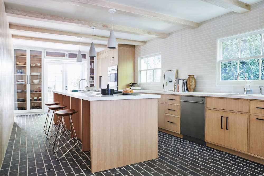
In many before-and-after home makeovers, the kitchen carries the emotional weight of the entire project. That is true here. The updated kitchen is larger, brighter, more functional, and more connected to the rest of the home. Custom Simo cabinetry in oak and white-oak-finished ply creates warmth without heaviness. Dark gray brick pavers on the floor reinterpret the home’s existing brick motif, while a pale tile backsplash keeps the room fresh.
The island is the anchor. It provides prep space, casual seating, and a visual center. Pendant lights above the island add scale without fuss. The kitchen now feels like a natural gathering place rather than a back-of-house utility zone. In a Beverly Hills house, that matters. In any house, it matters even more.
The ceiling beams are another subtle victory. Existing structural beams were wrapped in pale ash wood, transforming something heavy and dated into a design feature. This is the kind of detail that separates thoughtful renovation from simple replacement. Instead of removing every old element, the designers refined what was already there.
The Living Room Opens Toward the Pool
The living room received two major updates: a vaulted ceiling and French doors opening directly to the patio and pool. These choices changed the emotional tone of the room. Vaulting the ceiling increased volume and light, while the French doors strengthened the indoor-outdoor connection that defines the best Southern California homes.
The fireplace is another lesson in restraint. Part of the brick fireplace already existed, so Simo Design matched the brick, extended it upward to meet the newly pitched ceiling, and painted the whole structure white. The result feels calm and integrated, not patched together. It gives the room a focal point without stealing attention from the views, pool, or natural light.
In practical terms, this shift also made the home better for entertaining. Guests can move from living room to patio without feeling as if they are navigating a maze. The house now behaves like a California home should: relaxed, social, and slightly smug about the weather.
Bedrooms and Bathrooms: Privacy Meets Polish
The renovation also improved the private areas of the home. Two upstairs bedrooms that previously shared closet and bathroom space were reorganized with en suite baths and better storage. This change may sound simple, but it has a major impact on livability and resale appeal. In a luxury home, privacy is not a bonus; it is expected.
The bathrooms use a consistent palette of concrete tile, honed black marble mosaics, Caesarstone countertops, custom vanities, refined mirrors, and classic sconces. This repetition creates visual order. Instead of each bathroom shouting a different design opinion, the materials work together across the home.
The primary bathroom also moved toward calm brightness, with white paint, elegant lighting, and a more spa-like atmosphere. Compared with the earlier vanity-heavy glamour, the new mood is quieter, cleaner, and more timeless.
The Pool and Grounds: Where the House Finds Its California Soul
The outdoor transformation is essential to the success of the project. The pool, patio, and garden were already part of the property’s charm, but they needed editing. Simo Design preserved the existing brick patio where possible, re-plastered the pool in a darker gray tone, relocated the front door for better flow, and added outdoor destinations that made the grounds feel more intentional.
A timber pavilion with built-in stucco sofas and a glass roof became a special retreat within the garden. A dining area and bocce court gave the property more ways to be used. Ficus trees and a low fieldstone fence helped screen the driveway, increasing privacy and making the garden feel more secluded.
This is a key lesson for anyone studying Beverly Hills house transformations: luxury is not only square footage. Luxury is the feeling that every part of the property has a purpose. A shaded place to sit. A pool that feels integrated. A path that makes sense. A garden that looks natural rather than over-styled. These details make the difference between expensive and exceptional.
Why This Before-and-After Renovation Works
The success of the former Miss America Beverly Hills house transformation comes down to balance. Simo Design respected the home’s history without treating it like a museum. They modernized the rooms without flattening the personality. They improved function without chasing sterile minimalism.
1. The Renovation Preserved Character
The brick floors, traditional exterior language, mature landscape, and original sense of privacy were not erased. They were used as the foundation for the updated design. This gave the house authenticity, which is something money can help reveal but cannot instantly create.
2. The Materials Feel Warm and Durable
Ash wood, oak cabinetry, walnut, brick, marble, tile, and glass appear throughout the home. These materials age better than trend-driven finishes. They also create a tactile richness that photographs well and lives well.
3. The Flow Finally Matches the Lifestyle
The relocated front door, expanded kitchen, new mudroom storage, en suite bedrooms, and French doors all make the home easier to use. Good design is not just what looks beautiful in a listing photo. It is what makes Tuesday morning less chaotic.
4. The House Feels Modern Without Forgetting 1948
The best renovation is a conversation between old and new. In this case, the 1948 structure still matters. The update does not try to disguise the house as a brand-new glass box. It lets the home become a more refined version of itself.
Experience-Based Takeaways From This Beverly Hills House Transformation
Anyone who has lived through, planned, or even obsessively watched a home renovation knows the fantasy and the reality are not the same thing. The fantasy is a clean mood board, a perfect tile sample, and a designer saying, “We’ll just open this up.” The reality is dust, decisions, budgets, delays, and at least one moment when someone stands in the kitchen holding a faucet catalog like it contains the meaning of life.
The transformation of Mary Ann Mobley’s former Beverly Hills home offers practical lessons because it shows renovation as a process of judgment, not just spending. The first lesson is to identify the parts of a house that cannot be easily replaced. In this home, that meant the private site, the mature greenery, the brick, the traditional charm, and the basic logic of the floor plan. These were assets. A less sensitive renovation might have stripped them away in pursuit of “newness.” Simo Design did the smarter thing: they edited.
The second lesson is that function should lead beauty. The mudroom is a perfect example. A glamorous house still needs a place for shoes, bags, coats, and mail. A kitchen still needs room for people to gather without blocking the cook. Bedrooms still need storage. Bathrooms still need privacy. When these everyday needs are solved well, the home feels luxurious even when nobody is hosting a party.
The third lesson is to repeat materials with intention. The use of brick inside and outside ties the project together. Pale woods soften the larger rooms. White paint brightens heavy surfaces. Dark accents add contrast. This kind of repetition makes a large house feel coherent. Without it, a renovation can become a showroom of unrelated good ideas, which is still chaos, just expensive chaos.
The fourth lesson is that outdoor space deserves as much design attention as the interior. In Beverly Hills, the pool, patio, pavilion, dining area, and garden are not accessories. They are rooms without ceilings. By improving the connection between living room and pool, relocating the entry, and giving the grounds more purpose, the renovation made the entire property feel larger and more usable.
Finally, this before-and-after proves that a home with history does not need to be frozen in time. It can evolve. Mary Ann Mobley’s former house had celebrity heritage, but the renovation’s real achievement was turning that heritage into a livable future. The result is elegant, warm, and quietly confident. In other words, it still has star quality, but now it knows where to put the shoes.
Conclusion
The transformation of this former Miss America’s Beverly Hills house is a master class in thoughtful renovation. Simo Design did not simply polish a famous address; they rebalanced the entire property. The team preserved the estate’s best features, corrected awkward flow, expanded the kitchen, modernized bathrooms, opened the living room to the pool, and gave the grounds a more purposeful California lifestyle.
What makes the project memorable is not only the celebrity connection. It is the restraint. The house became brighter, cleaner, and more contemporary without losing the softness of its 1948 origins. For homeowners, designers, and real-estate enthusiasts, the lesson is clear: the best before-and-after transformations do not erase the past. They rescue it, refine it, and give it better lighting.