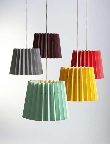
A lampshade is often treated as the quiet supporting actor of a room. It stands beside the sofa, behaves itself, and lets the wallpaper collect the compliments. Nottingham’s handmade lampshades challenge that arrangement. With bold color combinations, graphic forms, and carefully constructed paper surfaces, they turn an ordinary light fixture into something closer to functional art.
The phrase color therapy is appropriate here in a decorative rather than medical sense. A colorful lampshade will not replace professional health care, but it can change how a room feels. It can soften a gloomy corner, make a neutral bedroom more playful, or give an aging lamp base a second career without requiring a complete decorating overhaul.
One especially memorable example came from British graphic designers Ollie Wood and Joff Casciani, founders of the design brand Lane. Their Twin Tone Lampshades combined two sheets of heavyweight paper, producing one color on the outside and a contrasting color inside. The paper was sourced from the historic British manufacturer James Cropper, while craftspeople in Nottingham formed the shades by hand.
The concept was simple, but the effect was anything but sleepy. When the lamp was switched off, the exterior acted as a clean block of color. When illuminated, the inner color entered the performance, reflecting light and creating a warmer, brighter, or more dramatic glow. It was a lampshade with a daytime personality and an evening alter ego.
Why a Two-Tone Lampshade Changes More Than the Lamp
Color in a room usually arrives through paint, upholstery, rugs, and artwork. Those choices can be expensive, permanent, or physically exhausting. Anyone who has painted a ceiling knows that “refreshing the room” can quickly become an upper-body workout with receipts.
A handmade lampshade offers a smaller and more flexible way to introduce color. It occupies enough visual space to be noticed, yet it can be moved, replaced, or paired with a different base. This makes it particularly useful for renters, cautious decorators, and people who love color but do not want a tangerine living room wall staring at them during breakfast.
The Exterior Works Like a Decorative Object
During daylight hours, a saturated paper shade behaves like a sculpture. A deep blue shade can create a crisp focal point against a pale wall. Mustard yellow can warm up dark wood furniture. Dusty pink can soften a black metal lamp, while forest green can connect an interior with plants and outdoor views.
Because the surface is relatively compact, it is also a good place to try a color that might feel overwhelming on a larger scale. An electric orange lampshade is cheerful. An electric orange ceiling, on the other hand, may cause guests to wonder whether they have accidentally entered a juice bar.
The Interior Color Shapes the Glow
The lining of a lampshade affects what happens after sunset. A warm yellow, coral, or orange interior can make the emitted light appear richer and more intimate. A pale pink lining may flatter warm woods and textiles. Cooler interiors, such as blue or green, can create a more unusual atmospheric effect, although they may also alter how nearby colors and skin tones appear.
This is why a two-tone shade should be evaluated both switched off and switched on. The exterior color must work with the room, while the interior must cooperate with the bulb. Think of them as roommates. They do not have to dress alike, but they should be able to share a kitchen without starting an argument.
Nottingham Craftsmanship Meets Graphic Design
The appeal of Nottingham-made lampshades is not based on color alone. Their character comes from the relationship between graphic design and skilled production. The designer determines the proportions, palette, and visual rhythm; the maker turns that idea into an object that must remain balanced, cleanly finished, and structurally reliable.
Paper sounds humble, but heavyweight decorative paper can produce exceptionally crisp shapes. It holds color differently from woven fabric, creating a smooth, poster-like surface that suits modern and midcentury-inspired interiors. Edges, seams, and curves are easier to see, which means the quality of construction cannot hide behind tassels, ruffles, or strategic dimness.
Handmade production also leaves room for human judgment. A craftsperson checks alignment, tension, bonding, and the relationship between the paper and frame. Small variations may occur, but those differences are part of the object’s identity rather than evidence that a machine became distracted.
The Value of Knowing Who Made an Object
Mass-produced lighting is convenient, but handmade lighting provides a more direct connection to materials and process. The purchaser is not only choosing a color. They are supporting design knowledge, specialist suppliers, and practical skills that can disappear when every household object is treated as disposable.
This does not mean every handmade shade is automatically sustainable. Materials, adhesives, packaging, shipping distance, repairability, and working conditions all matter. Still, a well-made shade that remains attractive for years can be preferable to several cheap replacements purchased whenever a trend changes its mind.
Color Psychology Without the Decorating Myths
Color is often described with absolute rules: blue is calming, red is exciting, yellow is cheerful, and beige apparently has a respectable accounting job. Real responses are more complicated. Mood can be influenced by saturation, brightness, cultural associations, personal memories, room function, surrounding colors, and the quality of light.
A muted blue may feel restful in a bedroom, while an intense blue under a cool bulb can feel sharp or commercial. A soft terracotta can seem welcoming, but a highly saturated red-orange may dominate a small reading corner. The most successful palette is therefore not the color with the most impressive psychological résumé. It is the one that supports the activity and atmosphere of the room.
Use the Color Wheel as a Starting Point
Complementary colors sit opposite each other on the color wheel, such as blue and orange or yellow and purple. They create noticeable contrast and work well when the goal is an energetic statement. A navy exterior with a warm orange interior, for example, can look controlled during the day and unexpectedly vivid at night.
Analogous colors sit beside each other, such as blue, blue-green, and green. These combinations usually feel more unified. A teal exterior with a pale green lining would add color without producing visual fireworks beside the couch.
Monochromatic schemes use variations of one hue. A dark burgundy shade with a pale rose interior can appear refined because the contrast comes from tonal value rather than competing colors. Texture, gloss, and surrounding materials then prevent the arrangement from looking flat.
How to Choose a Handmade Lampshade for Your Room
A beautiful shade can still look awkward when it is the wrong size, shape, or fitting. Before falling emotionally and financially in love with one, inspect the lamp base and take measurements.
Check the Scale
Measure the shade’s top diameter, bottom diameter, vertical height, and slant. As a general starting point, the shade should feel substantial enough to balance the lamp base without swallowing it. Traditional guidance often places the shade height at roughly one-third of the total lamp height, while the lower diameter may be close to twice the width of the base.
These are guidelines rather than sacred geometry. A deliberately oversized drum shade can look striking on a simple base, while a compact shade may suit a narrow bedside table. The important test is visual balance. The lamp should look intentional, not as though its hat shrank in the laundry.
Identify the Fitter
The fitter is the hardware that attaches the shade to the lamp. Common types include spider fitters, which sit on a harp and are secured by a finial; uno fitters, which connect around the socket; and clip-on fitters, which attach directly to smaller bulbs.
Confirm compatibility before ordering a handmade shade. Adapters are available for some fittings, but an adapter cannot solve every mismatch. Photographing the existing hardware and recording its dimensions can prevent a disappointing game of decorative engineering.
Match Opacity to the Lamp’s Job
Colored paper and dense fabric absorb or redirect more light than a translucent white shade. That can be desirable for ambient lighting, where the purpose is atmosphere rather than maximum brightness. A darker shade may send most of its light upward and downward, creating a cozy pool around the lamp.
For reading, sewing, or desk work, make sure enough light escapes toward the task area. A pale interior can improve reflection, while a wider lower opening can direct more light onto a table or book. Do not ask one tiny navy lampshade to illuminate an entire room and then accuse it of lacking ambition.
Choosing the Right Bulb for Colorful Lampshades
The bulb is as important as the shade. Correlated color temperature, measured in kelvins, describes whether white light appears warm or cool. For living rooms and bedrooms, LEDs around 2700K generally produce a warm, familiar glow. Bulbs around 3000K provide slightly clearer light and can work well in kitchens, work areas, and contemporary spaces.
Very cool residential bulbs can make warm colors appear less inviting and may give a relaxing room an accidental office atmosphere. Before buying several bulbs, test one inside the shade after dark. Screens and product photographs cannot accurately predict how the combination will behave in your home.
Pay Attention to Color Rendering
The color rendering index, commonly called CRI, indicates how faithfully a light source reveals colors compared with a reference source. The U.S. Department of Energy generally recommends a minimum CRI of 80 for interior lighting, while a CRI of 90 or above offers better color fidelity.
High color rendering is especially useful with colorful lampshades, artwork, wood, food, and textiles. A beautifully printed shade can look disappointingly muddy beneath a poor-quality bulb. Spending money on carefully selected colors and then illuminating them with a bargain-bin mystery bulb is rather like buying a tailored suit and finishing it with gardening gloves.
Use LEDs and Respect the Fixture Rating
LED bulbs produce less heat than traditional incandescent bulbs and are therefore a practical choice for many paper and fabric shades. Nevertheless, always follow the maximum wattage or equivalent rating provided by the lamp and shade maker. Maintain proper clearance between the bulb and shade, and never use damaged electrical components.
A dimmable LED can make a colorful shade more versatile. Bright light may emphasize the inner lining during early evening, while a lower setting creates a softer pool of color later at night. Confirm that the bulb and dimmer are compatible to avoid buzzing, flickering, or the sensation that your lamp is attempting to communicate in code.
Room-by-Room Color Pairing Ideas
Living Room: Navy and Ochre
A navy exterior looks grounded and sophisticated beside oak, walnut, tan leather, or cream upholstery. Add an ochre or warm yellow interior to prevent the shade from feeling heavy. When illuminated, the lining gives the dark exterior a lively center.
Bedroom: Blush and Burgundy
A muted blush exterior with a burgundy lining feels warmer than plain white but remains restful. It works particularly well with linen bedding, antique brass, dark wood, and small floral patterns. Use a warm, dimmable bulb to keep the result gentle.
Home Office: Green and Pale Blue
Green can connect a work area with natural materials and houseplants, while a pale blue interior adds clean contrast. Pair the lamp with separate task lighting so the decorative shade does not carry the entire workload.
Dining Area: Terracotta and Pink
Terracotta has an earthy character that complements ceramics, woven materials, and wood tables. A pink interior can make the evening glow more playful without turning the room into a themed restaurant. Keep nearby accessories relatively simple and let the lamp provide the chromatic punch line.
Entryway: Yellow and Violet
An entryway can tolerate stronger contrast because people move through it rather than spending hours there. Yellow and violet form a complementary pairing with plenty of personality. Used on a console lamp, the combination creates an immediate welcome and signals that the home is not afraid of color.
Caring for a Handmade Paper Lampshade
Paper shades should be handled with clean, dry hands. Regularly remove surface dust using a soft brush, clean microfiber cloth, or low-suction vacuum attachment. Support the shade gently rather than squeezing its sides.
Avoid spraying cleaning products directly onto paper. Water, household chemicals, and vigorous rubbing can stain the surface, weaken adhesive, or distort the structure. If the maker provides care instructions, follow those rather than improvising with whatever happens to be under the kitchen sink.
Position the lamp away from persistent moisture, open flames, and intense direct sunlight. Prolonged ultraviolet exposure can fade saturated colors, while humidity may affect paper and bonding materials. Rotating the lamp occasionally can help the exterior age more evenly.
A Practical Styling Experience: Living With Color After Sunset
The following styling diary illustrates what someone might notice when introducing a handmade two-tone lampshade into an ordinary room. The setting is a neutral living room with off-white walls, a gray sofa, an oak side table, and a ceramic lamp base that has spent several years being perfectly serviceable and entirely forgettable.
Day One: The Lamp Becomes Furniture
With the old beige shade removed and a rich blue-and-orange paper shade installed, the lamp no longer disappears into the background. Even before it is switched on, the blue surface creates a visual anchor beside the sofa. The room has not been repainted, and no furniture has been replaced, yet the arrangement feels more deliberate.
The orange lining is barely visible from across the room. Up close, however, it appears along the upper and lower edges like a secret. That small detail encourages a second look, which is one of the pleasures of handmade design: the object does not reveal everything immediately.
Day Two: Evening Changes the Palette
At dusk, the lamp is turned on using a 2700K, high-CRI LED. The orange interior reflects the warm light, softening the blue exterior and casting a subtle amber tone onto the nearby wall. The shade looks less like a colored object and more like a source of color.
The effect also changes the surrounding materials. The oak table appears warmer, the gray sofa becomes less cool, and a brass picture frame catches the light. None of those objects changed, but the lighting altered their relationships. Interior color is rarely a solo performance; it is closer to a dinner party where every guest influences the conversation.
Day Three: Accessories Begin to Make Sense
A small orange book is moved from a shelf to the side table, repeating the lining color. A blue detail in a nearby print suddenly becomes more noticeable. These connections make the lamp feel integrated rather than randomly colorful.
The temptation is to continue adding matching objects, but restraint produces a stronger result. Two or three repetitions are enough. Filling the room with identical blue and orange accessories would make the palette look less curated and more like a sports team’s gift shop.
Day Four: Brightness Matters
At full brightness, the lamp is suitable for conversation and casual reading. When dimmed, the blue exterior becomes darker and the orange lining grows visually dominant. The mood shifts from lively to intimate without changing a single decorative object.
This reveals an advantage of a two-tone shade: one lamp can support several atmospheres. It functions as a graphic accent during the day, warm ambient lighting in the evening, and a low glowing object late at night.
Day Five: Imperfection Becomes Part of the Appeal
Closer inspection reveals the seam, the layered edge of the paper, and tiny signs that the shade was assembled by hand. These details do not distract from the design. They provide evidence of process and distinguish the piece from a perfectly uniform molded product.
The lamp has become more than a utility. It is now a point of conversation, a source of evening atmosphere, and a reminder that meaningful decorating does not always require dramatic renovation. Sometimes a room needs new flooring. Sometimes it simply needs a better hat for the lamp.
Conclusion: Small Object, Serious Color
Handmade lampshades from Nottingham demonstrate how craftsmanship, graphic design, and lighting technology can meet in one compact object. Their strongest feature is not merely bright color but controlled transformation. The exterior contributes to the room by day, while the interior modifies the light after dark.
A carefully chosen shade can revive an old base, introduce a daring palette with limited commitment, and add a visible human story to a mass-produced interior. Choose the correct size and fitting, consider opacity, use a warm high-quality LED, and test the combination at night. The result may not be clinical color therapy, but it can be excellent therapy for a room suffering from chronic beige.
SEO Data
Note: “Color therapy” is used here as an interior-design concept describing the emotional and atmospheric effects of color, not as a medical treatment or therapeutic claim.