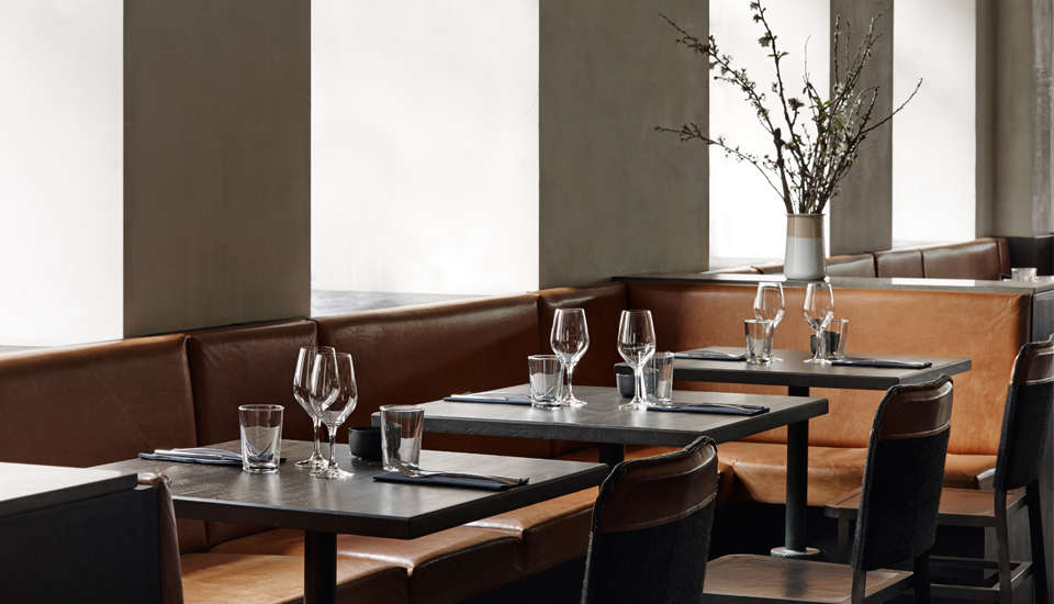
Some restaurants announce themselves with chandeliers, marble staircases, and a host who looks as though they personally approve the moon’s nightly schedule. Musling took a quieter route. Designed by Space Copenhagen beside the Torvehallerne food market, this seafood-focused bistro used stained oak, weathered metal, warm leather, and restrained lighting to create an interior that felt polished without becoming precious.
The result was a memorable example of Scandinavian restaurant design: atmospheric but practical, contemporary but connected to its setting, and stylish enough to photograph beautifully without making diners afraid to move their water glasses.
A Copenhagen Restaurant Shaped by Its Neighborhood
Musling occupied a prominent position on Linnésgade, facing Israels Plads and the glass-fronted Torvehallerne market halls near Nørreport Station. That location mattered. The surrounding district is not a sealed luxury enclave; it is a lively urban crossroads filled with commuters, cyclists, market shoppers, flower stands, food counters, and people debating whether one more pastry counts as lunch.
Torvehallerne introduced a modern version of the traditional covered market to central Copenhagen. Its transparent halls display fish, meat, vegetables, cheese, coffee, chocolate, baked goods, and prepared dishes in an energetic public setting. Across the way, Israels Plads was transformed from a traffic-dominated space into an active civic square with seating, recreation, and strong pedestrian connections.
Musling’s design responded to this environment rather than competing with it. Space Copenhagen pursued what can be described as an honest material language: surfaces looked tactile, furniture appeared durable, and the dining room carried traces of the market’s informality. The restaurant felt urban and sophisticated, but it never seemed to forget that food begins with ingredients, hands, weather, and daily deliveriesnot with a branding presentation containing the phrase “disruptive oyster journey.”
Who Designed Musling?
Space Copenhagen is the multidisciplinary studio founded by designers Signe Bindslev Henriksen and Peter Bundgaard Rützou. The studio works across interiors, furniture, lighting, hospitality, and product design, often combining apparently opposing qualities: industrial and organic, minimal and expressive, classic and modern.
Its hospitality portfolio has included internationally recognized Copenhagen restaurants and hotels, making the studio especially skilled at designing spaces that must perform under real pressure. A restaurant is not a showroom. Chairs are dragged, wine is spilled, servers turn corners at speed, and somebody will eventually balance a coat where no architect intended a coat to go.
At Musling, the studio’s response was not to decorate every surface. Instead, it created a layered backdrop for food, conversation, and movement. The design depended on proportion, texture, patina, and controlled contrast more than obvious visual spectacle.
A Collaboration Rooted in Copenhagen’s Seafood Scene
Musling was developed with Anders Selmer and Bagge Algreen, the restaurant team associated with Kødbyens Fiskebar in Copenhagen’s Meatpacking District. The concept emphasized a more relaxed seafood-bistro experience, with documented offerings that included oysters, fish, shellfish, vegetables, snacks, and natural wines.
The restaurant later received Michelin Bib Gourmand recognition, an award associated with good cooking and strong value rather than the ceremony of star-level fine dining. That distinction suited Musling’s personality. It was ambitious, but its ambition wore sensible shoes.
First Impressions: Dark, Warm, and Deliberately Understated
The first visual impression of the Musling interior was its muted palette. Instead of pale blond timber and bright white wallsthe international shorthand for anything labeled “Nordic”Space Copenhagen leaned into charcoal, gray, tobacco brown, blackened metal, and stained wood.
Large windows brought daylight into the restaurant and connected the dining room to the activity of the square. Against that natural brightness, darker interior elements created depth. The room did not feel gloomy; it felt grounded. Daylight slid across metal counters, leather banquettes, wooden floorboards, and simple table settings, revealing subtle variations in every surface.
This balance is one of the project’s strongest lessons. Minimalism does not require visual emptiness, and warmth does not require covering the room in pillows. Musling achieved comfort through materials that aged gracefully and colors that softened the light.
The Material Palette: Oak, Steel, Leather, and Patina
Stained Oak Adds Weight and Familiarity
Dark stained oak appeared in the flooring and furniture, giving the space a sense of history even though the overall composition was modern. The grain remained visible, preventing the wood from becoming a flat decorative color. It looked like material rather than makeup.
Wood also helped connect the dining room to familiar European bistro interiors. It introduced warmth beneath the cooler metallic bar and provided a comfortable visual foundation for tables, chairs, and banquettes.
Burnished Metal Brings an Industrial Edge
The long, rugged bar was one of Musling’s defining elements. Clad in dark metal, it provided a strong horizontal line through the interior and established the restaurant’s industrial character. Its surface appeared burnished rather than mirror-polished, which made it feel substantial and usable.
This choice was especially appropriate for a seafood restaurant near a market. The metal suggested working counters, kitchens, tools, and trade without turning the dining room into a theme park version of a fish warehouse. There were no decorative nets waiting to capture an unsuspecting handbag.
Warm Leather Softens the Architecture
Brown leather banquettes lined portions of the dining room. Their warm tone balanced the dark furniture and steel surfaces, while the upholstery made longer meals more comfortable. Leather was an effective choice because it could acquire character through use rather than looking ruined by it.
The banquettes also improved the room’s visual rhythm. Their continuous lines organized the perimeter, increased seating capacity, and gave diners a sense of enclosure without adding bulky partitions.
The Bar as the Social Center
Musling’s bar was not treated as a leftover service station. It functioned as a central architectural feature and an important part of the guest experience. Streamlined black stools and high tables created flexible places for a glass of wine, a few oysters, or a less formal meal.
The bar’s scale encouraged activity. Bottles, glassware, staff movement, and small dishes animated the otherwise restrained room. This is a useful principle in restaurant design: when the architecture is quiet, visible hospitality can provide the theater.
High seating also created a different social pace from the conventional dining tables. Guests could stop briefly, eat spontaneously, or watch the room without committing to a long, ceremonious dinner. In a neighborhood shaped by a market and transit hub, that flexibility made practical sense.
Furniture That Supports the Room Instead of Shouting
The seating included simple dining chairs, compact stools, high tables, and built-in banquettes. Much of it shared a dark, slender profile, allowing the room to accommodate many guests without appearing crowded by heavy furniture.
The stools were particularly effective beside the bar. Their thin frames preserved open sightlines, while dark seats echoed the surrounding steel. At the tables, the furniture remained upright and functional rather than lounge-like. Musling was designed for eating, talking, and sharingnot for disappearing into a sofa until closing time.
The mix of seating types also subtly divided the restaurant into zones. Window seats offered views toward the square, banquettes created more intimate edges, and bar seating accommodated casual visits. No dramatic walls were needed to explain where one experience ended and another began.
Lighting That Understands the Assignment
Lighting in Musling was restrained and warm. Small ceiling spots provided controlled illumination, while sculptural pendants added texture above selected areas. Some fixtures had irregular, paper-like shades that looked almost handmade, introducing an organic counterpoint to the precise metalwork.
During the day, the windows did much of the heavy lifting. In the evening, lower artificial light would have intensified the browns, grays, and blackened finishes. This transition allowed the same space to feel open at lunch and more intimate at dinner.
Most importantly, the lighting served the tables. Food, faces, glassware, and menus remained central. A restaurant light fixture may be beautiful, but it should not force diners to use their phone flashlights like amateur cave explorers.
How the Interior Reflected the Food
Musling’s documented menu philosophy centered on seafood, seasonal produce, and a relatively relaxed style of eating. Oysters, local greens, fish, shellfish, snacks, and natural wines fit naturally into the environment created by Space Copenhagen.
The design did not rely on literal marine references. There were no blue waves painted on the walls and no chairs shaped like clams. Instead, the connection to seafood was communicated through freshness, material honesty, market proximity, and the cool strength of the metal bar.
This indirect approach made the restaurant more timeless. A concept becomes exhausting when every detail repeats the same message. Musling trusted guests to understand the relationship among the market outside, the ingredients on the plate, and the practical beauty of the interior.
A Setting for Sharing
Contemporary reviews described a menu suited to sharing, including oyster selections and fish-centered small plates. That style of service matched the dining room’s social layout. Bar seats, compact tables, and communal energy supported a meal that could unfold through several dishes rather than one formal plate per person.
Sharing food also changed the atmosphere. Diners reached, compared, discussed, and occasionally negotiated custody of the final scallop. The interior provided enough polish to make the evening feel special, but enough informality to keep it lively.
Why the Musling Interior Worked
The restaurant succeeded as a design project because its major decisions reinforced one another. The market location suggested informality and ingredient-driven cooking. The seafood concept supported robust, honest materials. The dark palette created atmosphere, while large windows prevented heaviness. The bar generated movement, and the simple furniture kept that movement visible.
Nothing appeared to have been added merely because a blank surface made someone nervous. This restraint gave individual details more impact. A vase of branches, a row of bottles, a paper-textured pendant, or a neatly set table stood out because the background was calm.
The interior was also photogenic without feeling designed only for photographs. That distinction matters. Many modern restaurants provide one spectacular wall and forty-seven uncomfortable seats. Musling’s appeal came from the whole room: circulation, lighting, touch, seating variety, window views, and material consistency.
Design Lessons From Musling
Let the Location Influence the Concept
Musling borrowed energy from Torvehallerne and Israels Plads. Restaurants become more memorable when they belong to their surroundings rather than looking like an interior that could be shipped to any fashionable city.
Choose Materials That Improve With Use
Leather, stained oak, and burnished metal can develop patina. In hospitality spaces, this is often more realistic than expecting every surface to remain untouched and showroom-perfect.
Use Contrast Instead of Decoration
Dark steel against warm leather, organic lighting against rigid counters, and bright windows against muted walls created interest without visual clutter.
Design for Several Types of Visit
A strong restaurant can support a quick drink, a solo meal, a casual date, and a longer dinner with friends. Musling’s combination of bar seating, tables, banquettes, and window positions allowed the room to adapt.
An Extended Visitor Experience: Seeing Musling Through a Design Lover’s Eyes
A design-focused visit to Musling would begin before reaching the doorway. Arriving from Nørreport Station, a visitor would move through one of Copenhagen’s busiest central districts, passing bicycles, food shoppers, commuters, and the transparent Torvehallerne market halls. The experience would already be filled with color and motion: vegetables stacked in market displays, silver fish on ice, flowers, bread, coffee cups, and people attempting to carry all of the above while unlocking a bicycle.
Crossing toward Linnésgade, the restaurant would appear as part of the neighborhood rather than a self-contained destination. That relationship would be important. A visitor who had just walked through the market could immediately understand why Musling favored seafood, produce, natural wine, and an unforced style of service. The restaurant’s concept would feel connected to the visible life of the city.
Upon entering, the change in atmosphere would be subtle but clear. Street noise would soften. The darker palette would slow the eye after the brightness of the market. The metal bar would establish the room’s structure, while brown leather and wood would prevent the interior from feeling cold. Guests might first notice the overall mood and only later begin identifying the ingredients responsible for it: the sheen of steel, the worn depth of oak, the irregular shape of a pendant shade, and the narrow profiles of the stools.
A seat at the bar would offer the most active experience. From there, a guest could observe drinks being poured, plates arriving, glassware moving, and staff navigating the narrow working zone. The restaurant would feel less like a silent design exhibit and more like a well-composed machineexcept this machine serves oysters and probably improves everyone’s mood.
At a window table, the experience would become more cinematic. The square and market would remain visible outside, turning pedestrians and cyclists into a constantly changing backdrop. Daylight would show the true character of the surfaces, especially the difference between polished glass, soft leather, stained timber, and matte walls. As evening approached, reflections would begin appearing in the windows and the room would become more enclosed.
The ideal meal in this setting would be unhurried but not overly formal. Several seafood dishes placed in the center of the table would encourage conversation and make the table itself part of the visual composition. Oyster shells, wine glasses, ceramic plates, napkins, and small serving dishes would gradually animate the restrained furniture. The room was designed to look better when occupied, which may be the highest compliment available to a restaurant interior.
After eating, a visitor might walk back through Israels Plads and recognize how carefully Musling translated the neighborhood indoors. The restaurant did not imitate the market; it filtered its qualities. Activity became a social bar. Raw ingredients became honest materials. Market informality became flexible seating. Copenhagen’s gray daylight became a reason to use warm leather and dark oak.
That final realization would make the visit memorable even beyond the food. Musling demonstrated that hospitality design can be distinctive without being loud. It can feel luxurious without relying on glossy excess, and it can create atmosphere without trapping guests inside a theatrical concept. The experience was less about being dazzled by one dramatic feature and more about noticing how dozens of quiet decisions worked together.
Conclusion: A Quietly Influential Copenhagen Interior
Musling remains a compelling case study in Copenhagen restaurant design. Space Copenhagen created a room that balanced industrial strength with human warmth, using stained oak, burnished steel, leather banquettes, simple furniture, and carefully controlled light.
The design supported the restaurant’s seafood-bistro identity without resorting to obvious nautical decoration. It also responded intelligently to Torvehallerne and Israels Plads, allowing the life of the neighborhood to become part of the dining experience.
Although Musling Bistro subsequently closed, the project still offers useful lessons for designers, restaurateurs, and travelers interested in Scandinavian hospitality. Its enduring appeal comes from restraint, authenticity, and the radical idea that guests should remember how a room made them feelnot just which wall they photographed.