Note: This article is written for educational and editorial purposes. It discusses market performance charts, investment reading habits, and data interpretation, not personal financial advice.
Why Performance Charts Still Matter in a Noisy Market
Performance charts are the investing world’s version of a dashboard light. They do not drive the car for you, they do not predict every pothole, and they definitely do not stop your portfolio from making weird noises in March. But they do help you see what is happening beneath the emotional fog of headlines, hot takes, and that one person on social media who is somehow always “all in” at exactly the right time.
Updating performance charts is not just a spreadsheet chore. It is a way to test old assumptions against fresh evidence. A chart that looked brilliant five years ago may now need a new benchmark, a better time frame, or a note explaining that one unusual period did most of the heavy lifting. Markets change. Interest rates change. Inflation changes. Leadership inside the stock market changes. Good charts should change too.
The title “Updating Some Performance Charts & What I’ve Been Reading Lately” sounds casual, almost like a coffee-table note from someone who opened Excel and accidentally fell into a rabbit hole. But the topic is bigger than that. It touches portfolio analysis, long-term investing, market history, behavioral finance, and the habit of reading widely before drawing conclusions. In other words, it is about becoming a better interpreter of data, not just a collector of colorful lines.
The Best Charts Begin With Better Questions
A common mistake in investment analysis is opening a charting tool before deciding what question needs answering. That is how people end up with twelve indicators, six moving averages, three trend lines, and a chart that looks like a plate of spaghetti after a small earthquake.
The better approach starts with a clear question. Are we trying to understand annual S&P 500 returns? Rolling 10-year performance? The difference between stocks and bonds? The impact of inflation? Whether active managers are beating their benchmarks? Each question deserves a different chart.
Chart One: Calendar-Year Returns
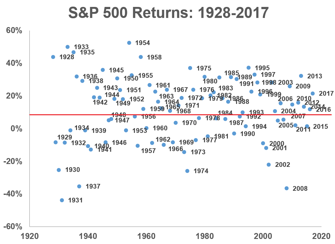
Calendar-year return charts are simple, but they are useful because they remind investors how uneven markets can be. A long-term average return may look smooth in a textbook, but real life arrives in chunks: strong years, weak years, boring years, and the occasional “please stop refreshing your brokerage app” year.
A chart of annual S&P 500 returns, for example, can help investors see that positive years are common but not guaranteed. It also shows that large gains and sharp declines are part of the same historical package. The point is not to guess next year’s return. The point is to stop acting shocked every time the market behaves like the market.
Chart Two: Rolling Returns
Rolling returns are even more useful for long-term planning. Instead of looking at one calendar year, a rolling-return chart shows returns over overlapping periods, such as 3-year, 5-year, 10-year, or 20-year windows. This helps answer a more practical question: what kind of experience might a patient investor have had over different holding periods?
Rolling charts often reveal a powerful lesson. Short periods can be wild. Longer periods tend to look more stable, though never risk-free. That is why investors should match charts to time horizons. A retiree drawing income next year and a teenager investing for retirement should not stare at the same chart with the same emotional intensity.
Chart Three: Drawdowns
Drawdown charts are the broccoli of performance analysis. Nobody cheers when they show up, but they are good for you. A drawdown measures how far an investment falls from a previous peak. It is one thing to say an asset has delivered strong long-term returns. It is another to ask whether you could sit through the uncomfortable parts without making a panic-flavored decision.
Every long-term investor should understand drawdowns because they show the cost of admission. Stocks have historically rewarded patience, but patience is not free. It often requires watching temporary losses become very loud before they become temporary in hindsight.
Updating Performance Charts Means Updating the Story
When charts are updated, the numbers change first. The story changes second. That second part is where the real thinking happens.
For example, U.S. equity performance in recent years has been heavily influenced by large technology and artificial intelligence-related companies. A broad index may look diversified on the surface, but market-cap-weighted indexes can become concentrated when a handful of giants perform extremely well. That does not make the index bad. It simply means the chart needs context.
Similarly, bond charts look different after a period of higher interest rates than they did during the ultra-low-rate years. Inflation charts look different after the post-pandemic price surge. Cash yields look different when short-term interest rates are no longer sitting near the floor. A chart that ignores these regime shifts may be technically accurate but practically incomplete.
Benchmarks Are Not Decorations
A benchmark is not a fancy background prop. It is the measuring stick. If you are analyzing a U.S. large-cap stock strategy, comparing it to a global bond index would be like judging a fish by its ability to assemble patio furniture. The benchmark should match the strategy’s opportunity set, risk profile, and investment style.
This is why active-versus-passive scorecards matter. Research tracking active funds against their benchmarks has repeatedly shown how difficult it is for managers to outperform consistently after costs. But the details matter. Some periods create more opportunity for stock pickers than others, especially when performance dispersion rises across sectors, styles, or market-cap groups.
The lesson is not “active is always bad” or “passive is always perfect.” The better lesson is that every performance claim should be tested against a fair benchmark, an honest fee comparison, and a long enough time horizon to reduce the odds of mistaking luck for skill.
What I’ve Been Reading Lately
The best performance charts are built with data, but they are improved by reading. Data shows what happened. Reading helps explain why it may have happened, what might be missing, and where our interpretation could go wrong.
Market Guides and Big-Picture Chartbooks
Market guidebooks from major asset managers are useful because they gather many indicators in one place: valuations, earnings, interest rates, inflation, consumer data, sector leadership, international markets, and historical comparisons. These resources are not crystal balls. They are more like well-organized kitchens. You still have to cook, but at least the ingredients are labeled.
J.P. Morgan’s market charts, BlackRock’s market commentary, and similar institutional research can help investors compare today’s environment with history. The danger is treating every chart as a forecast. A better habit is to ask, “What does this chart clarify?” and “What does it leave out?”
Economic Data From Primary Sources
Primary economic data matters because commentary often travels faster than accuracy. Inflation, employment, GDP, consumer spending, and interest-rate expectations are too important to understand only through summaries. Sources such as the Bureau of Labor Statistics, the Bureau of Economic Analysis, and the Federal Reserve’s FRED database help keep analysis grounded.
FRED is especially helpful for chart lovers because it allows users to graph and compare economic time series. That means an investor can look beyond a headline and examine longer trends in inflation, Treasury yields, unemployment, housing, credit spreads, and many other indicators. It is basically a candy store for people who think “seasonally adjusted annual rate” is a reasonable phrase to say before breakfast.
Portfolio Construction Research
I have also been reading more about portfolio construction: diversification, rebalancing, asset allocation, costs, and investor behavior. Vanguard’s investing principles, Morningstar portfolio research, Schwab’s historical portfolio tools, and CFA Institute materials on performance evaluation all point toward the same broad idea: returns matter, but process matters too.
A portfolio should not be judged only by whether it beat the hottest index last year. It should be judged by whether it fits the investor’s goals, risk tolerance, time horizon, tax situation, liquidity needs, and ability to stick with it when markets get rude.
How to Make Performance Charts More Useful
Updating a chart is easy. Updating it well takes judgment. Here are several practical ways to make performance charts clearer, more honest, and more helpful for readers.
Use Realistic Time Frames
A one-year chart can be useful, but it can also be dangerous if it becomes the whole story. Many strategies look brilliant over short periods and ordinary over full cycles. Others look terrible during one market environment and reasonable over longer windows. Showing multiple time frames helps prevent overreaction.
Include Inflation When It Matters
Nominal returns tell you how many dollars you gained. Real returns tell you how much purchasing power you kept. In periods of higher inflation, the difference matters. A savings rate, bond yield, or stock return may look attractive until inflation walks in, takes a chair, and starts eating half the snacks.
Show Risk, Not Just Return
Return charts get the applause. Risk charts do the cleanup. Volatility, drawdowns, worst-year returns, and rolling underperformance all help readers understand the emotional and financial experience behind the final number.
Label Assumptions Clearly
Every chart has assumptions. Are dividends reinvested? Are returns before or after fees? Is the data adjusted for inflation? Does the chart use total return or price return? Are taxes included? A chart without assumptions is not elegant. It is suspiciously quiet.
Avoid Chart Theater
Chart theater happens when a visual is designed to impress rather than inform. Too many colors, dramatic axes, selective start dates, and unlabeled data can make a chart persuasive without making it useful. The goal is clarity, not fireworks.
Specific Examples of Charts Worth Updating
S&P 500 Annual Return Distribution
This chart shows how often the market has delivered different ranges of annual returns. It helps readers see whether a recent year is unusual or simply part of the historical spread. A strong year may feel extraordinary in the moment, but return distributions often show that big gains are not rare enough to build an entire personality around them.
Stocks, Bonds, and Cash Over Rolling Periods
A rolling comparison of stocks, bonds, and cash can reveal how asset classes behave across different environments. Stocks may dominate over long periods, but bonds and cash can play important roles in stability, income, and flexibility. This chart is especially helpful for explaining why diversification is not about always owning the winner. It is about not needing to know the winner in advance.
Active Funds Versus Benchmarks
SPIVA-style charts are valuable because they cut through marketing language. They show how many active managers outperform or underperform comparable indexes over different periods. The details vary by category, but the broader takeaway remains consistent: outperforming a benchmark is difficult, and doing it repeatedly is even harder.
Market Concentration
A chart showing the weight of the largest companies in a major index can help explain why index performance may depend heavily on a small group of stocks. This does not mean concentration automatically predicts poor returns. It simply means investors should know what they own.
The Reading Habit Behind Better Analysis
One underrated benefit of reading widely is humility. The more serious research you read, the harder it becomes to pretend that markets are simple. A single chart can make a point. A library of charts can start an argument. That is healthy.
Reading across different sources helps balance perspectives. Asset managers may emphasize long-term discipline. Economists may focus on inflation, labor, productivity, and growth. Index providers may highlight benchmark behavior and fund performance. Financial writers may translate the data into plain English. None of these voices is complete alone, but together they create a more useful map.
That is why “what I’ve been reading lately” belongs beside “updating performance charts.” The charts provide structure. The reading provides context. Without charts, reading can become a pile of interesting opinions. Without reading, charts can become numbers wearing a nice suit.
of Personal Experience: Updating Charts Without Losing Your Mind
Updating performance charts has taught me that the hardest part is rarely the math. The hard part is deciding what deserves attention and what deserves a polite wave goodbye. Every time I sit down to refresh a chart, I discover at least one old assumption hiding in the corner like a raccoon in a garage. Maybe the benchmark no longer fits. Maybe the chart started before a major market cycle and now gives too much credit to one lucky starting point. Maybe the color scheme looked professional in 2018 but now resembles a weather map designed by a caffeinated parrot.
The first experience worth mentioning is the temptation to add more. More data, more labels, more comparison lines, more notes, more clever little arrows saying, “Look here, important thing!” But after enough updates, I have learned that the best chart often comes from subtraction. Remove the unnecessary. Keep the message clear. A reader should not need a magnifying glass, a finance degree, and emotional support to understand the main point.
The second lesson is that old charts can be emotionally sticky. When a chart once made a great argument, it is tempting to preserve that argument forever. But markets do not care about our favorite slides. A chart that used to support one conclusion may become less convincing as new data arrives. That is not failure. That is the entire point of updating the chart. Good analysis should be willing to say, “This still holds up,” or “This needs a new explanation,” or even, “Well, that aged like milk in a hot car.”
The third lesson is that reading improves chart design. When I read market outlooks, academic-style research, economic releases, and practical investor guides, I notice how different sources frame the same issue. One source may focus on valuations. Another may focus on earnings. Another may focus on inflation or investor behavior. Those differences help me decide whether a chart needs a companion chart, a footnote, or a completely different angle.
The fourth lesson is that performance charts can calm people down when they are built honestly. During volatile markets, investors often feel like the current moment is uniquely chaotic. Sometimes it is unusual. Often, it is less unique than it feels. Historical charts can show that downturns, recoveries, leadership changes, and disappointing stretches are normal features of markets. The chart does not eliminate discomfort, but it can replace panic with perspective.
The final lesson is that updating charts is really updating your thinking. The spreadsheet is just the visible part. Behind it is a process of asking better questions, checking assumptions, comparing sources, and admitting uncertainty. That is why I like pairing performance updates with a reading list. The charts say, “Here is what happened.” The reading says, “Here are several ways to think about it.” Together, they create a more balanced approach to investing, analysis, and decision-making. Also, they give you an excellent excuse to spend an afternoon with coffee, data, and the noble belief that this time, the chart labels will align perfectly on the first try. They will not, but hope is part of the process.
Conclusion: Better Charts, Better Questions, Better Decisions
Updating performance charts is not busywork. It is a discipline. It forces investors and writers to revisit assumptions, improve context, and explain markets with more honesty. The best charts do not promise certainty. They organize uncertainty so readers can make better decisions.
The same is true of reading. A thoughtful reading habit helps prevent overconfidence and keeps analysis connected to real data. Market guides, economic releases, portfolio research, benchmark studies, and performance evaluation frameworks all add something valuable. The goal is not to read everything. The goal is to read enough of the right things to become harder to fool.
In the end, performance charts and reading lists work best together. Charts give us evidence. Reading gives us interpretation. And when both are updated regularly, investors gain something more useful than a prediction: perspective.