Red is the friend who shows up five minutes early, brings a plus-one you didn’t expect, and somehow still
becomes the life of the party. It’s bold, emotional, attention-grabbingand yes, sometimes a little dramatic.
The good news: you don’t have to “tone it down” to make it work. You just have to pair it with the right
supporting cast.
In this guide, you’ll get 21 tried-and-true color combinations that go with red (from timeless
to delightfully unexpected), plus practical tips for choosing the right red shade, balancing the palette,
and using these combos in real homes, outfits, and design projects.
How to Make Red Behave (Without Neutering It)
Before we jump into combinations, let’s talk about why red can feel “easy” in one space and “who approved
this?” in another. Most red success stories come down to three things: undertone,
proportion, and context.
1) Pick the right red family
- Blue-based reds (cherry, cranberry, true red) feel crisp and modern. They love cool partners like navy and teal.
- Orange-based reds (tomato, poppy) feel energetic and playful. They shine with warm neutrals, mustard, and natural woods.
- Brown-based reds (brick, rust, oxblood) feel grounded and “designer cozy.” They pair beautifully with olive, camel, and cream.
2) Use the “volume knob” trick
If red is the lead singer, everything else is the band. You can let red be the whole chorus (walls, cabinets,
big furniture), or you can make it a hook (pillows, art, a rug, shoes, a bag). When you’re nervous, start with
a small dose: it’s easier to add more than to repaint your whole personality.
3) Balance intensity with a simple ratio
A reliable approach is the classic design proportion: choose a dominant color, a supporting color, and an
accent. Red often works best as the accentor the supporting colorunless you’re intentionally going for
high-impact drama (which can be fabulous, by the way).
21 Knockout Color Combinations That Go with Red
Below are 21 red color combinations you can use in interiors, fashion, branding, and beyond.
Each one includes why it works and how to use it without accidentally creating a circus (unless that’s your vibe
no judgment).
1) Red + Crisp White
Clean, bold, and instantly fresh. White gives red breathing room and makes it look intentional rather than
overpowering. Try a red front door with bright white trim, or a red dress with white sneakers for a sharp,
modern look.
2) Red + Soft Cream
Cream warms red and makes it feel more inviting than stark white. This is a great choice for brick reds,
rust reds, and cozy traditional spaces. Think: cream walls, red patterned rug, and warm wood furniture.
3) Red + Black
High contrast, high confidence. Black turns red into a statementgraphic, glamorous, and a little rock-and-roll.
Use black sparingly if your red is bright (a black frame, hardware, or accent chair). In fashion, this combo is
timeless for a reason.
4) Red + Charcoal Gray
If black feels too intense, charcoal is the “grown-up” alternative. It keeps red sophisticated and modern,
especially with matte finishes. Great for living rooms: charcoal sofa, red art, and a few warm wood accents.
5) Red + Light Gray
Light gray softens red and makes it feel contemporary and calm. This pairing is especially nice in rooms with
lots of natural light, where red can otherwise dominate. Add texture (linen, boucle, woven rugs) to keep it
from feeling flat.
6) Red + Beige/Tan
Beige and tan act like the steady friend who keeps red from doing anything impulsive. Warm tans pair especially
well with orange-based reds (tomato, poppy) and brown-based reds (brick, terracotta). It’s a “designer neutral”
combo that looks expensive even when your budget isn’t.
7) Red + Camel
Camel is tan’s chic cousin. Together, red and camel feel polished and classicperfect in wardrobes and interiors.
Try red pillows on a camel leather sofa, or camel boots with a red sweater. It reads confident, not chaotic.
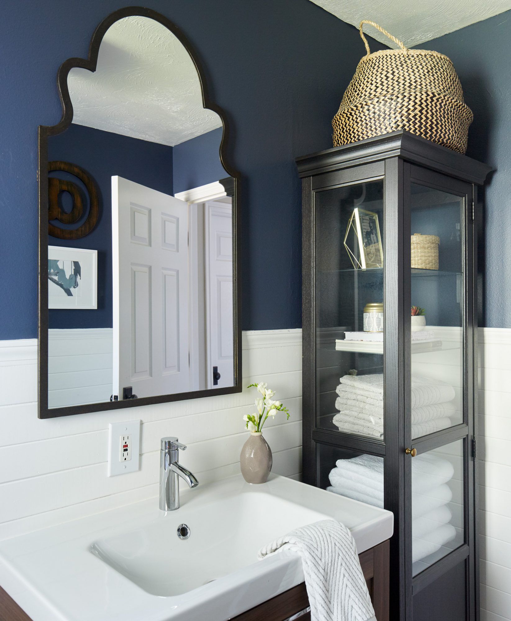
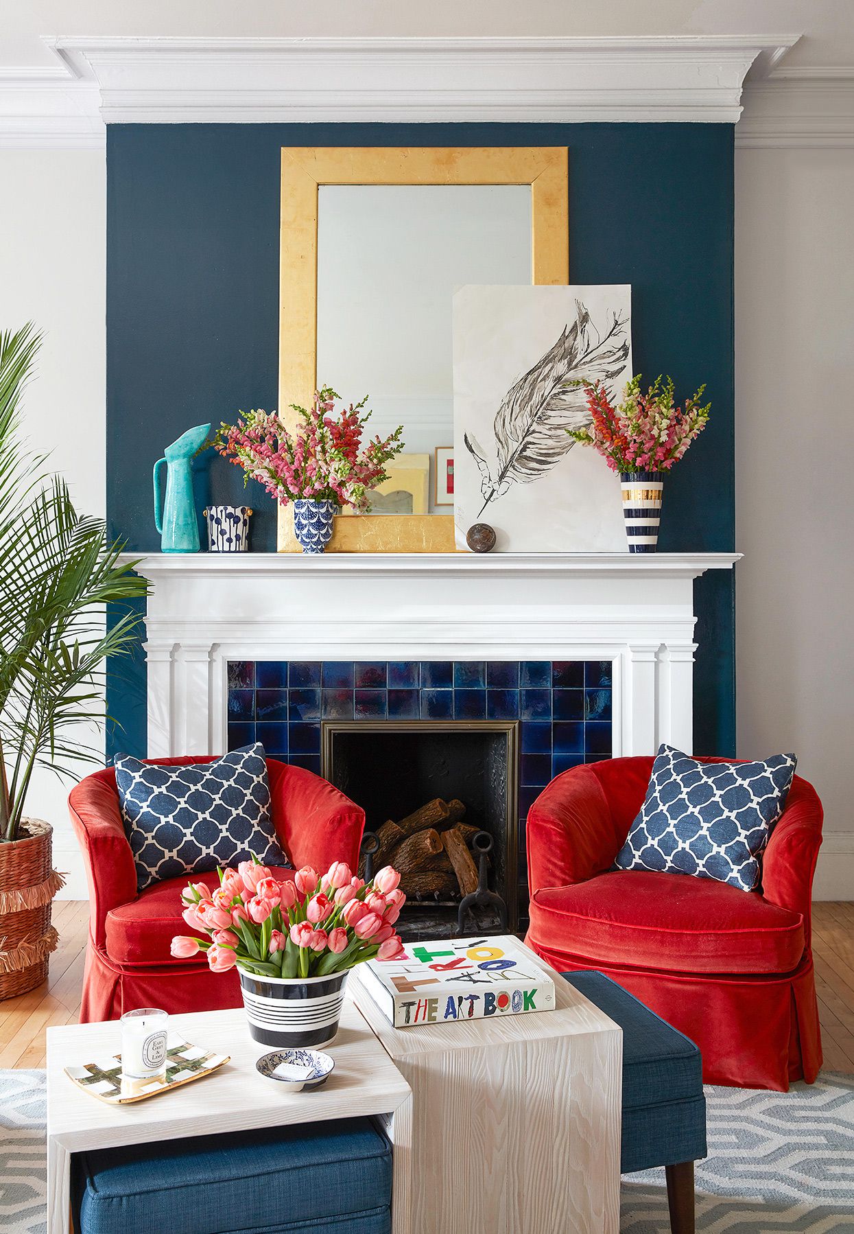
8) Red + Navy
A timeless contrast: red brings energy, navy brings depth. This pairing works in coastal, traditional, and modern
styles. In a room: navy built-ins, a red rug, and white trim. In an outfit: navy blazer, red lip, done.
9) Red + Slate Blue
Slate blue is softer than navy and gives red a calmer, more lived-in feel. This is a great combo for bedrooms or
officesspaces where you want warmth without “alarm bell” energy. Add warm brass or natural wood for balance.
10) Red + Teal
Teal is a knockout with red because it creates vibrant contrast without the harshness of pure complementary green.
It’s playful, artistic, and ideal for mid-century or eclectic spaces. Use teal as the larger field color (walls,
sofa) and red as the pop (art, pillows, lamps) for a balanced look.
11) Red + Turquoise/Aqua
Turquoise gives red a fresh, slightly retro spark. This is especially strong with coral reds, warm reds, and
patterned textiles. Try a red kilim rug with turquoise accents, or aqua pottery on a warm red kitchen shelf.
12) Red + Emerald Green
Rich, jewel-toned, and surprisingly versatile. Emerald plus red can feel festive, but the trick is choosing
deeper, more muted versions (think burgundy and emerald velvet) and avoiding super-saturated “holiday” tones
unless that’s the point. Add cream or brass to make it feel year-round.
13) Red + Forest Green
Forest green grounds bright reds and makes them feel classic rather than seasonal. Picture a red Persian-style
rug in a room with deep green walls or drapery. This combo looks especially good with warm woods and antique brass.
14) Red + Sage Green
Sage is the “soft landing” for red. It makes bold reds more livable and keeps earthy reds feeling organic. This
pairing works beautifully in kitchens and dining rooms: sage cabinetry, warm red accents (dish towels, art, rugs),
and creamy counters.
15) Red + Olive Green
Olive loves brick red, rust, and oxblood. Together they feel earthy, layered, and collected over time. Try olive
walls with a rust-toned rug, or olive upholstery with red-and-cream pattern pillows.
16) Red + Blush Pink
Red and blush is romantic without being sugary. Blush tones soften red’s intensity and add a modern, friendly vibe.
Great for bedrooms, nurseries, and living rooms where you want warmth and personality. Keep one shade muted (blush)
and let the other shine (red).
17) Red + Hot Pink/Fuchsia
This is maximalism done rightbold, cheeky, and fashion-forward. The key is contrast: pair a deep red with a bright
pink, or a bright red with a deeper magenta. In interiors, use this combo in small doses (art, pillows, floral
arrangements) so it reads intentional, not accidental.
18) Red + Lavender/Lilac
Lavender cools red and creates an unexpected, modern softness. This works especially well with berry reds and
cranberry tones. Add gray or white to keep the palette airy and contemporary.
19) Red + Plum/Eggplant
Moody and luxurious. Plum and red together feel dramatic, intimate, and elevatedperfect for dining rooms,
libraries, or eveningwear. Use rich textures like velvet, lacquer, and satin finishes to lean into the glam.
20) Red + Mustard/Ochre
Warm-on-warm pairing that feels vintage, artsy, and cozy. Mustard is strong enough to stand up to red, and the
two together feel intentionalespecially with natural materials like leather, walnut, and woven textiles. Great
for boho, mid-century, and eclectic spaces.
21) Red + Metallics (Gold/Brass or Silver/Chrome)
Metallics act like “light” in your palette. Gold and brass warm red and make it feel luxe and
classic. Silver and chrome sharpen red and make it feel modern and graphic. If your red is deep
and earthy (like ruby or oxblood), brass is usually magic. If your red is bright and clean (true red), chrome can
look crisp and contemporary.
Quick Match Guide: Choose Your Red, Choose Your Mood
- Want it timeless? Red + white, red + navy, red + charcoal.
- Want it cozy? Brick red + cream, red + camel, red + olive.
- Want it bold? Red + teal, red + hot pink, red + emerald.
- Want it modern? Red + light gray, red + slate blue, red + chrome.
- Want it artsy? Red + mustard, red + lavender, red + turquoise.
Pro tip: if you’re using a very saturated red (think fire-engine), give it at least one “quiet” partner
(white, cream, gray, tan) so the palette has somewhere to rest. If your red is muted (brick, rust), you can layer
in richer colors (olive, navy, mustard) without overwhelming the space.
Real-World Experiences with Red: What Actually Happens When You Use It
Let’s be honest: red is not a shy color. When you add it to a roomor even just your outfitit tends to change how
the whole scene feels. People often expect red to be “too much,” but the lived reality is usually more nuanced.
Here are some common experiences designers and homeowners talk about, plus what typically makes red feel right.
Experience #1: Red looks different every hour of the day. In morning light, many reds read cleaner
and brighter. At night, under warm bulbs, that same red can lean deeper, cozier, or even slightly brown. This is why
test swatches matter: a red you love at noon can feel like a totally different personality after sunset. If you want
consistency, pair red with steady neutrals (cream, gray, or warm white) and pick lighting with a similar color temperature
throughout the space.
Experience #2: A “little red” often becomes “more red,” and that’s not always bad. A common pattern:
you add one red pillow, then suddenly notice how amazing red looks with your wood tones… and now there are red books,
a red vase, and a red throw. The trick is choosing a repeatable red family. If your first red is a warm brick, keep
future reds in that neighborhood (rust, terracotta, cinnamon) so the room feels collected rather than chaotic.
Experience #3: Red can make a space feel warmer and more social. Dining rooms, kitchens, and living areas
often benefit from red accents because they create energy and a sense of “gather here.” Even a deep red rug can make a large
room feel more anchored and welcoming. If you’re worried about intensity, use red in textiles first (rugs, curtains, upholstery)
so you can adjust easily.
Experience #4: The “wrong” partner color is usually the real problem. When red looks off, it’s often because
the supporting colors fight it. A cool cherry red next to a very warm beige can feel mismatched. A rusty red next to an icy
blue-gray can look accidental. People who end up loving red long-term typically match undertones: warm reds with warm partners
(cream, camel, ochre, olive) and cool reds with cool partners (navy, slate, teal, crisp white).
Experience #5: Red is a confidence boostervisually and emotionally. In wardrobes, a pop of red (shoes, bag,
lipstick, scarf) often becomes a go-to “instant upgrade” because it makes even neutral outfits feel intentional. In interiors,
red accents can do the same: one bold red moment can make the whole room feel styled. The key is placementuse red where you want
the eye to land: the fireplace, the entry, the dining table, the art wall, the statement chair.
The best part? You don’t have to commit to a full red room to enjoy the benefits. Start with one red element, pair it with one
of the combinations above, and build slowly. Red rewards experimentationas long as you give it a little structure (undertone
matching, balanced proportions, and a supporting neutral). In other words: let red be bold, but don’t let it run for office
without a campaign manager.
Conclusion
Red doesn’t need “fixing.” It needs a plan. Whether you love a bright true red, a cozy brick, or a dramatic burgundy,
the right pairing makes red feel stylish, livable, and unmistakably intentional. Use neutrals for balance, cool tones for
crisp contrast, warm tones for cozy harmony, and metallics to add polish. Then let red do what it does best: make things memorable.